Matt Beard
Matt Beard is a graphic designer specialising in editorial design, branding, print and advertising. His attention to detail is well suited to editing. Matt has enjoyed using a multimedia approach in his work and has a flair for typography. His considered and creative ideas incorporate a contemporary twist to produce enduring outcomes.
Follow me on socials
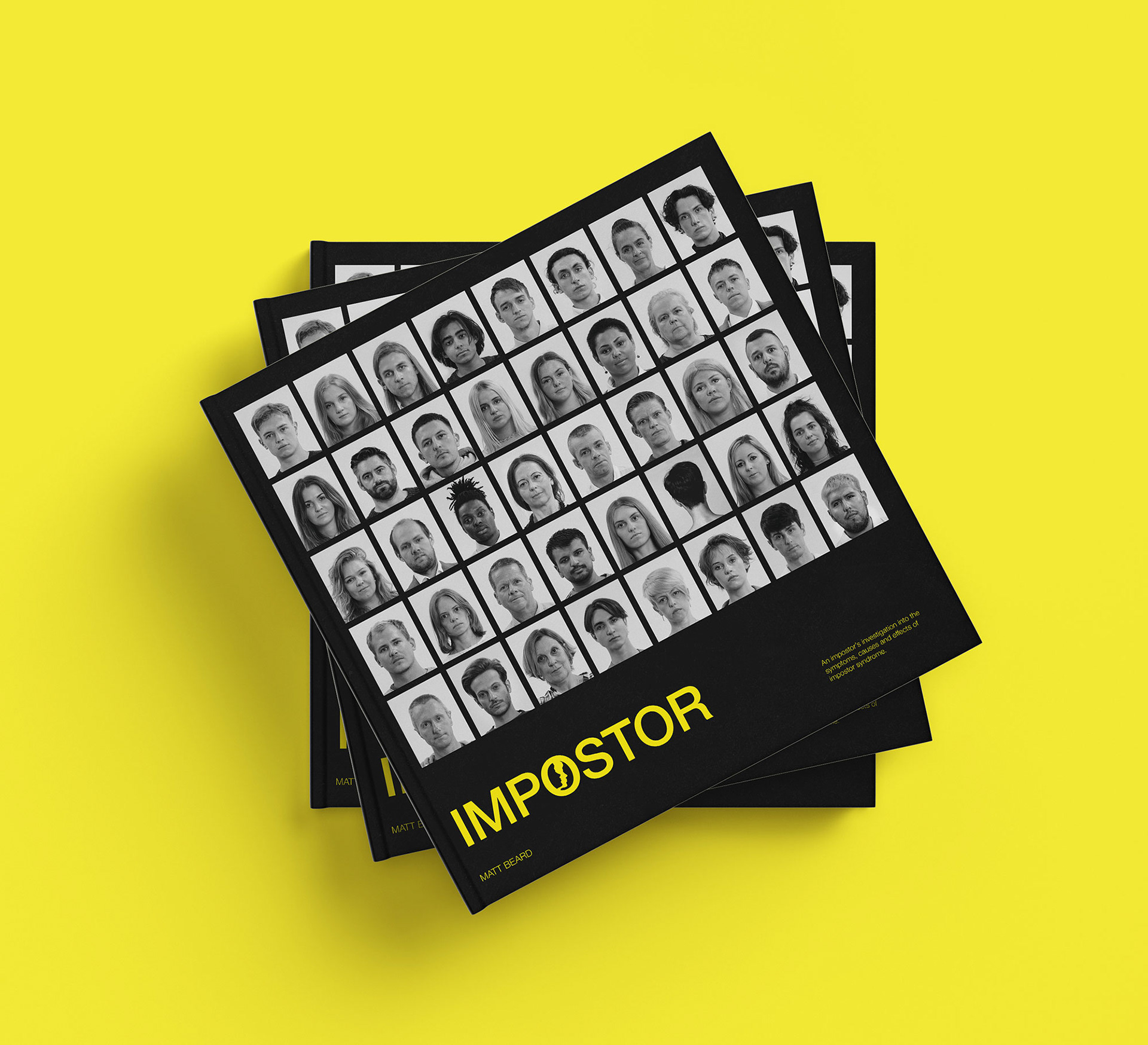
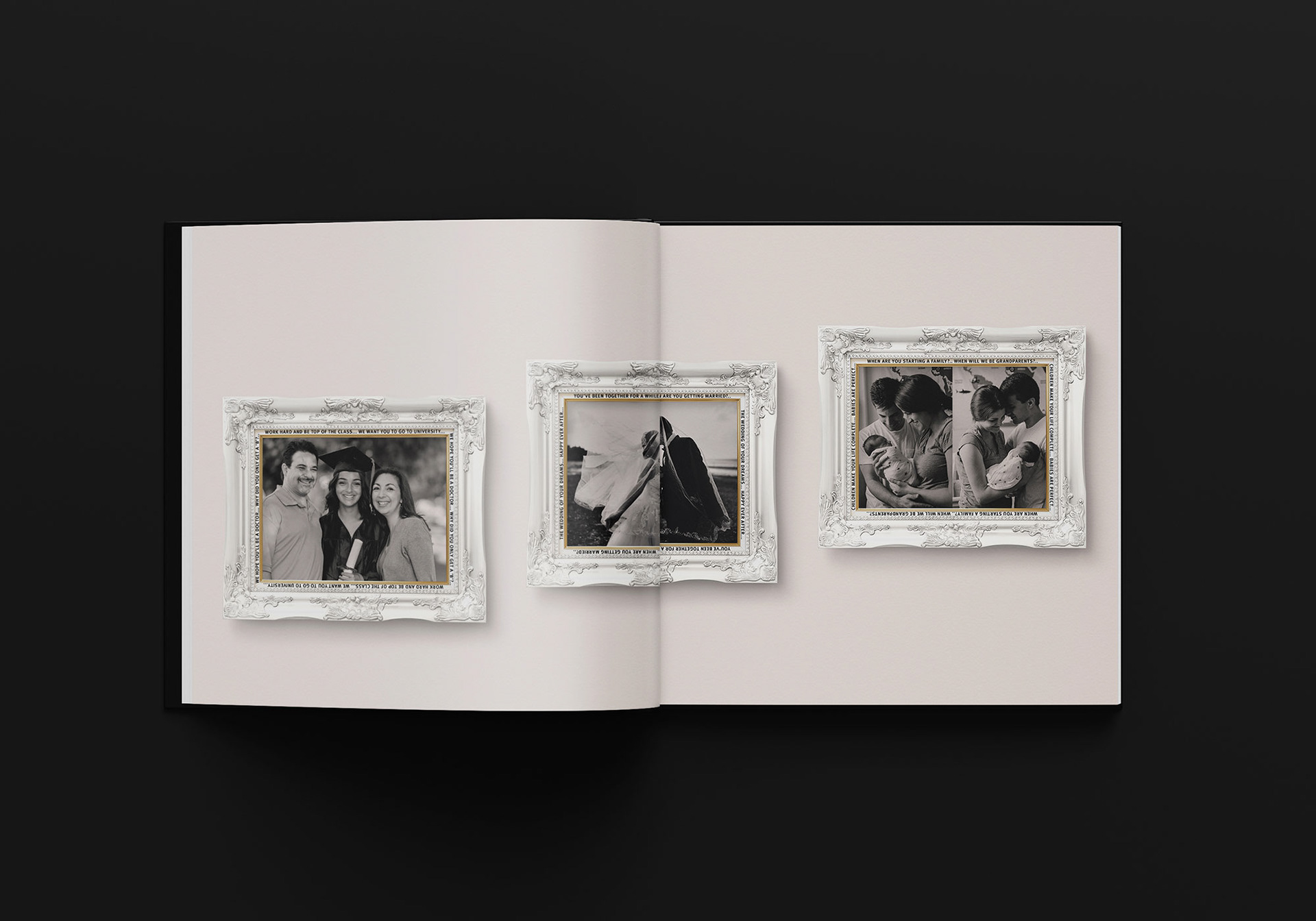
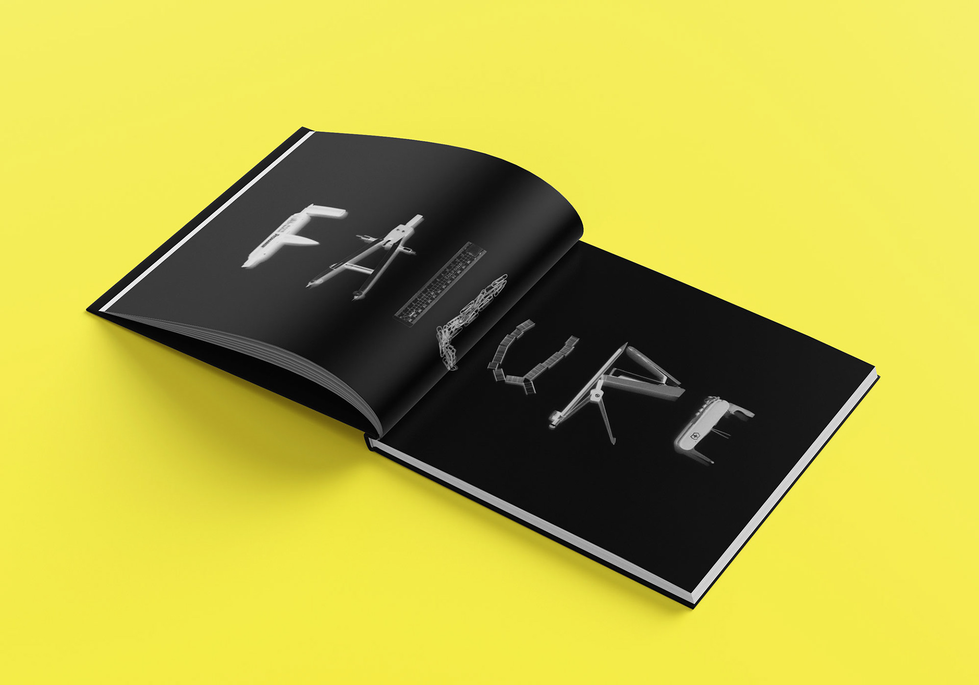
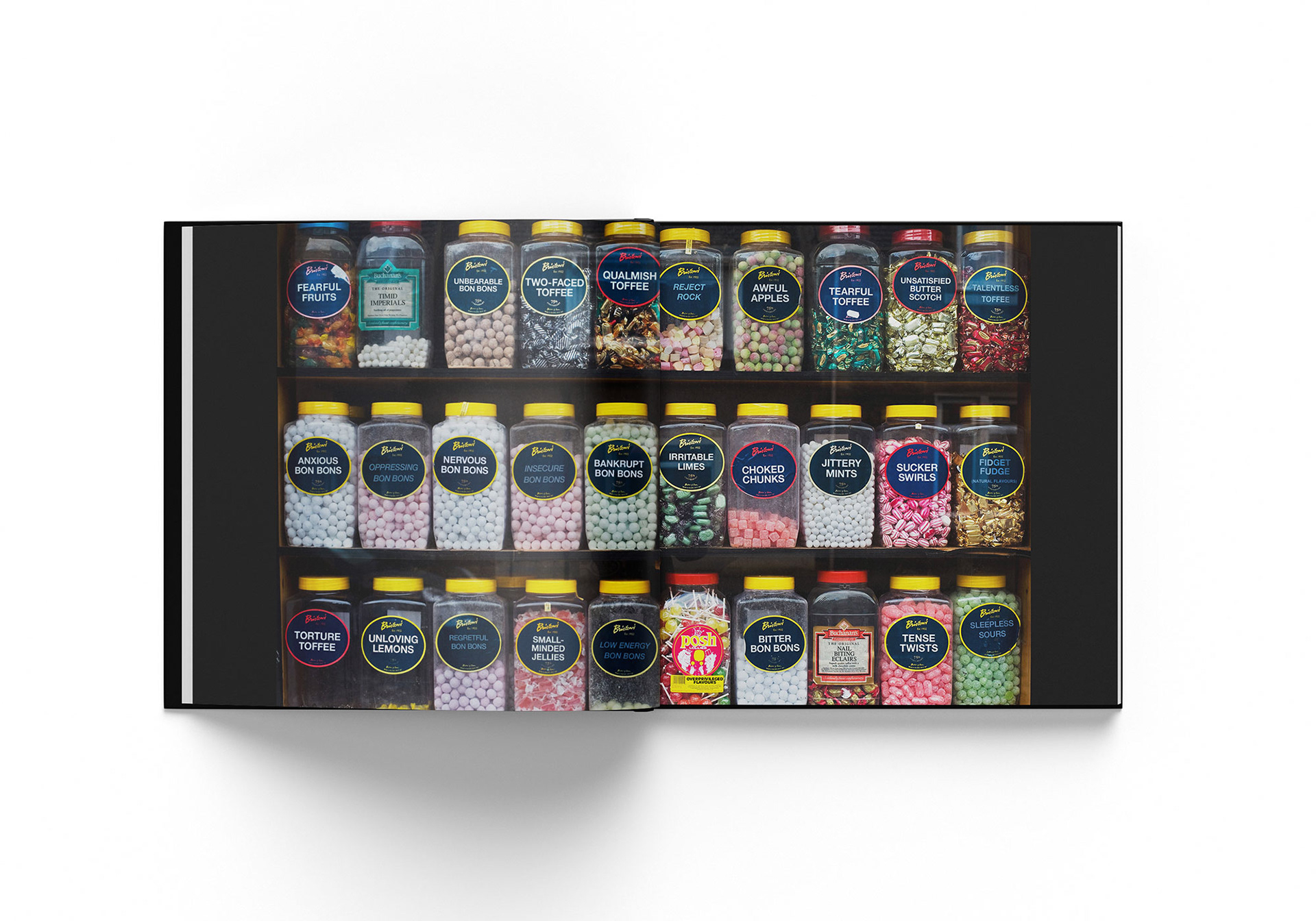
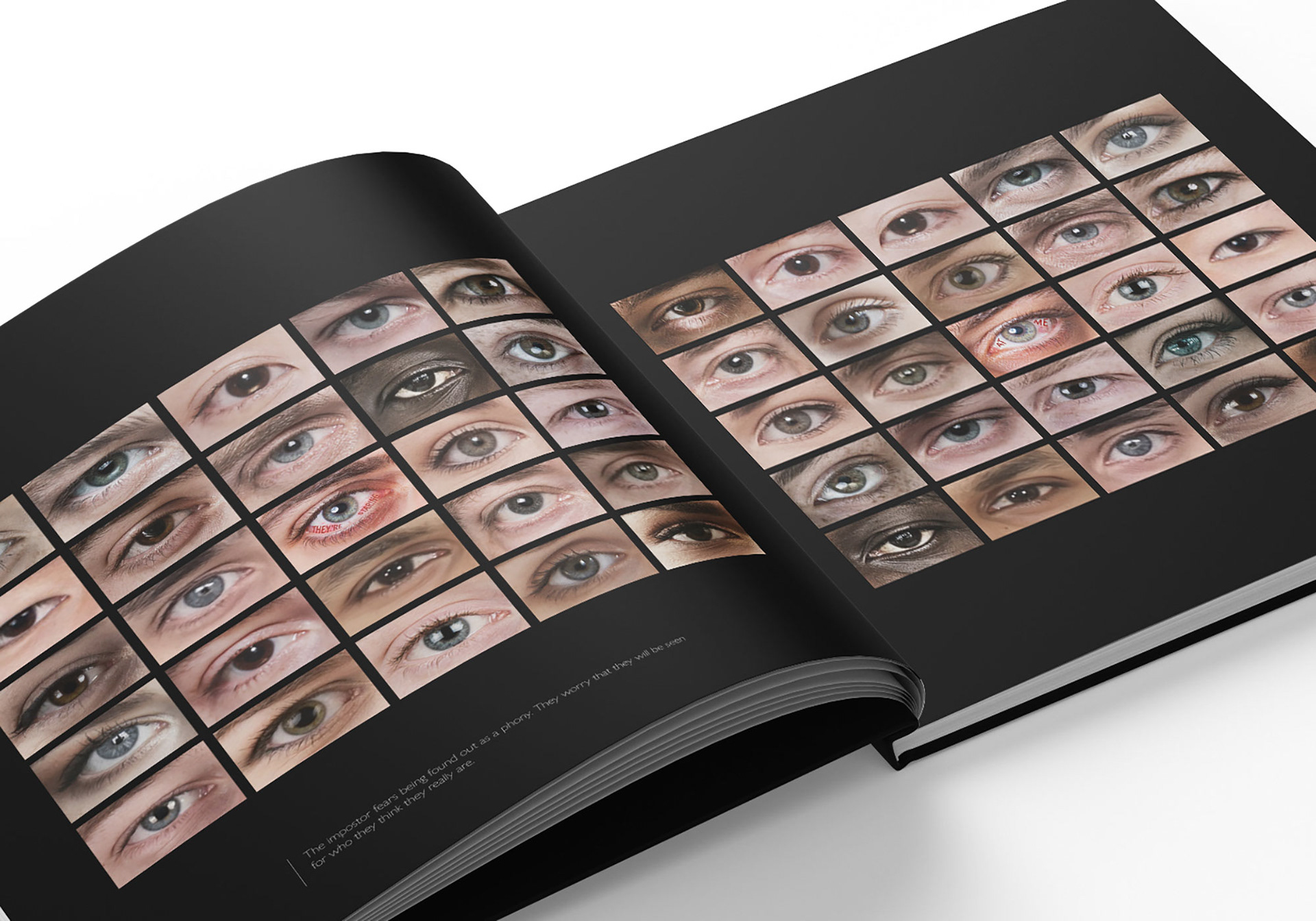
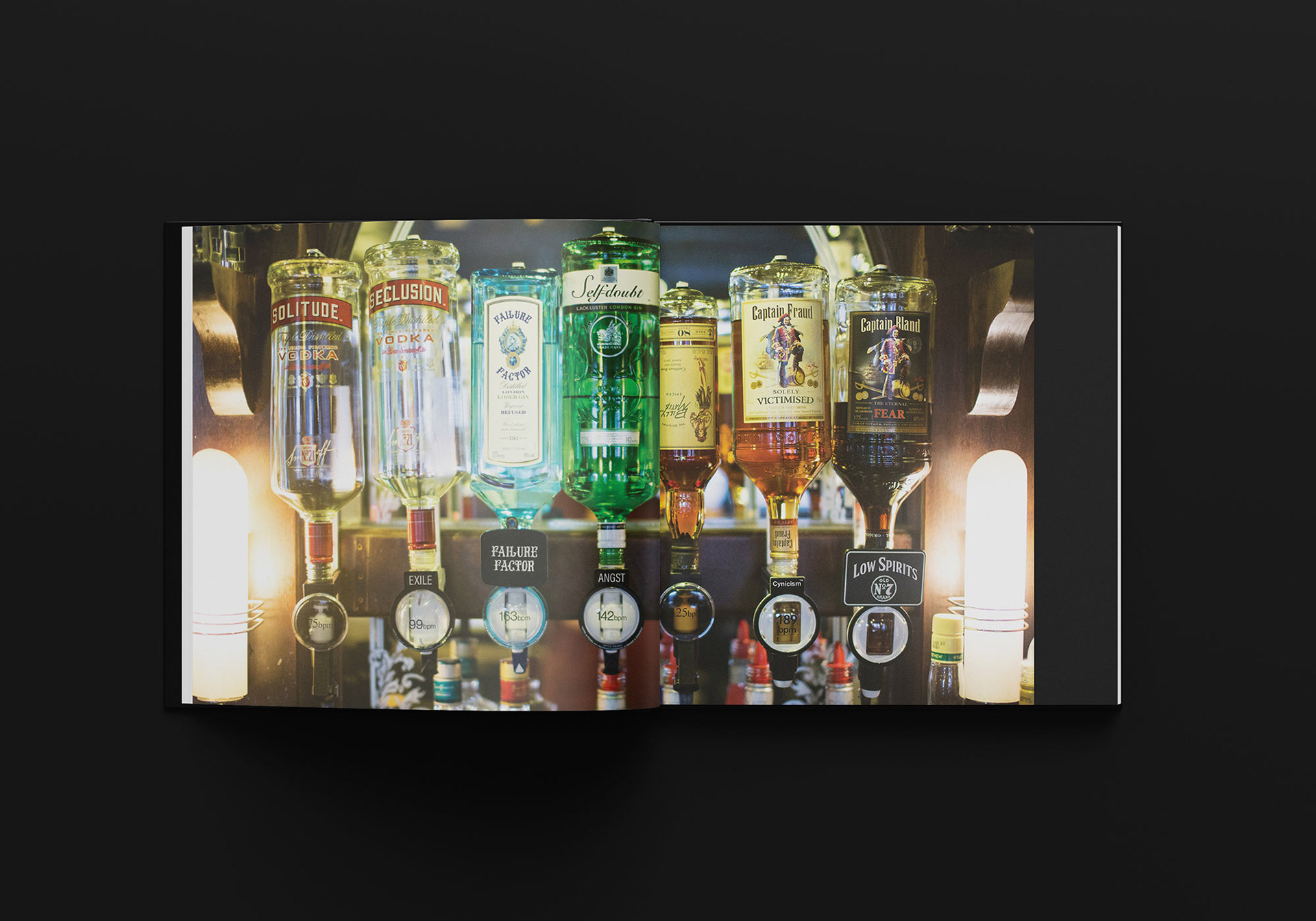
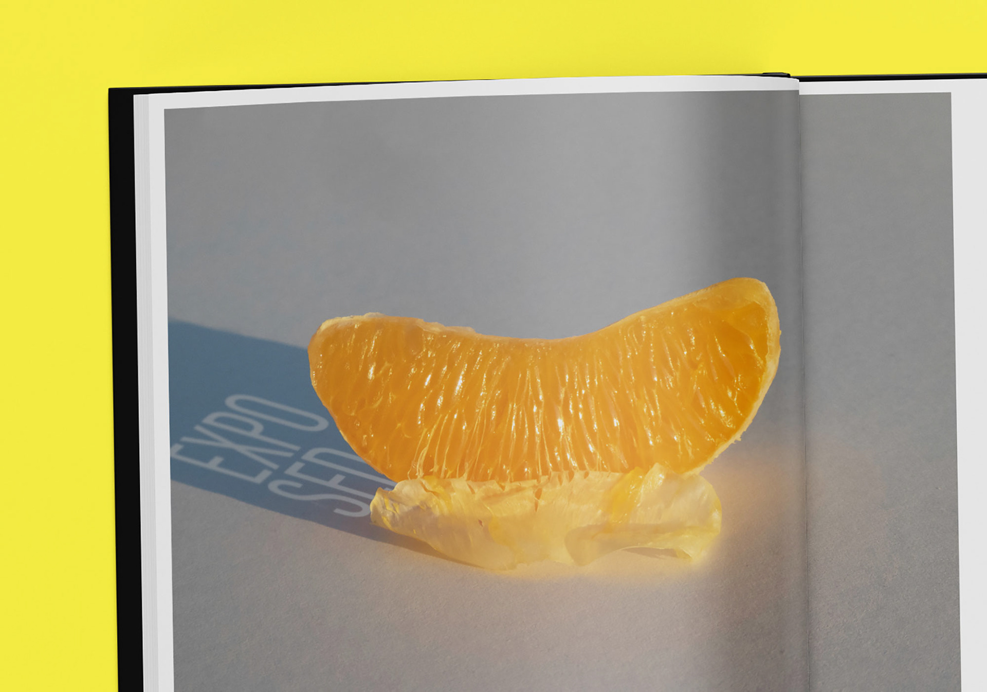
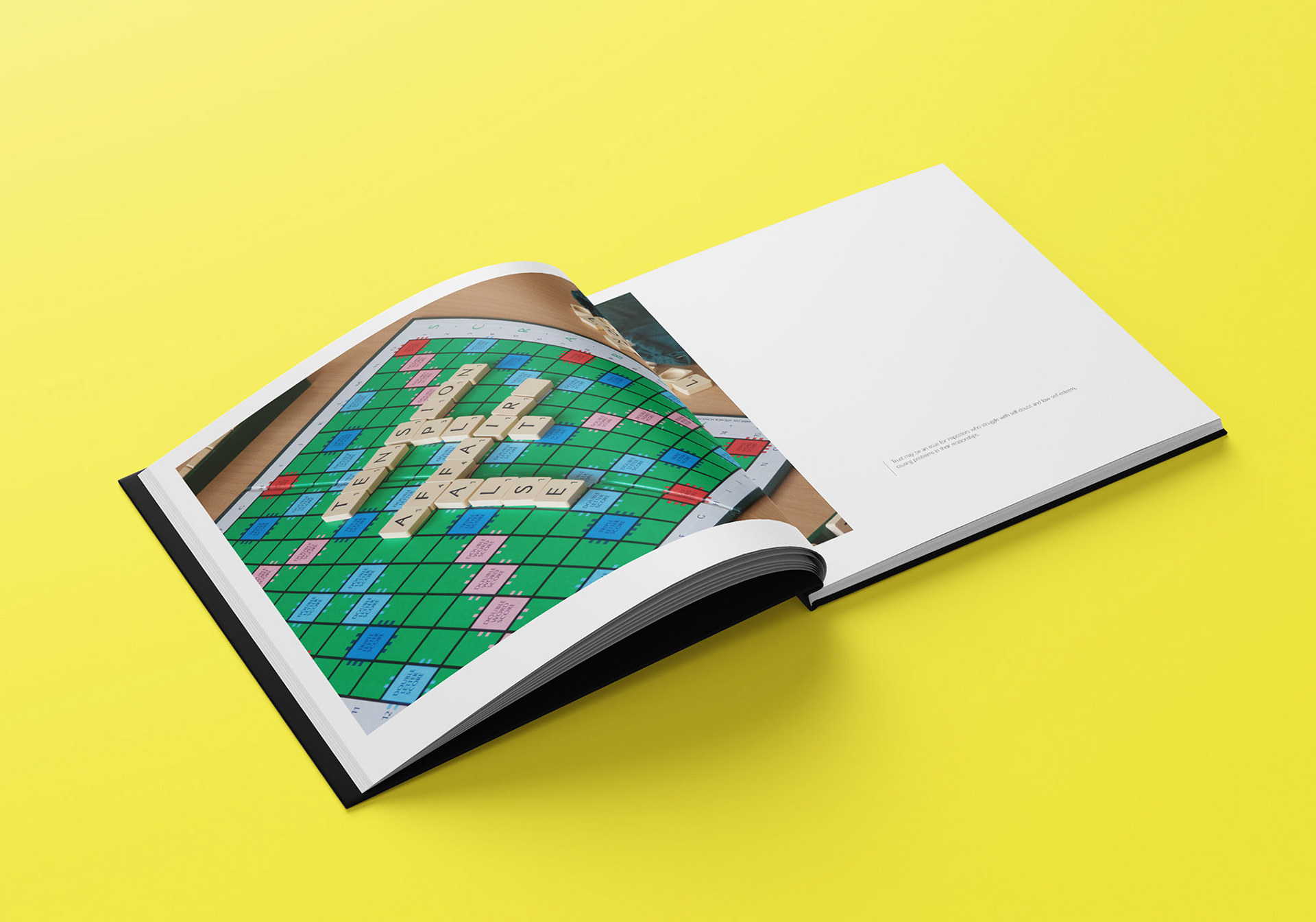
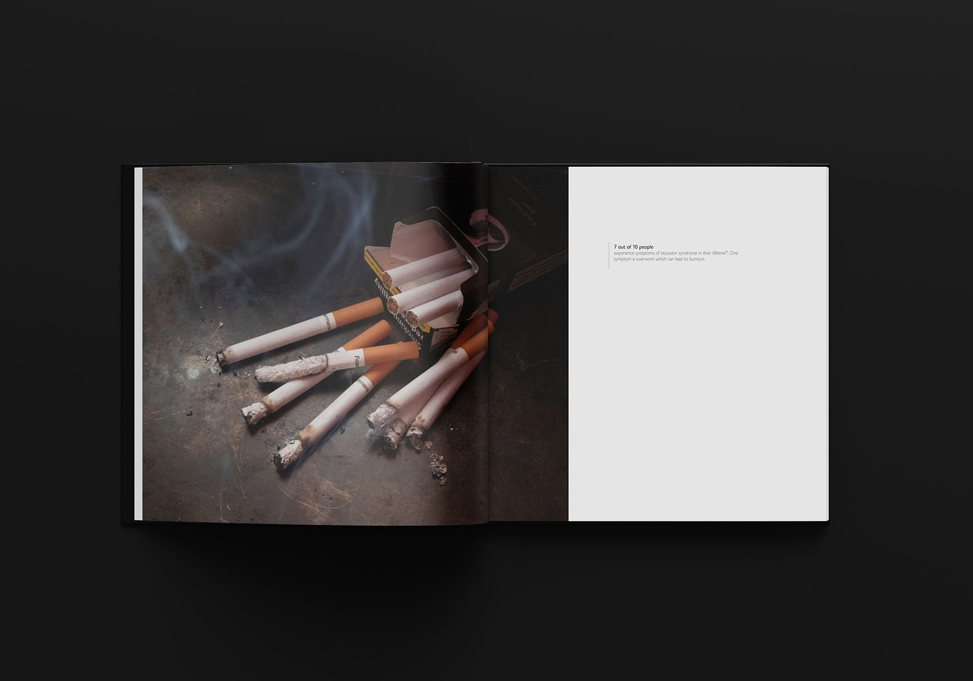
Final Major Project: Impostor
Although the first paper on impostor syndrome was published in 1978, many people still do not acknowledge it as a recognised condition. This project explores what it is, how it manifests and how it affects the impostor in the hope that it will broaden awareness of the syndrome and challenge assumptions in the minds of people who dismiss it.

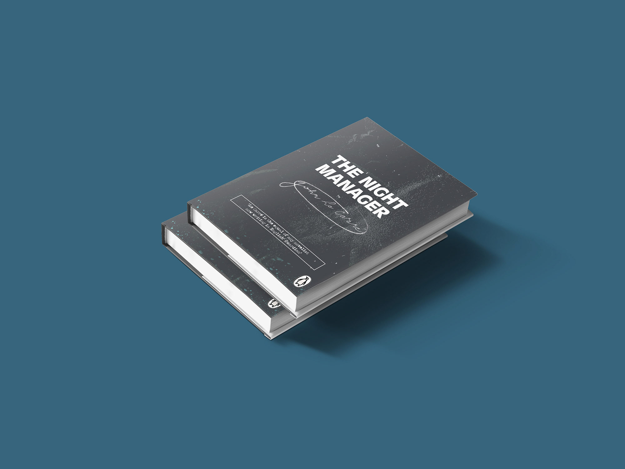
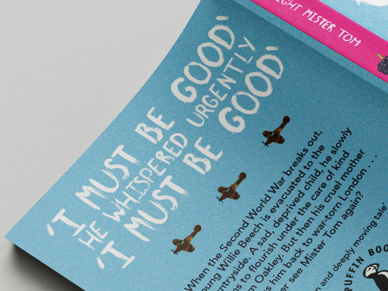
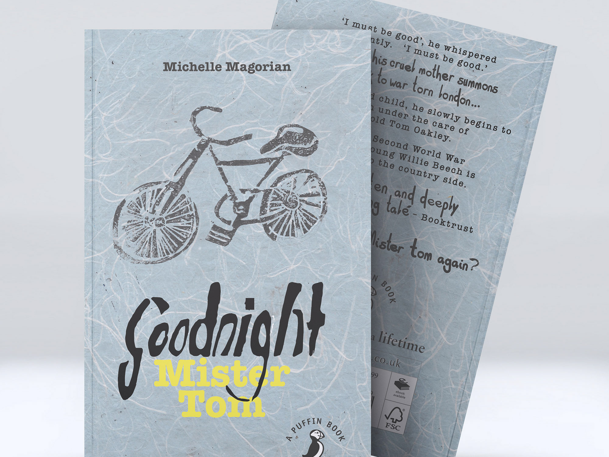
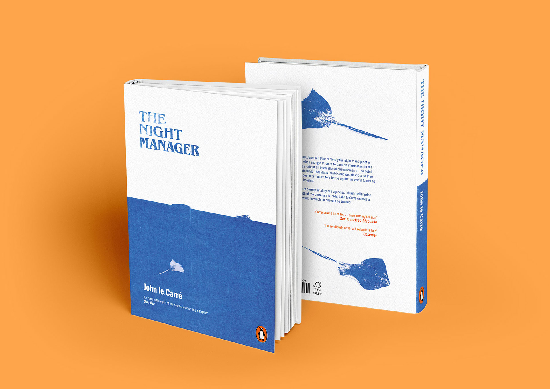
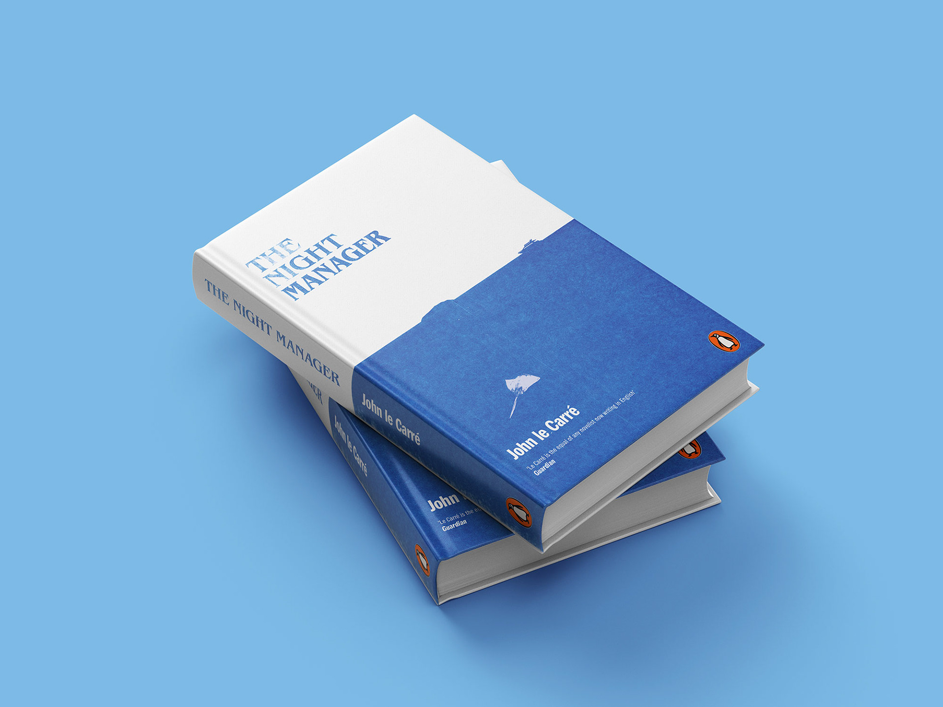
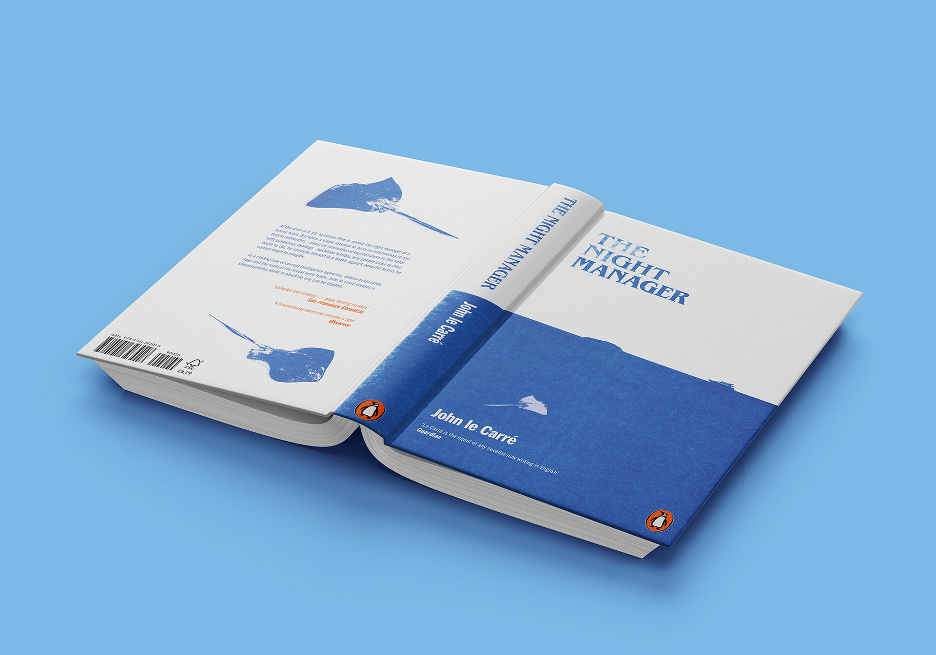
Project: The Night Manager Book Cover
Client: Penguin Student Design Award
The design concept aimed to show a complex story through the art of subtlety. By using a risograph, the print effect presents a weathered texture as the novel consists of secret documents from the Cold War era. The stingrays have an abstract link to the law enforcement ‘Sting Operation’. On top of the sea line, a yacht is travelling towards an island where the final scene culminates.
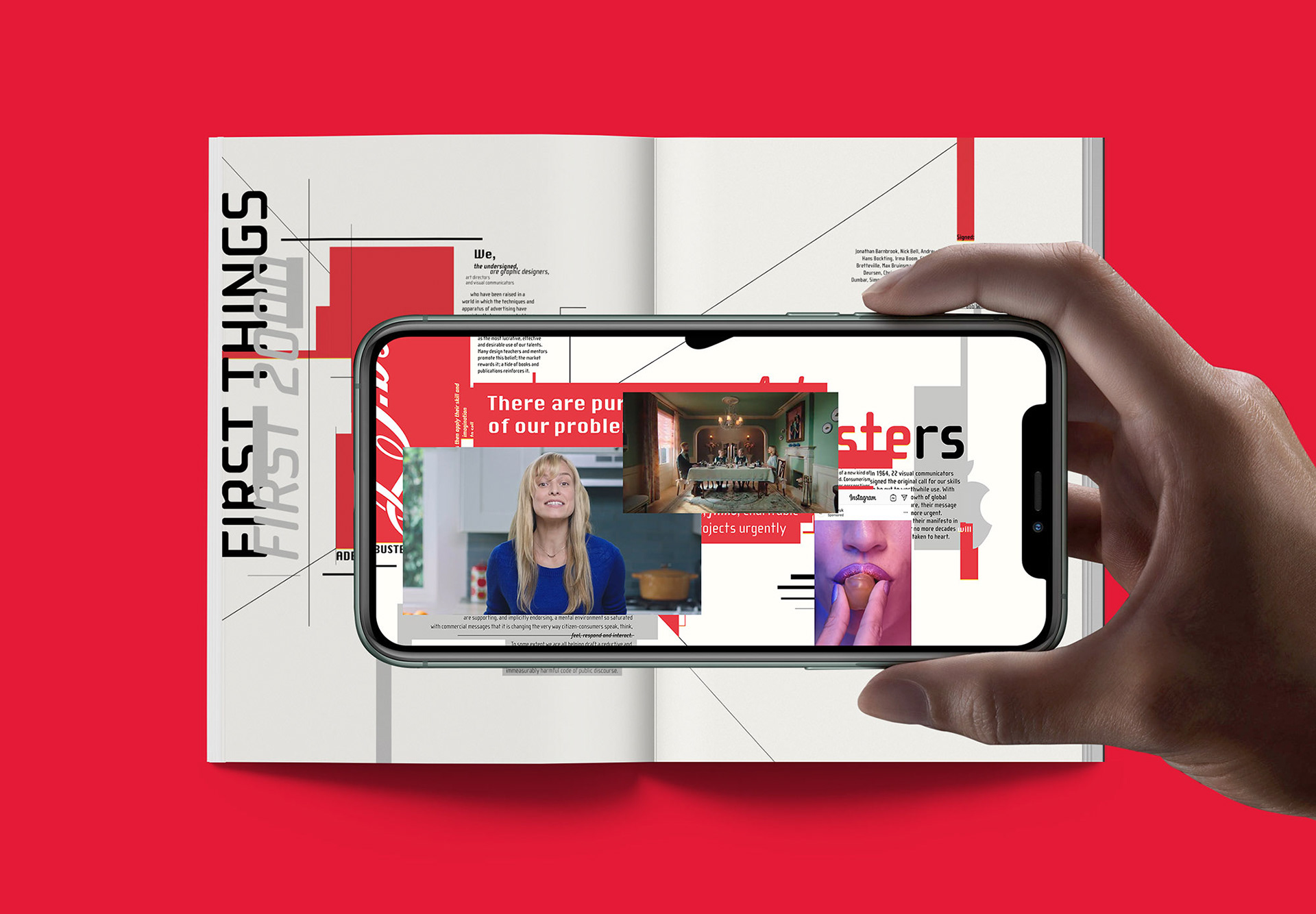
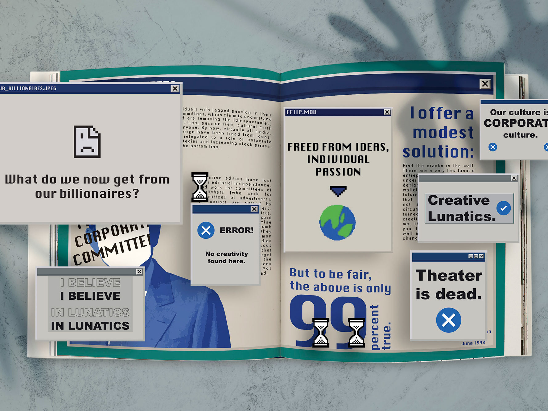
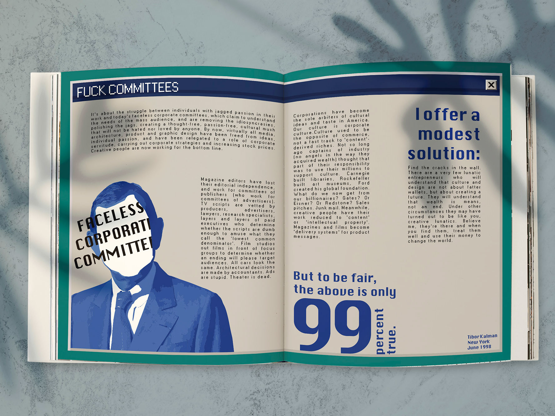
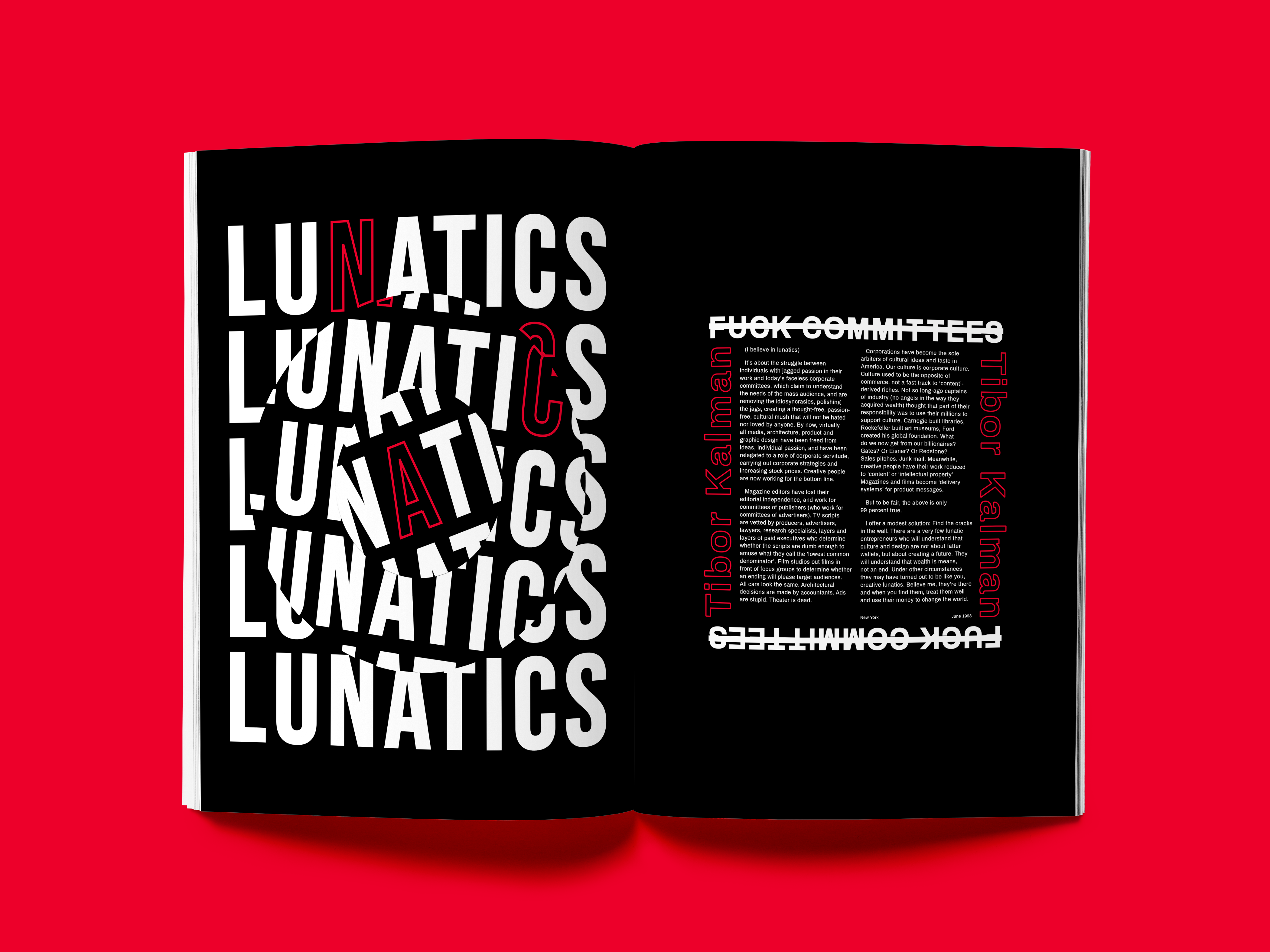
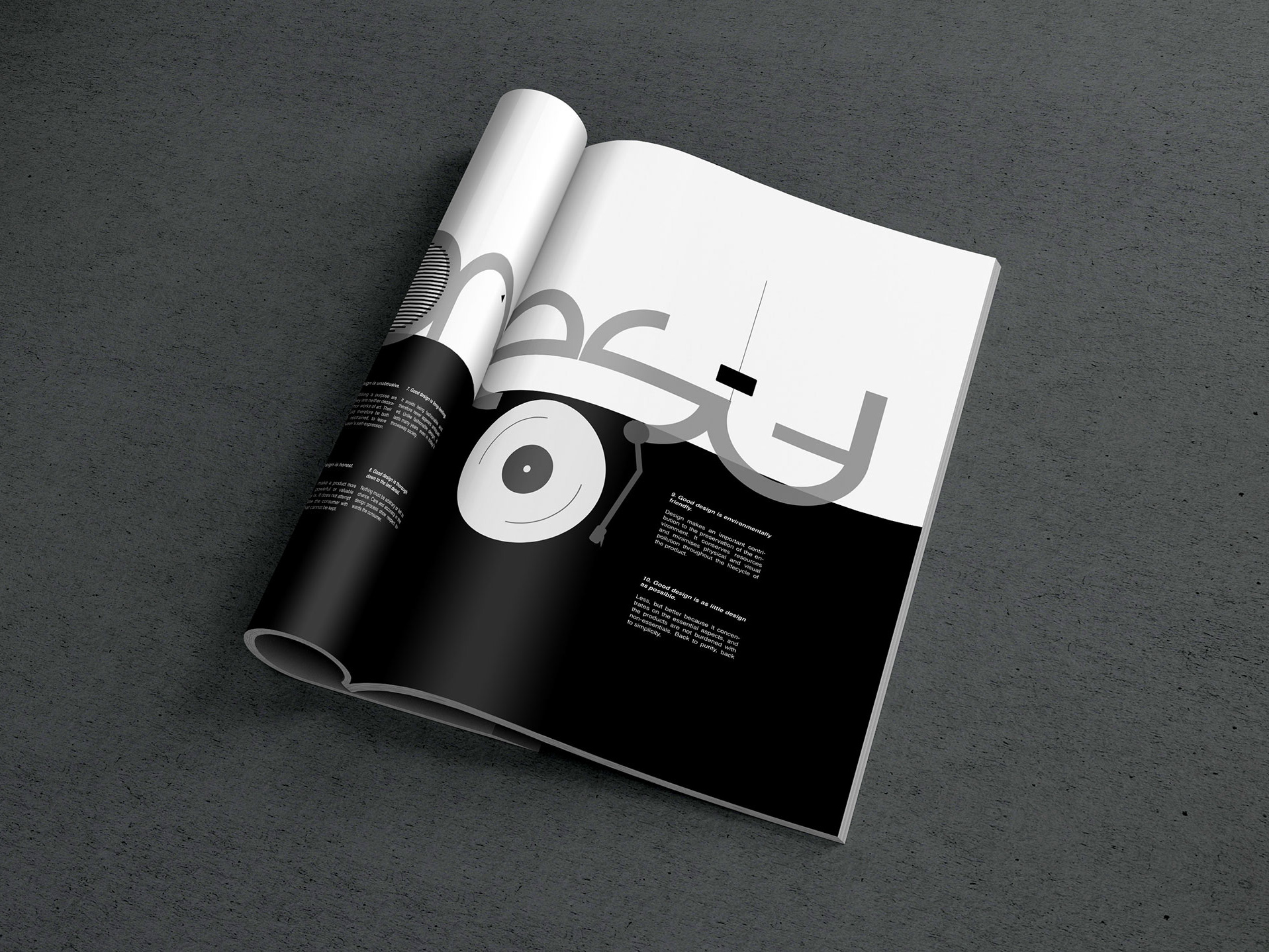
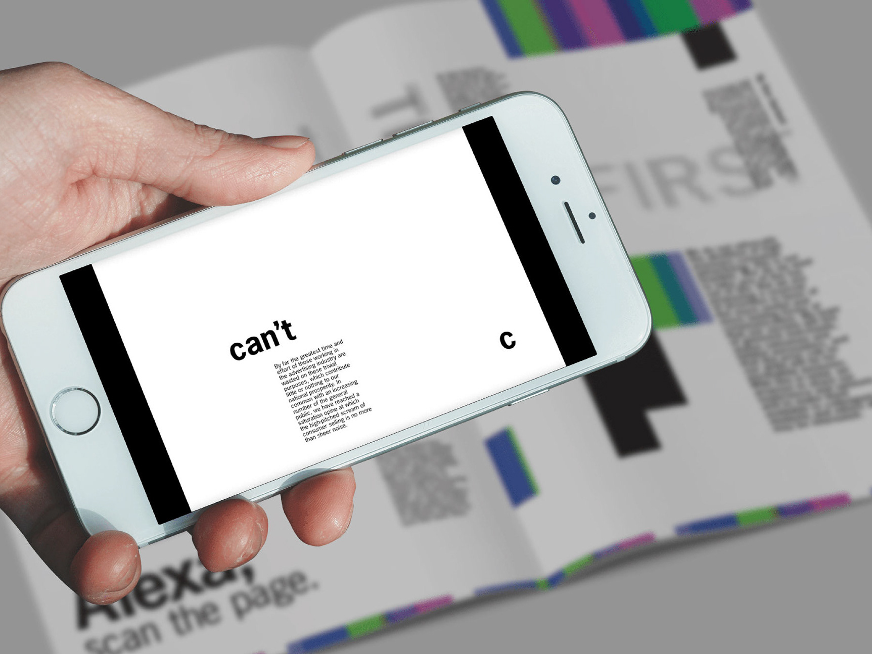
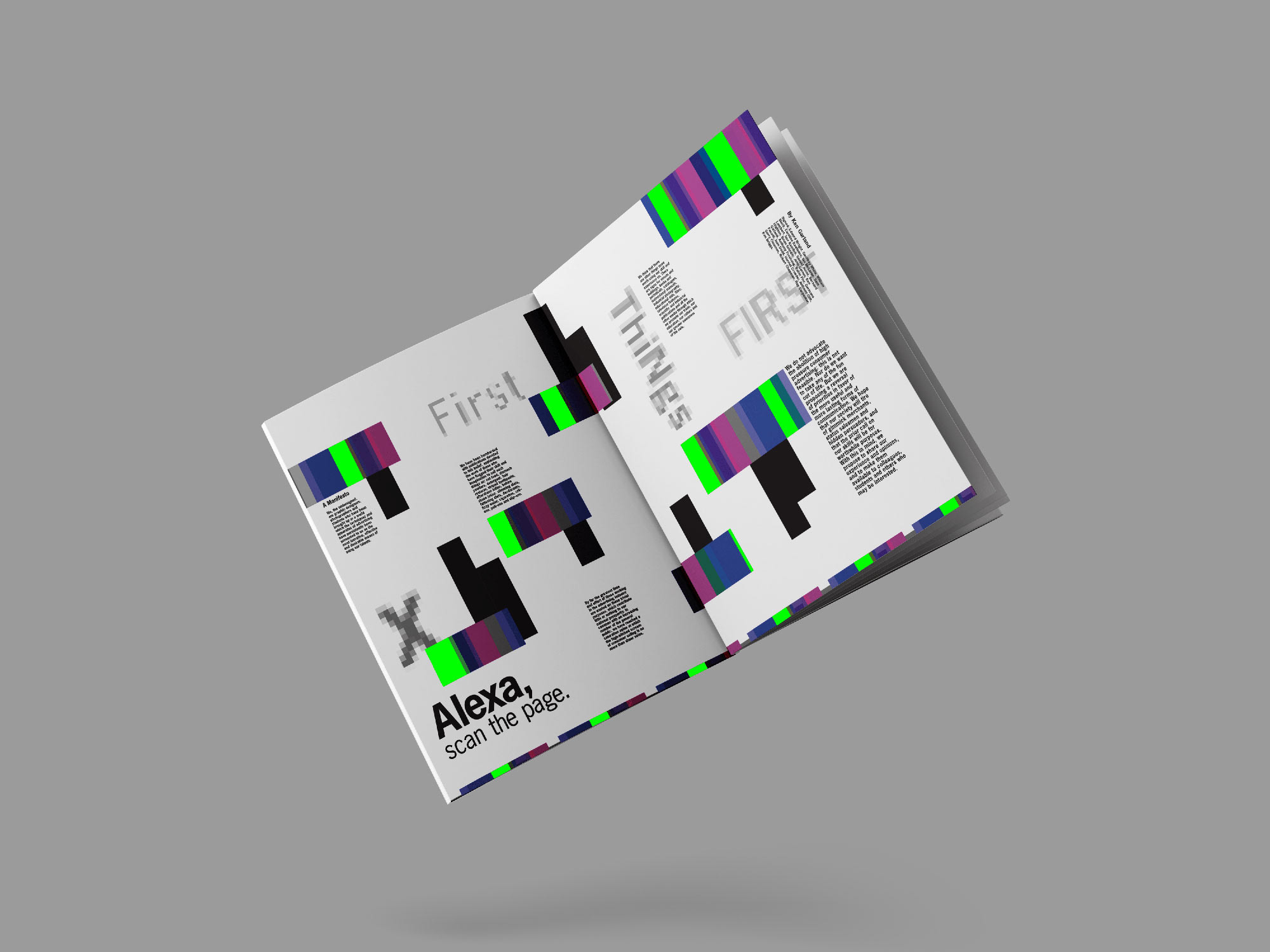
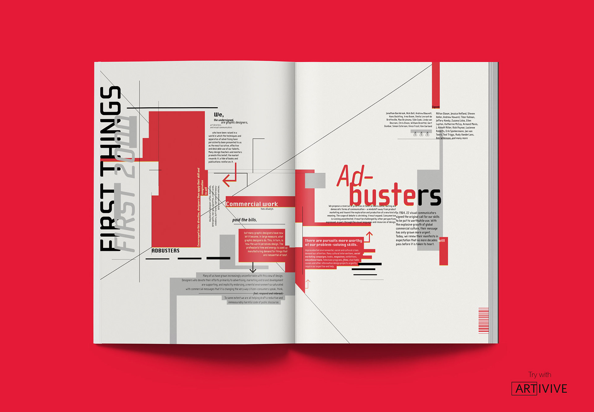
Project: Editorial Beyond the Page
Use Augmented Reality to bring a design manifesto to life.
The double-page spread that showcases the ‘First Things First 2000’ manifesto by Adbusters is set in 90s graphics, relevant to the period. Assisting the print, an AR layer has been created to make the manifesto come to life. The AR layer includes pop-ups of advertisements from websites and social media apps that clutter the page with visual noise, conflicting with the manifesto’s aim: that designers should use their skills for the greater good.
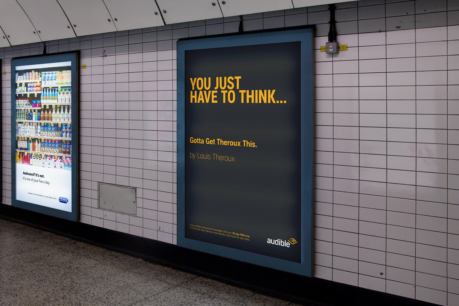
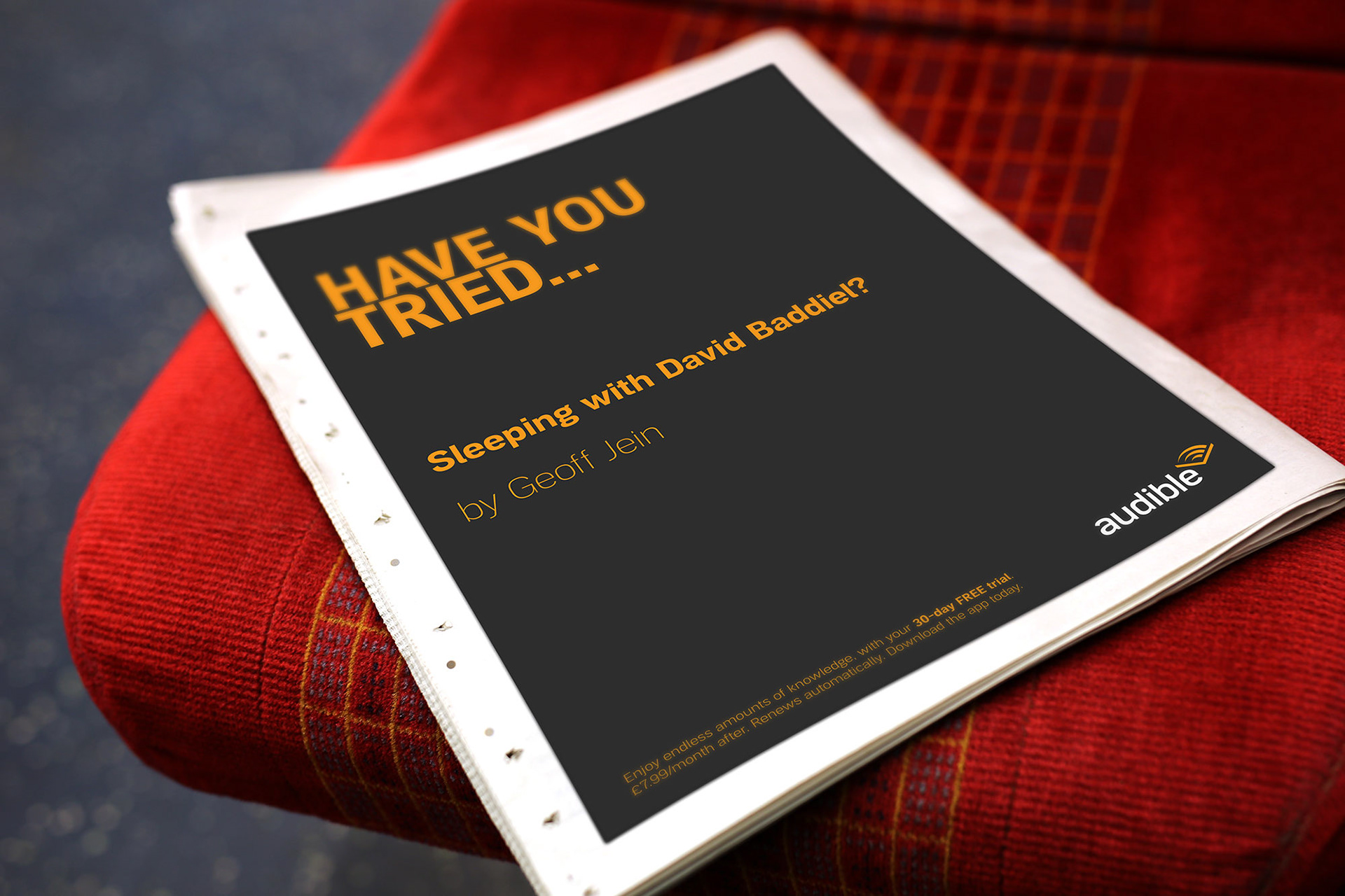
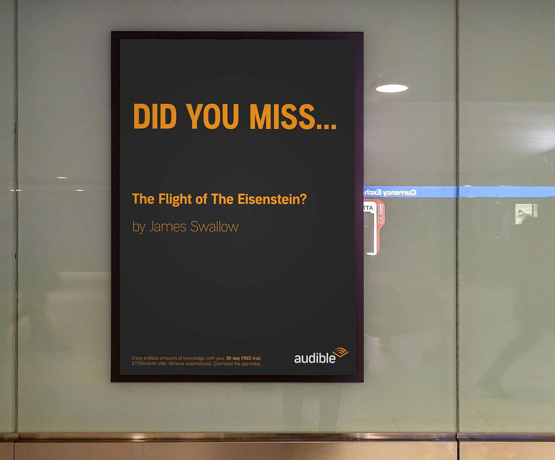
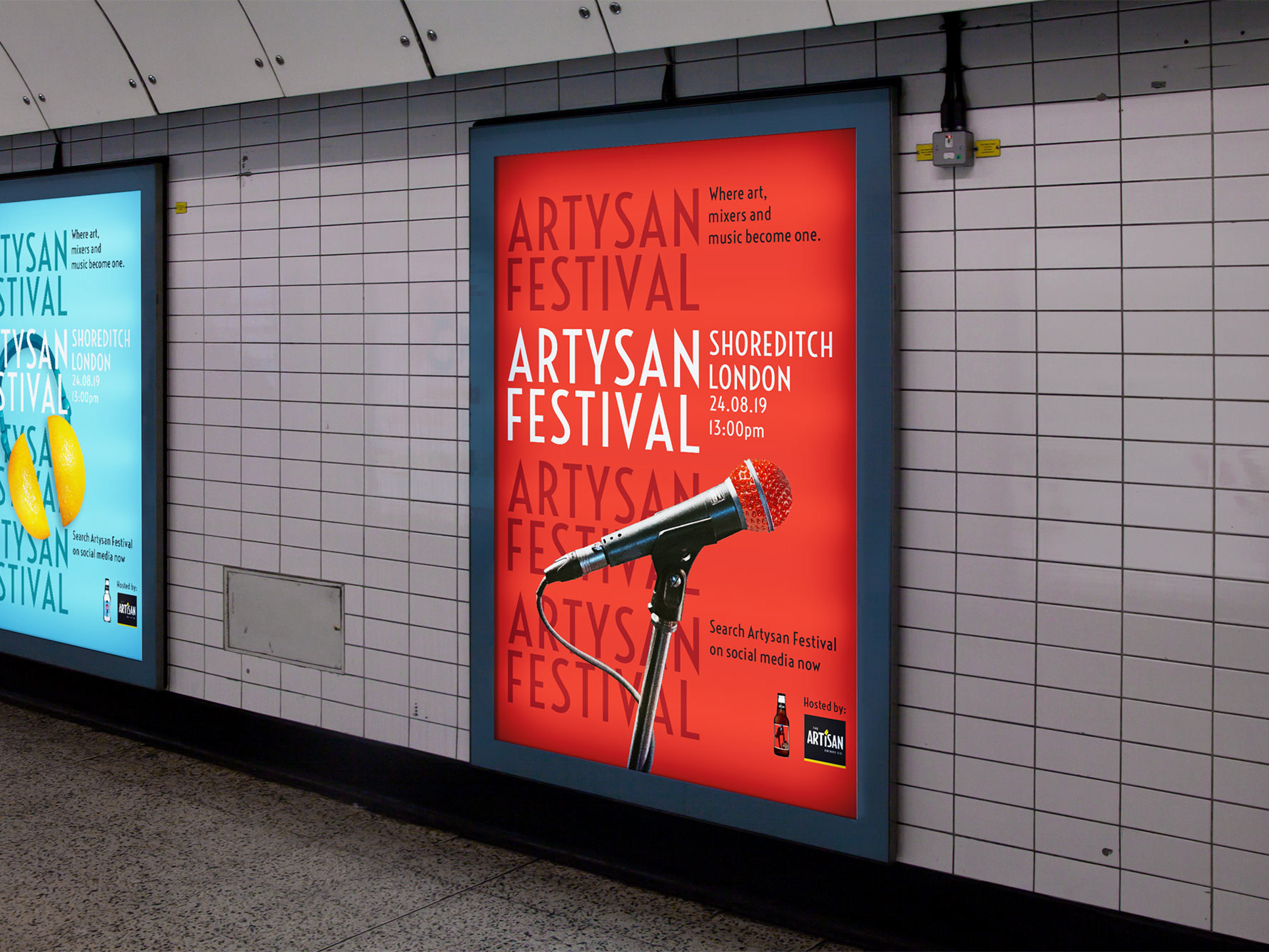
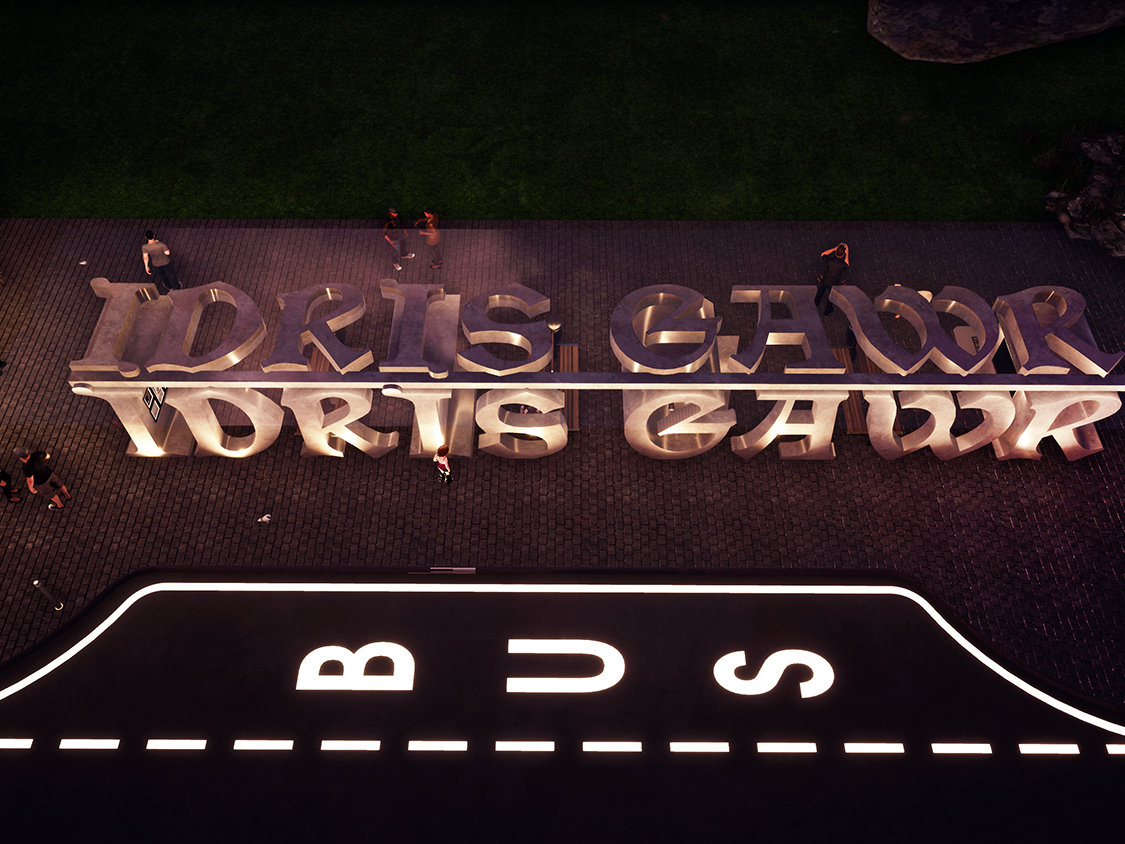
Project: D&AD New Blood Awards - Audible
Design an out-of-home campaign that encourages leisure upgraders, aged over 25, to sign up for a 30-day free Audible trial.
To help captivate the target audience, a series of posters are situated around the UK’s main cities’ means of transport i.e: London underground, trains and airports. After understanding that advertisements have only a few seconds to grab the attention of passers-by, bold typographic designs were put in place to maximise this opportunity. The concept encompasses the idea of using witty comments, utilising book titles to best suit the target audience.