I am a passionate and driven Graphic Designer, who loves to work across a variety of creative paths and disciplines. I approach tasks in a thoughtful and analytical way, and am always intrigued to find new ways of working for the most effective outcomes. Discovering new paths within design is a constant source of motivation, including methods of traditional printing to create an authentic product. By looking at the past, present and future in planning and delivery, allows my work to encapsulate the strongest values of the subject area, and provide a final piece of work that befits the vision intended.
Follow me on socials
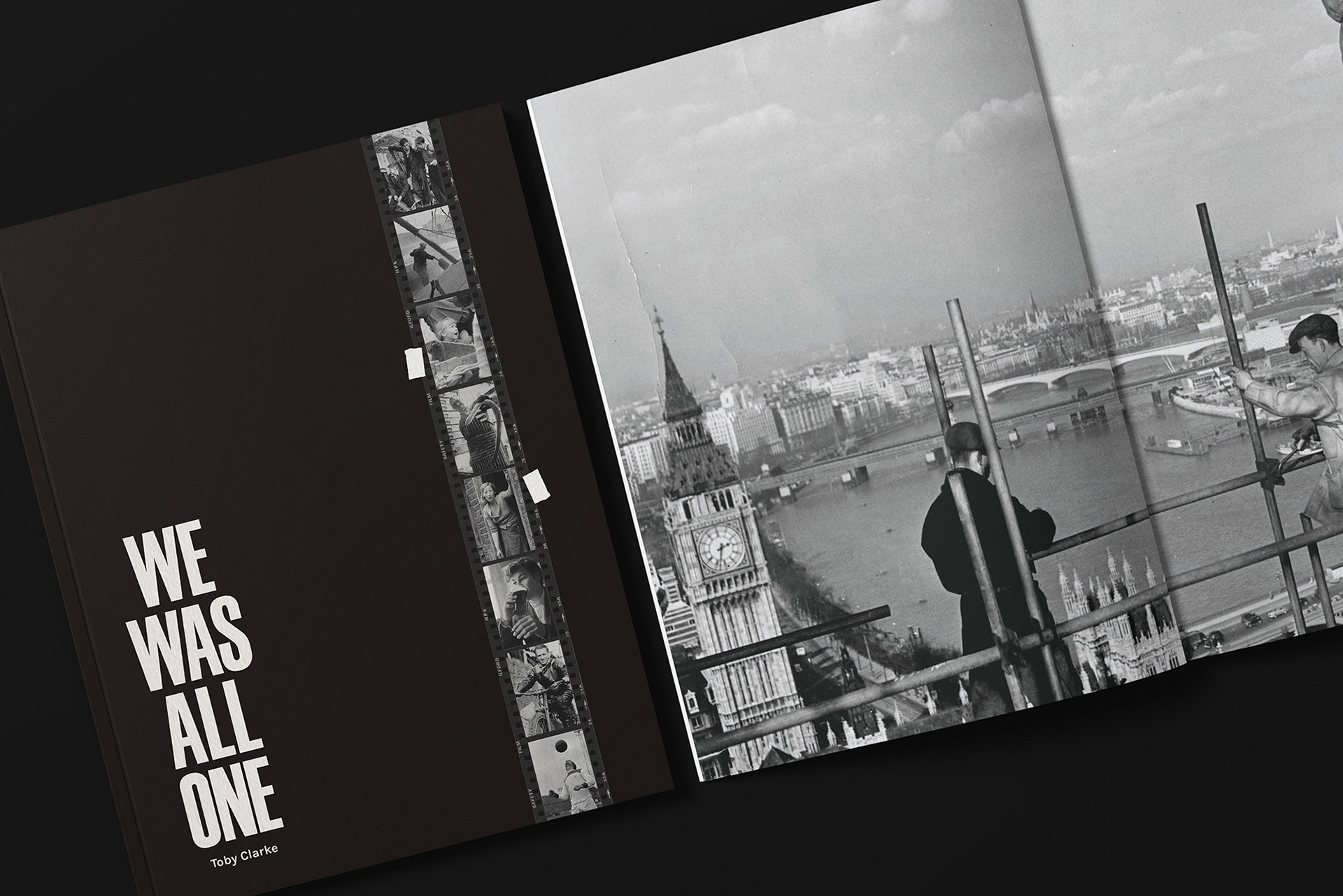
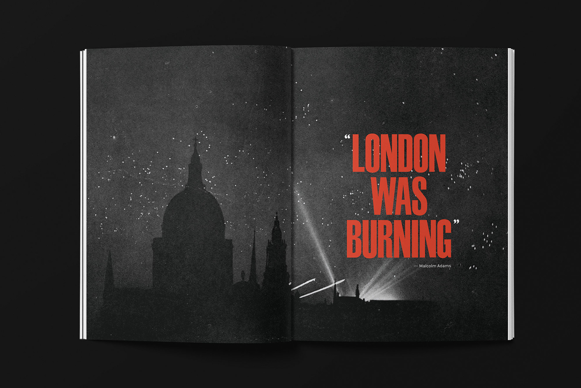
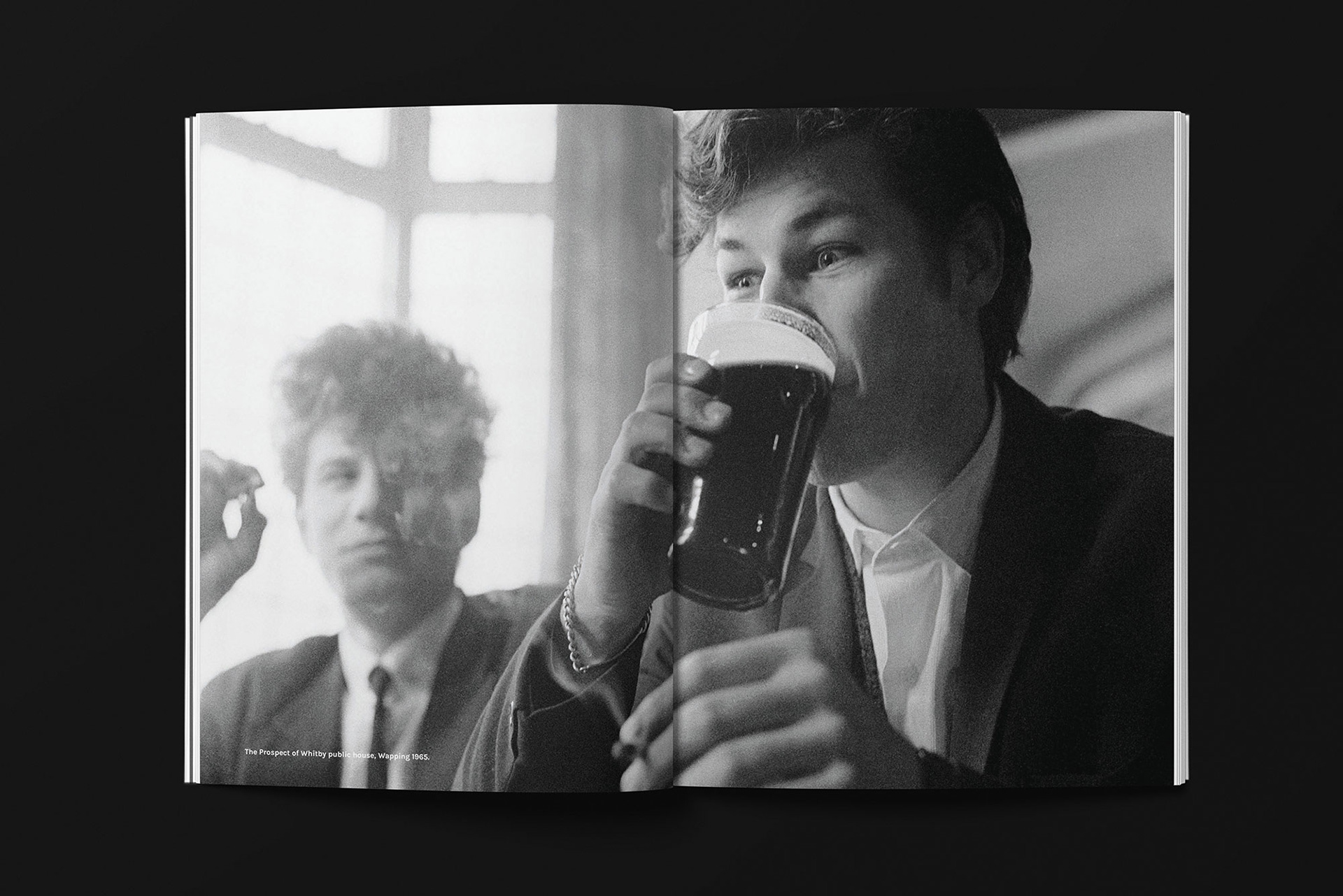
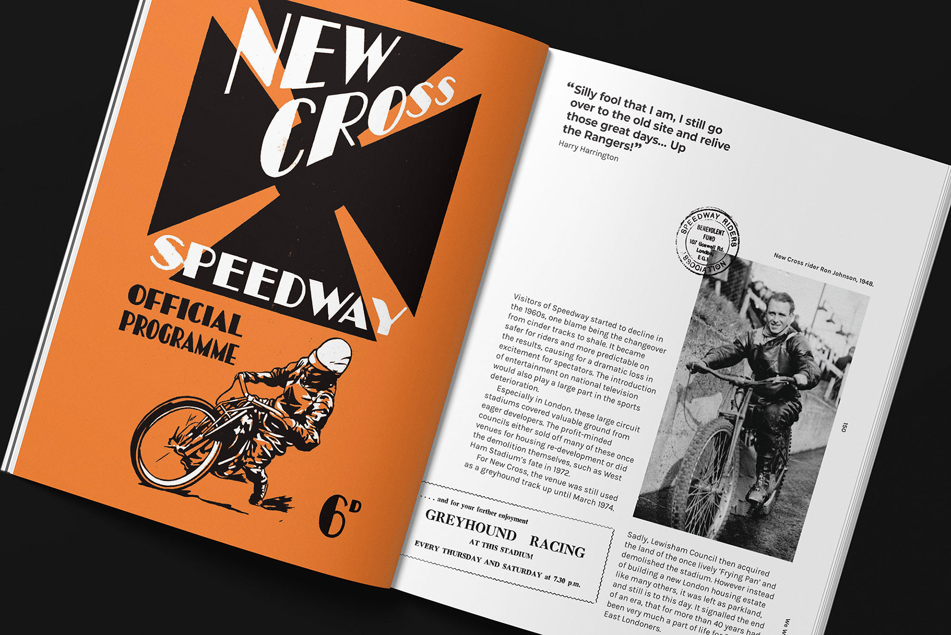
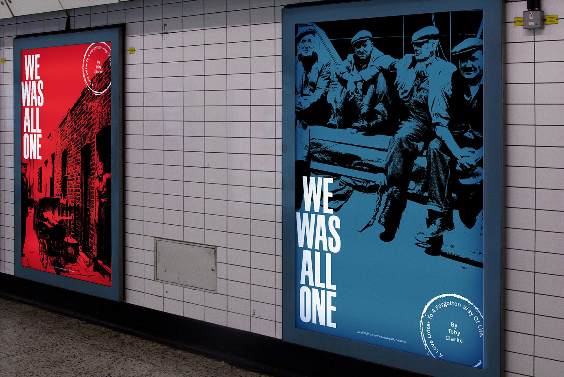
Final Major Project: We Was All One
Produce a visual piece of work that communicates an awareness and education for the preservation of a bygone era.
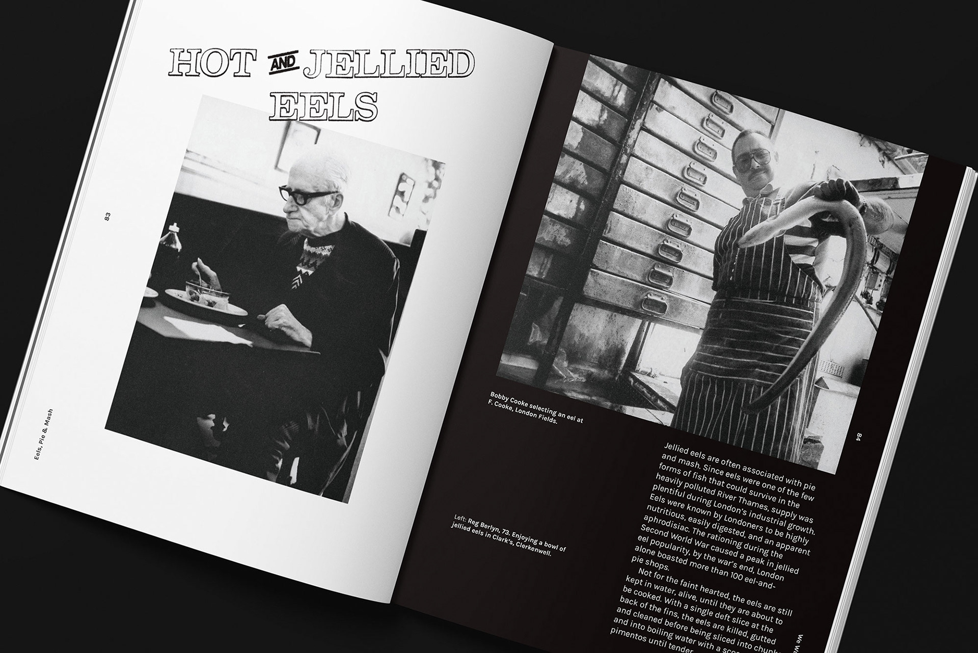
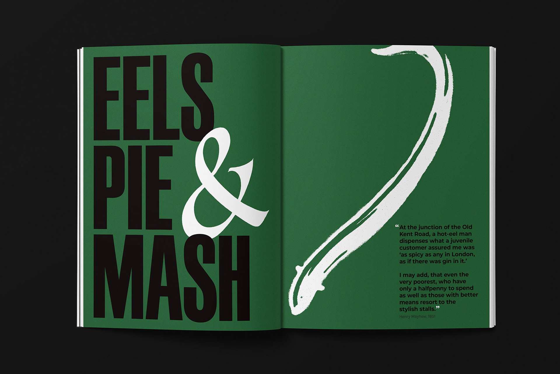
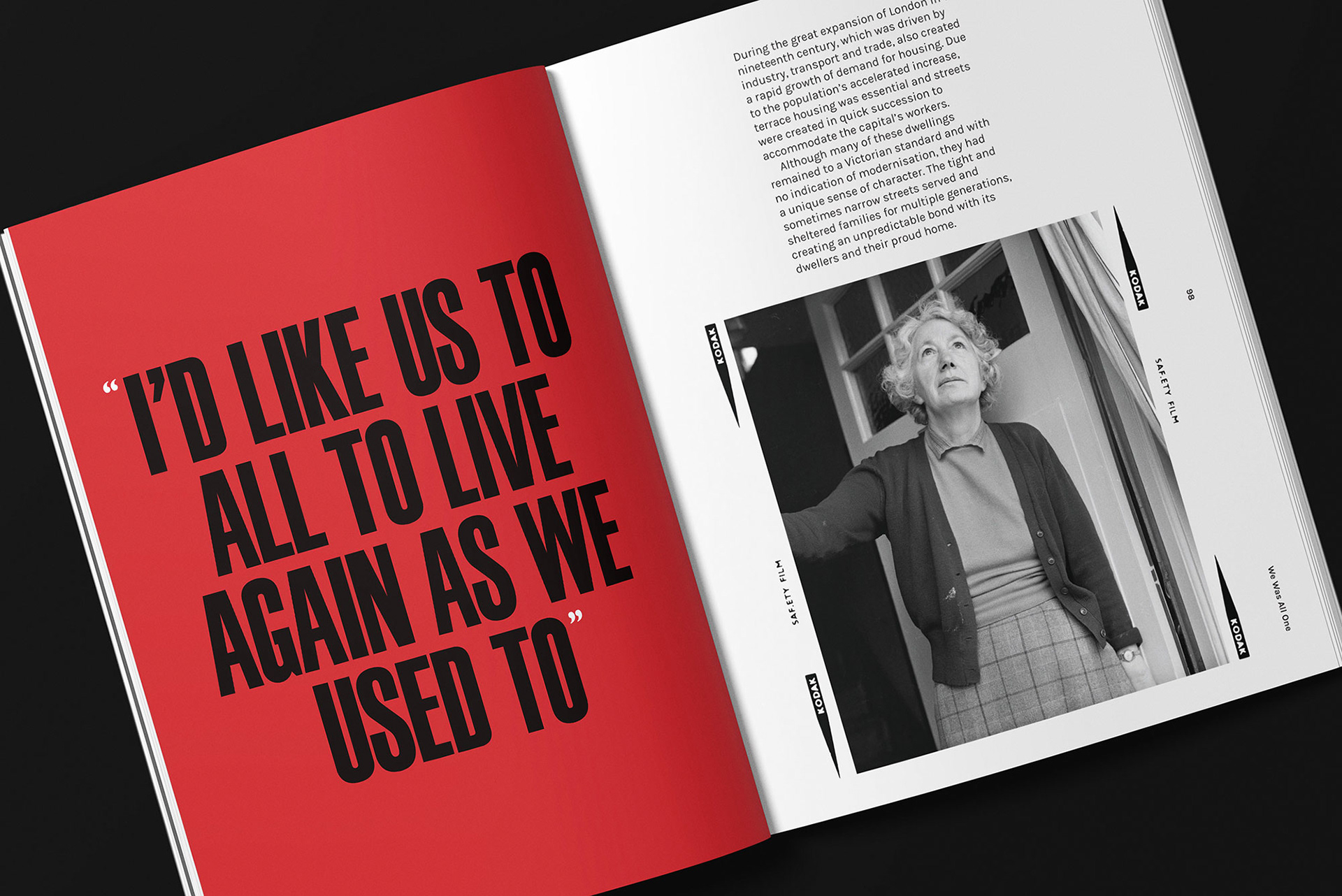
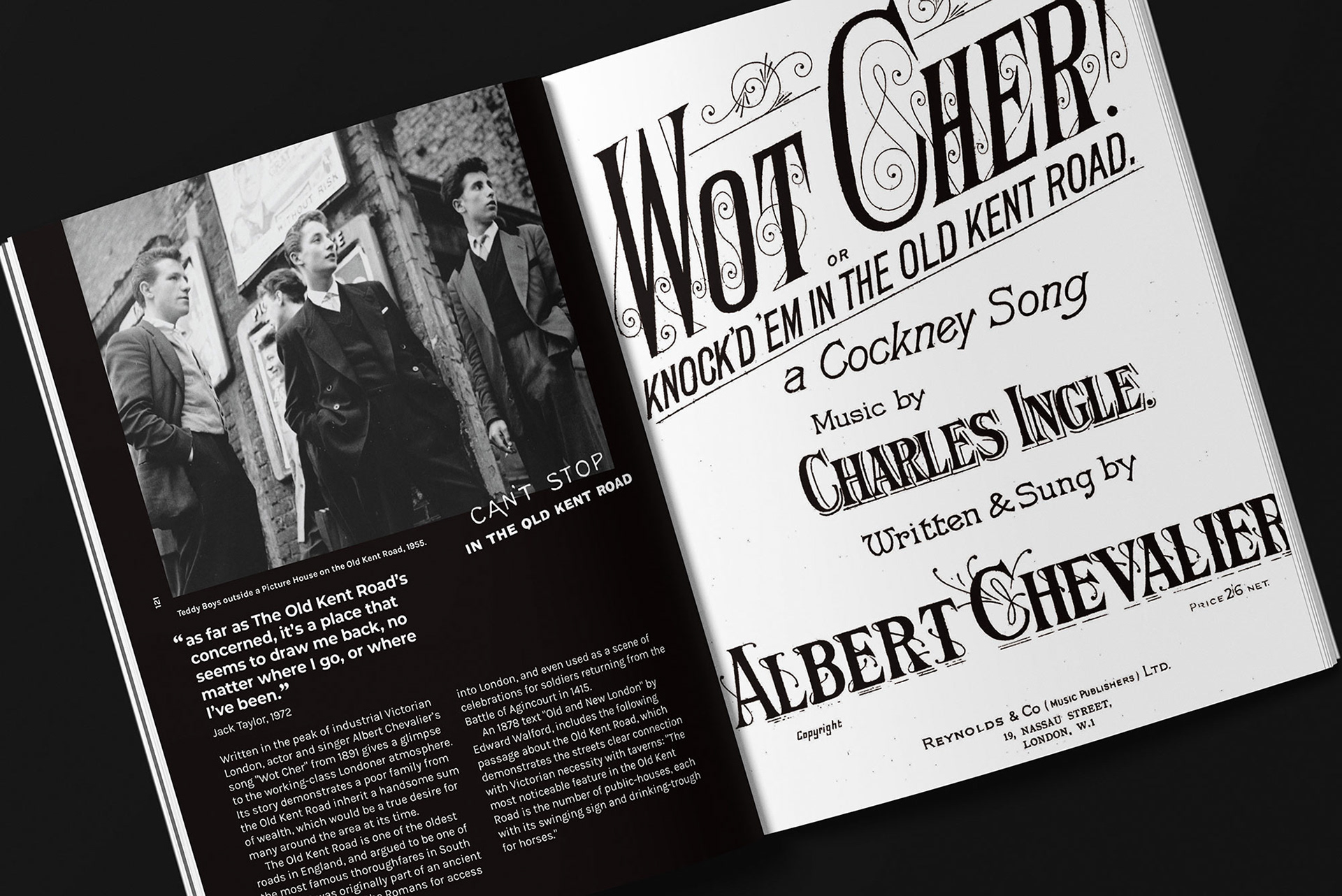
“We Was All One” is not a history lesson, but a love letter to a forgotten way of life. It explores and observes aspects of traditions and entertainment. From the heritage and importance of Pie’n’Mash shops, to working on the once bustling docklands.
The sense of pride has long since died out, and the generations of people who look back at the past with nostalgia are slowly fading. This book acts as a time capsule for the memories and stories by them, and for future generations to learn and be inspired by its rich history.

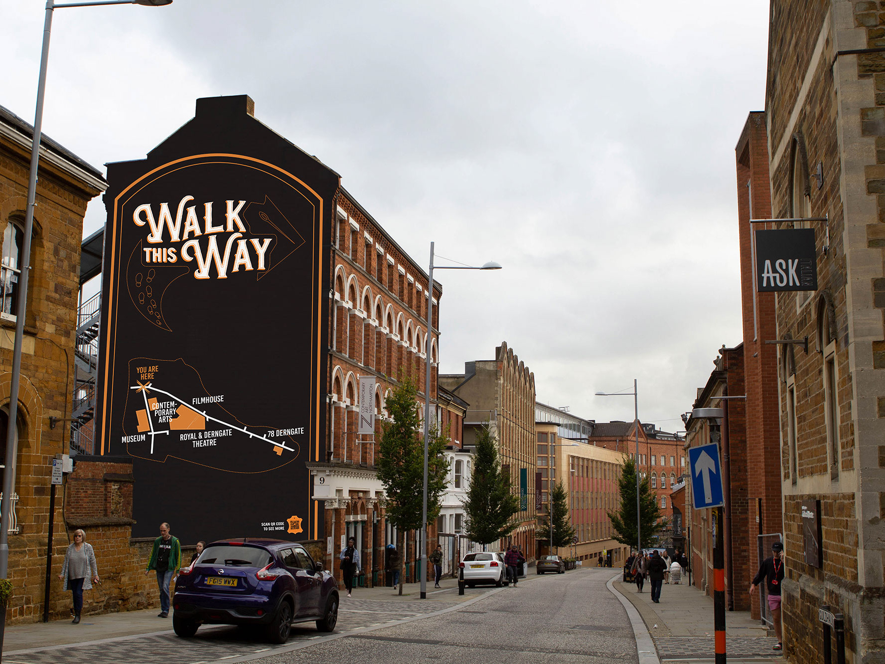
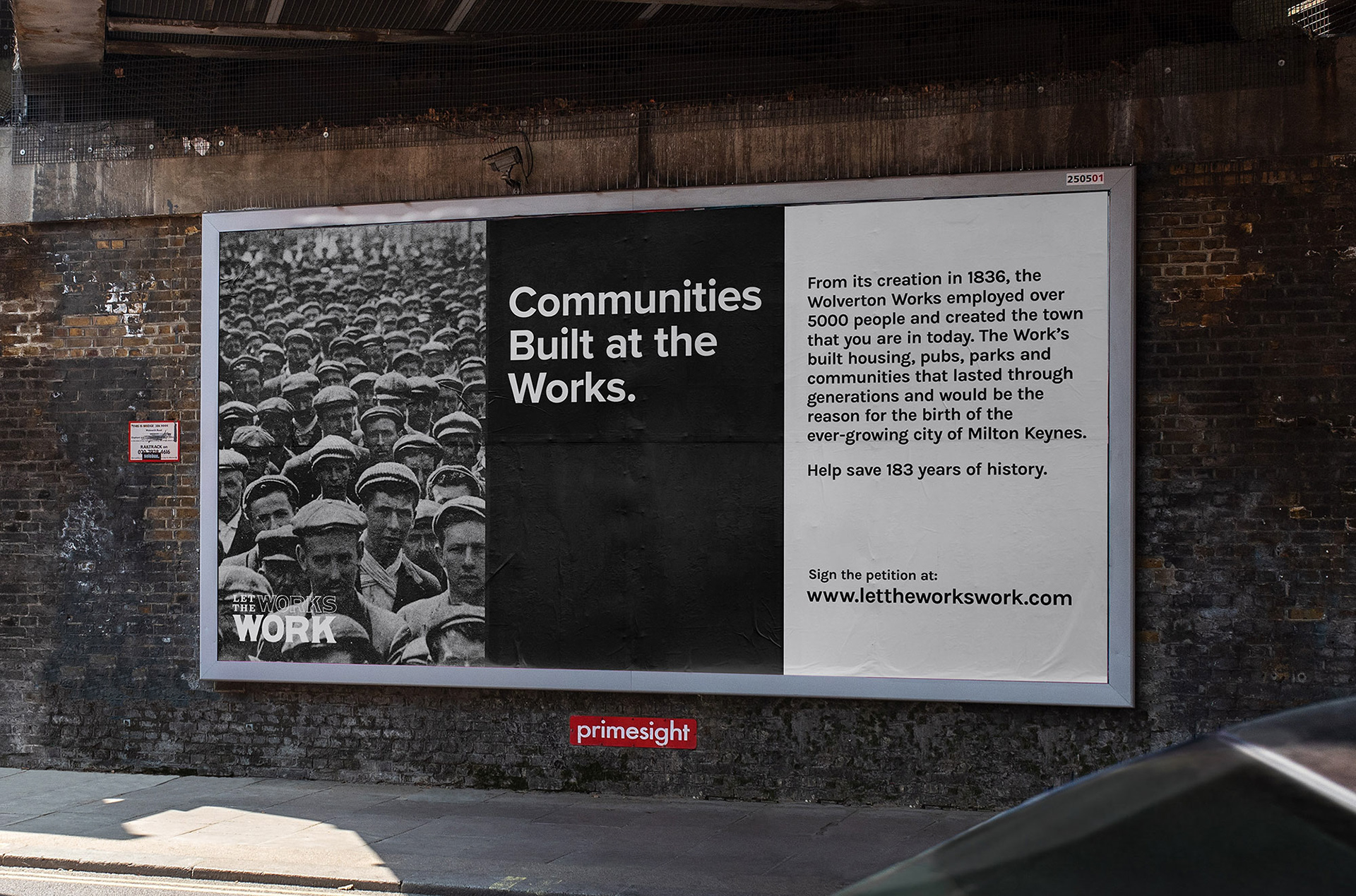
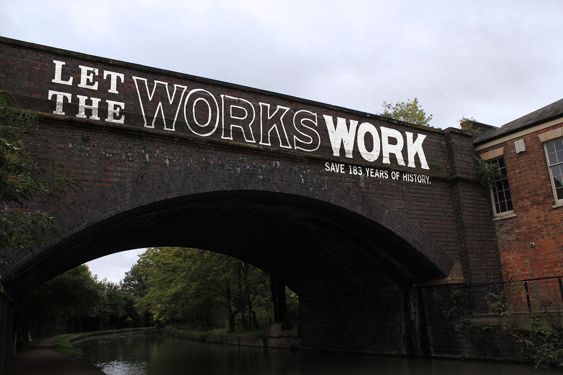
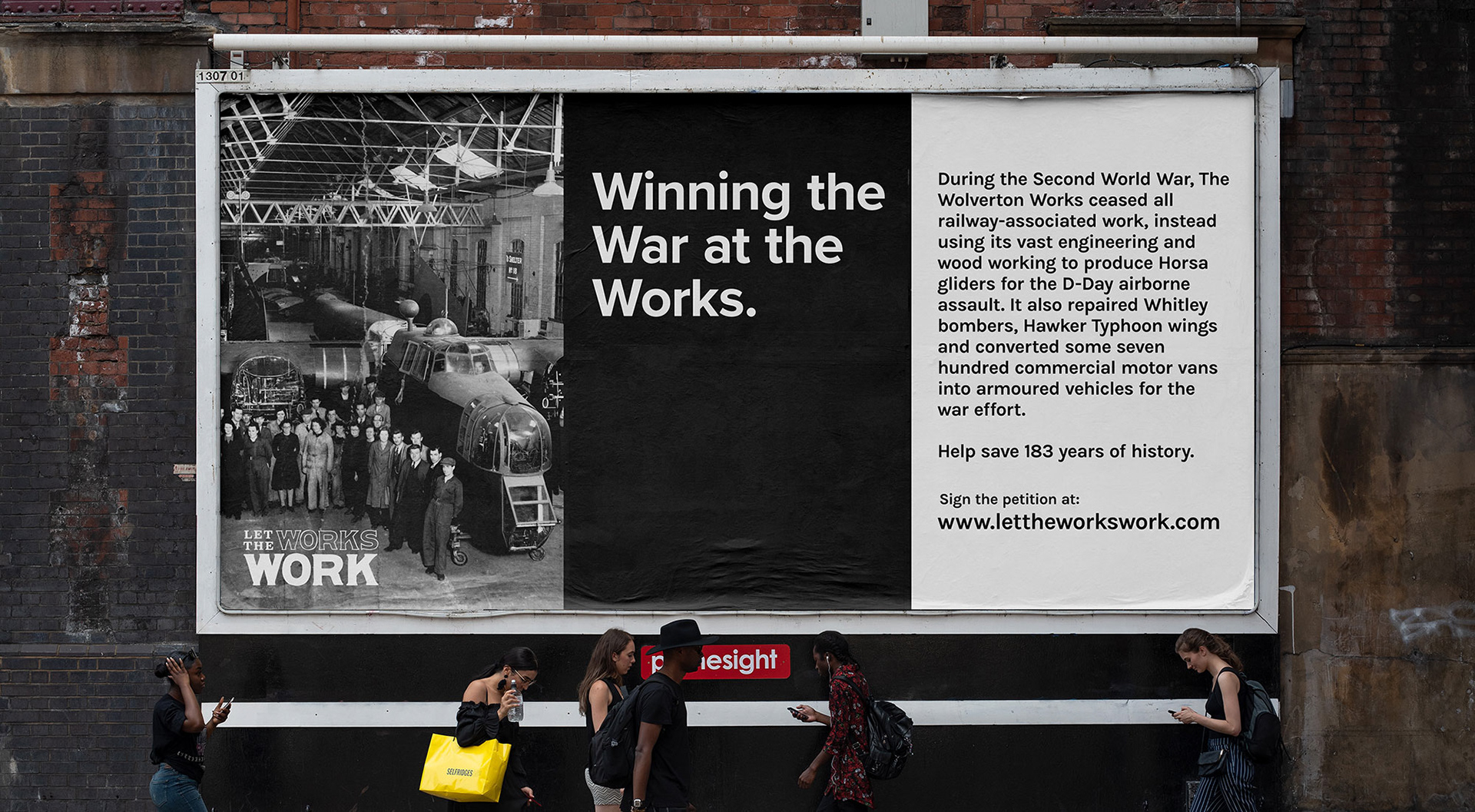
Project: My Type of Place
Identify a location and produce a site- specific typographic intervention that positively communicates the virtues of that place.
“Let the Works, Work” tackles the issue of the demolition of the historic Wolverton Railway Works. Established in 1836, the famous works which has maintained railway transport for 180 years is in imminent danger. This project is a campaign against the Milton Keynes Council for its involvement in approving the destruction of the works by 2020. Its purpose is designed to allow the public to take action by signing its petition for demolition to be stopped.
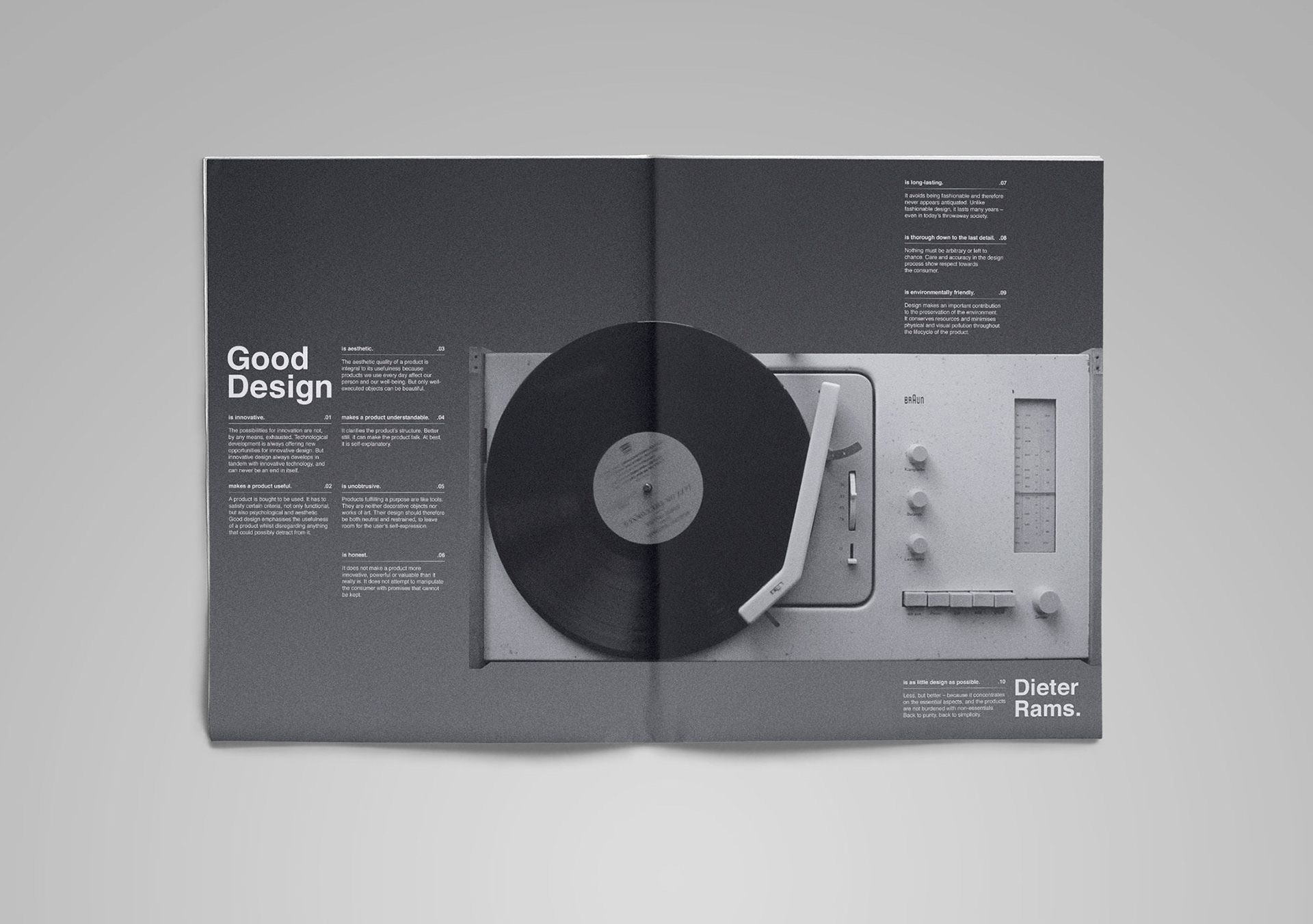
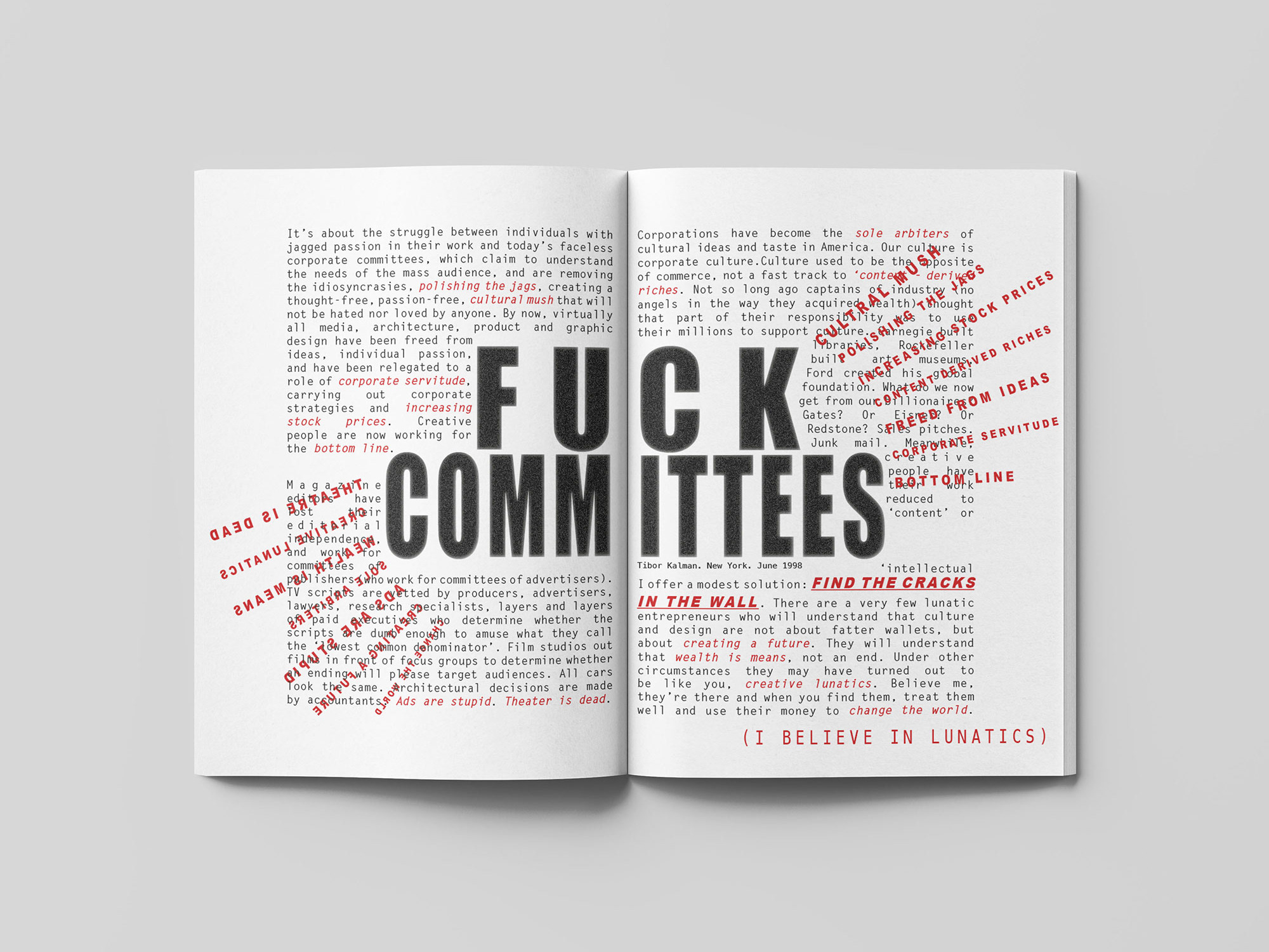
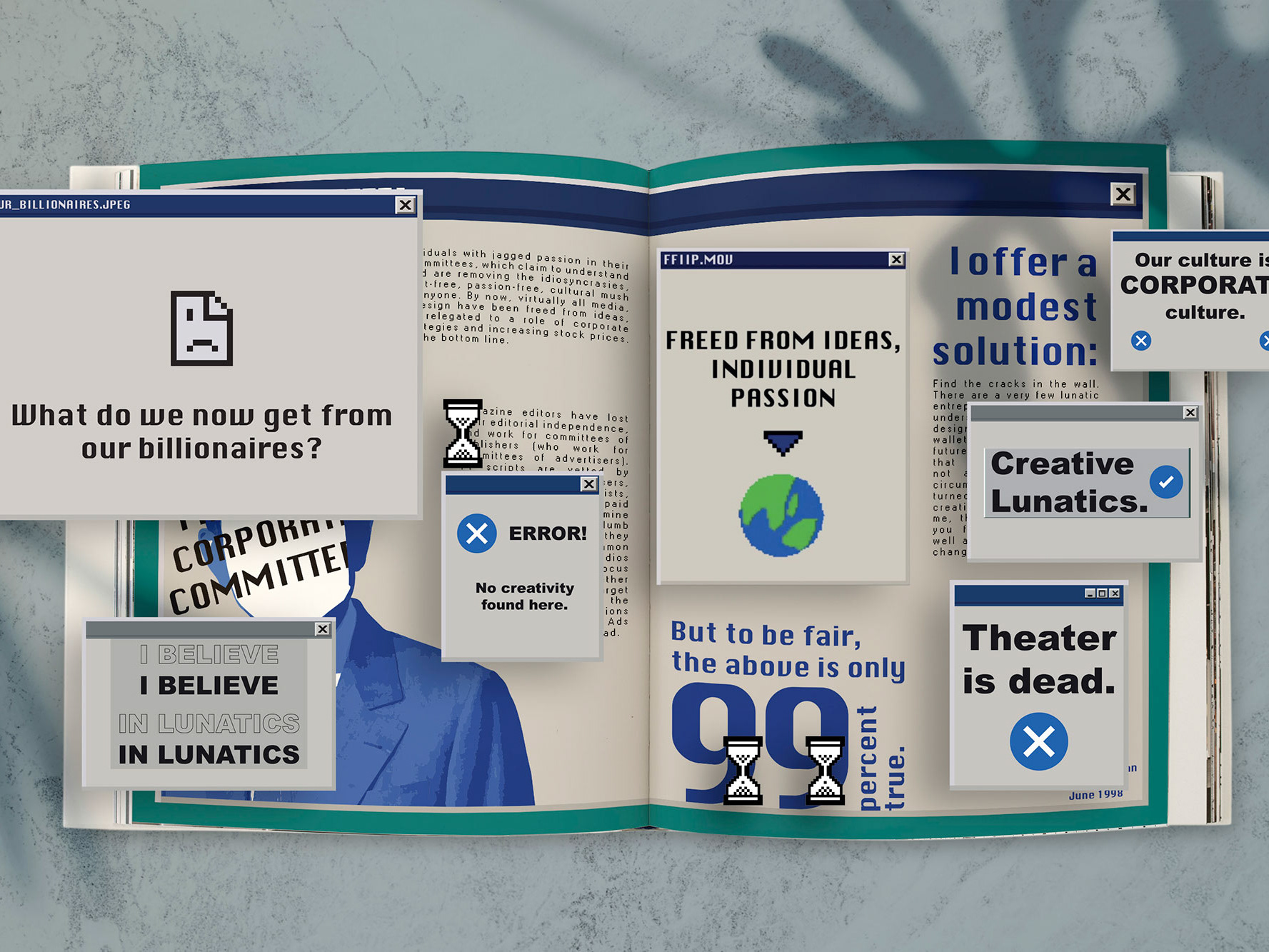
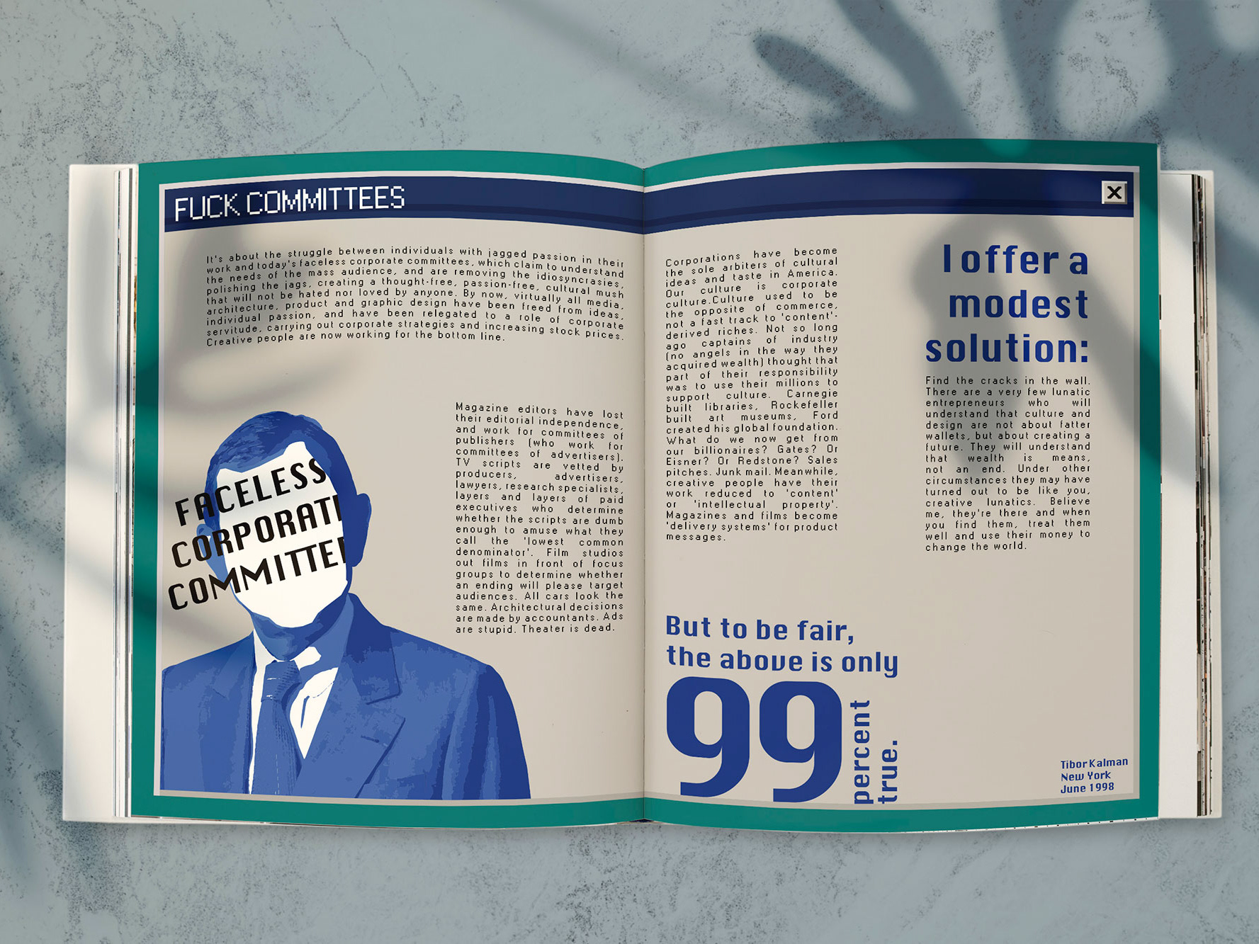
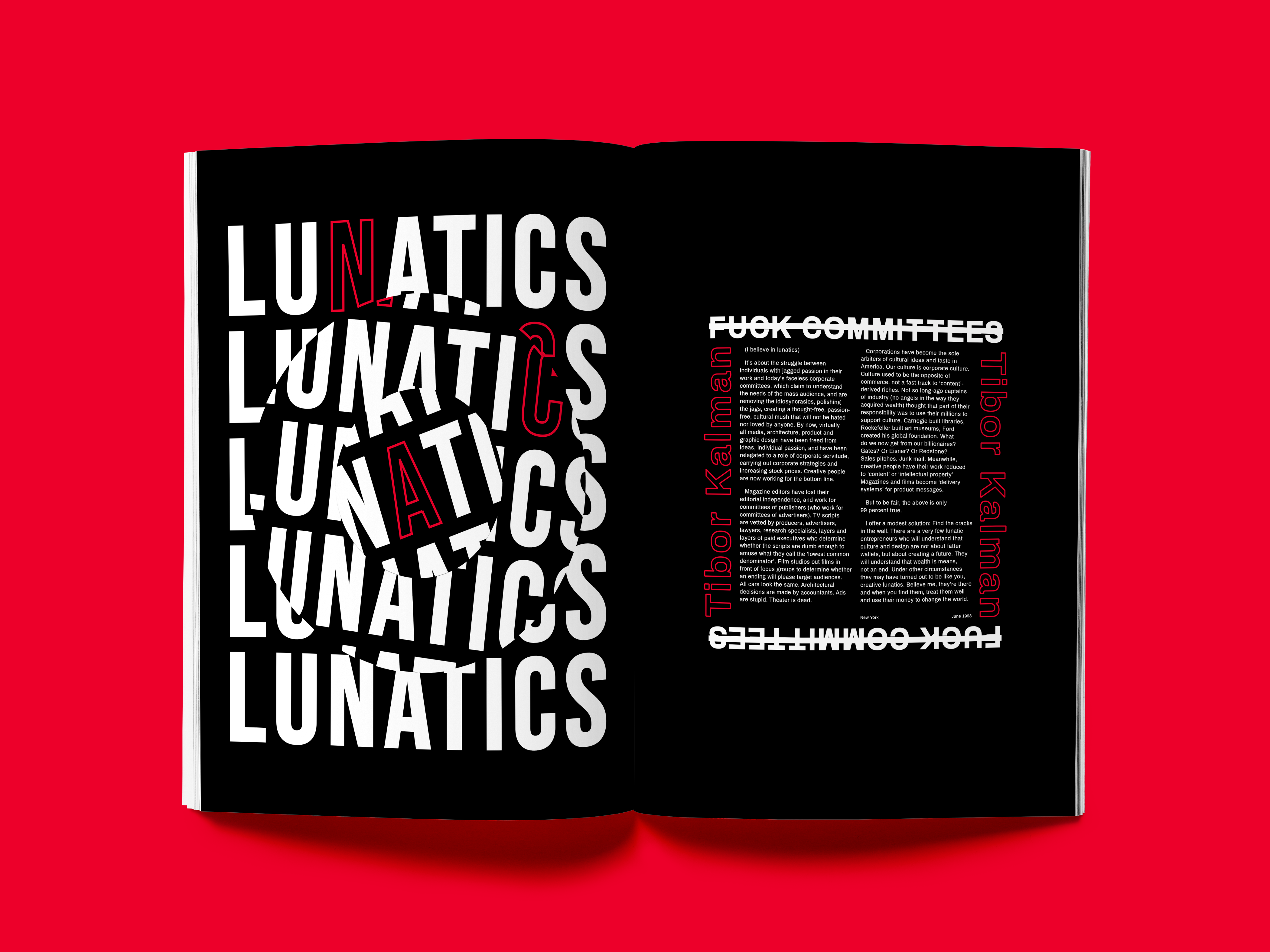
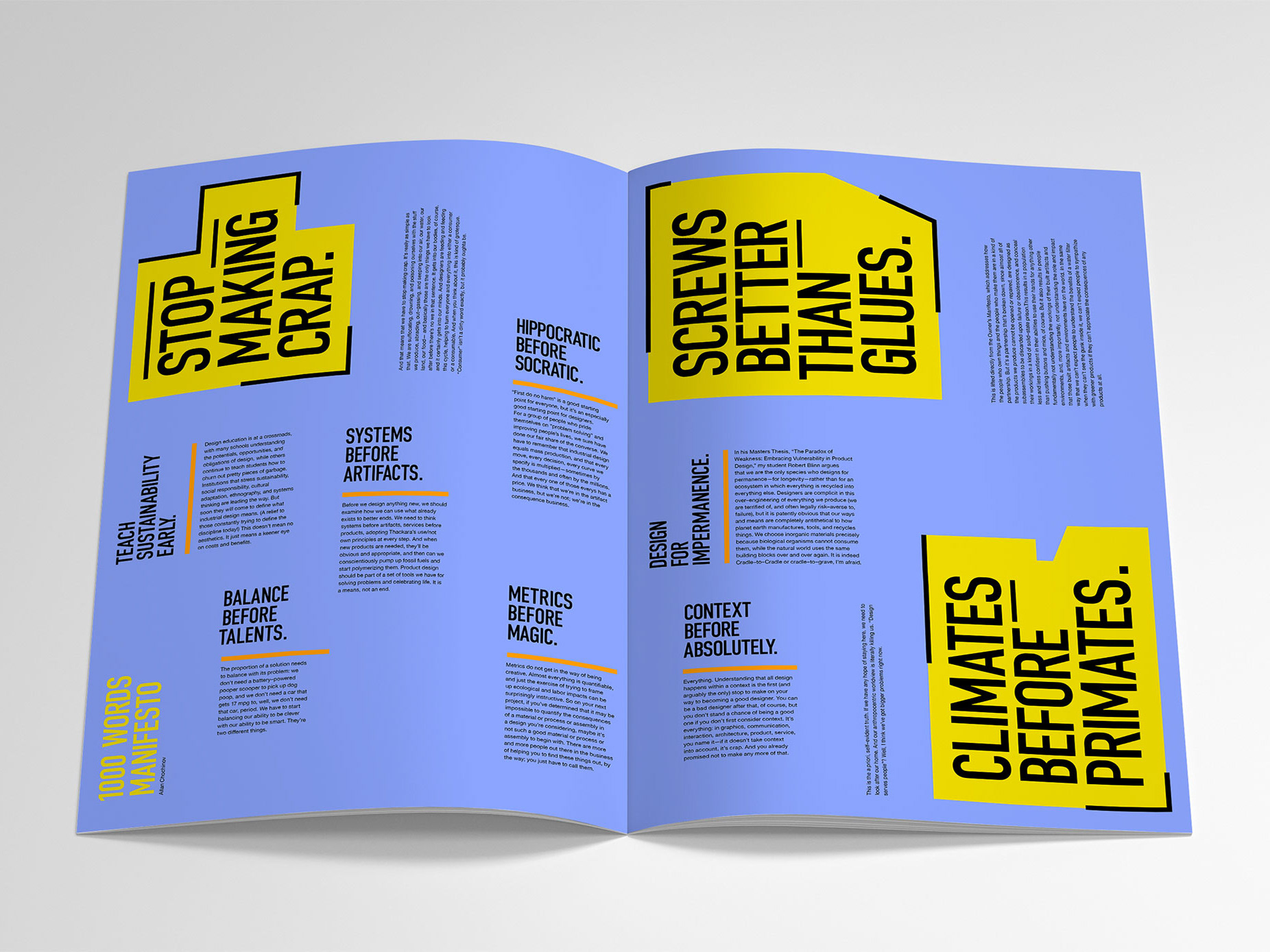
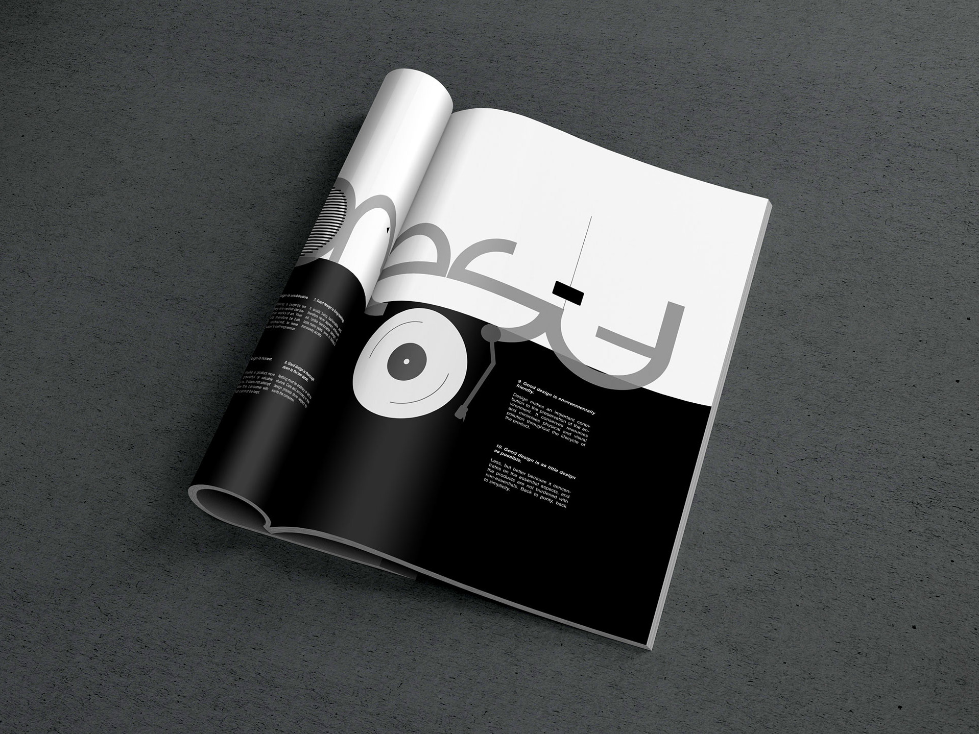
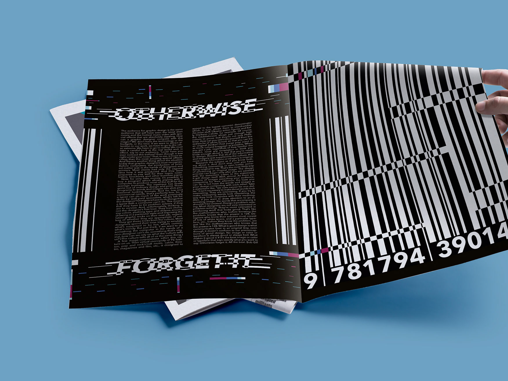
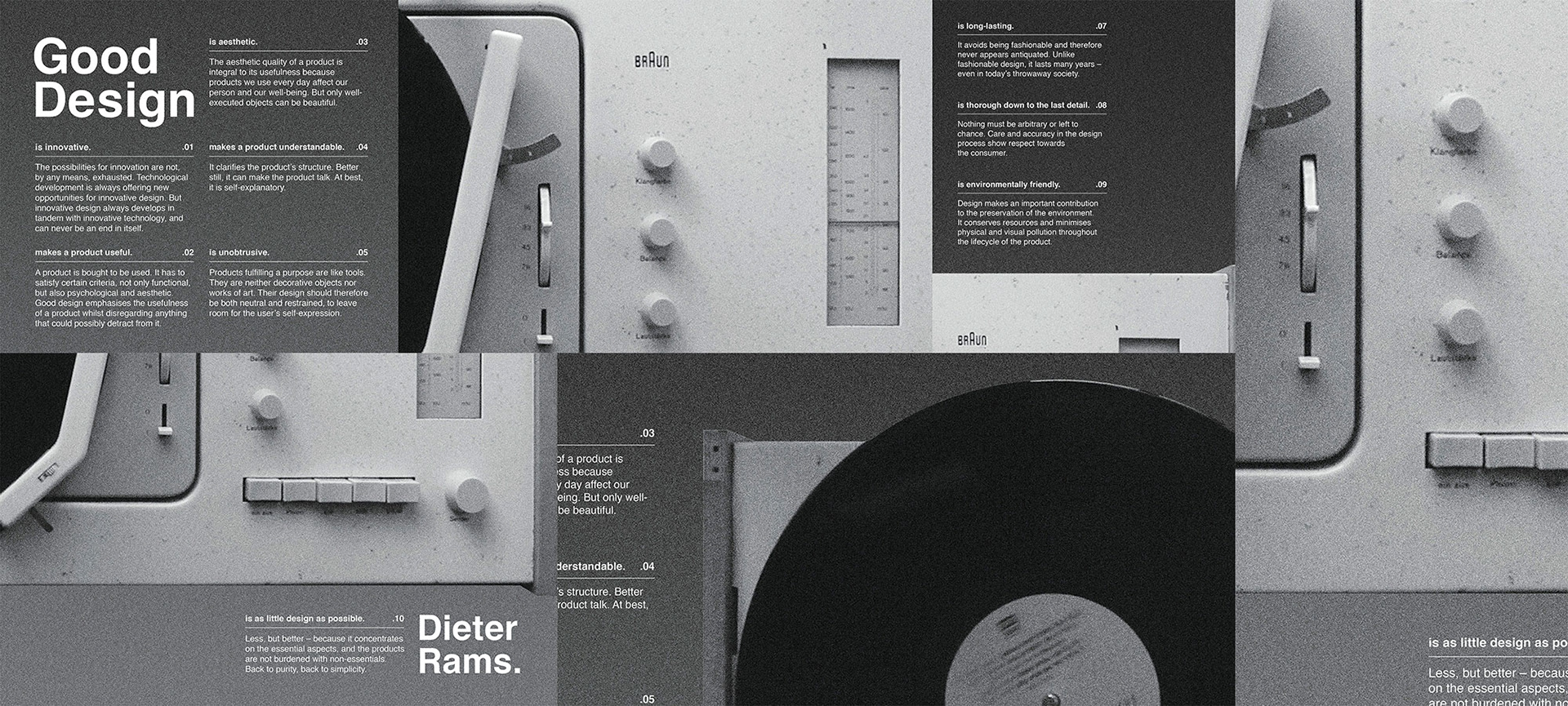
Project: Editorial Beyond the Page
Use Augmented Reality to bring a design manifesto to life
The final spread design responds to the well-known ‘Ten Principles for Good Design’ by renowned modernist designer Dieter Rams. The engineered spread encapsulates Ram’s ‘Less, but better’ theory, which favours minimal design over complexity. Featuring the Braun SK61 turntable that is argued to be the first piece of innovative product design by Dieter. A strict grid spread transforms by using the Artivive app, which demonstrates Rams’ design come to life with his own interview extracts.
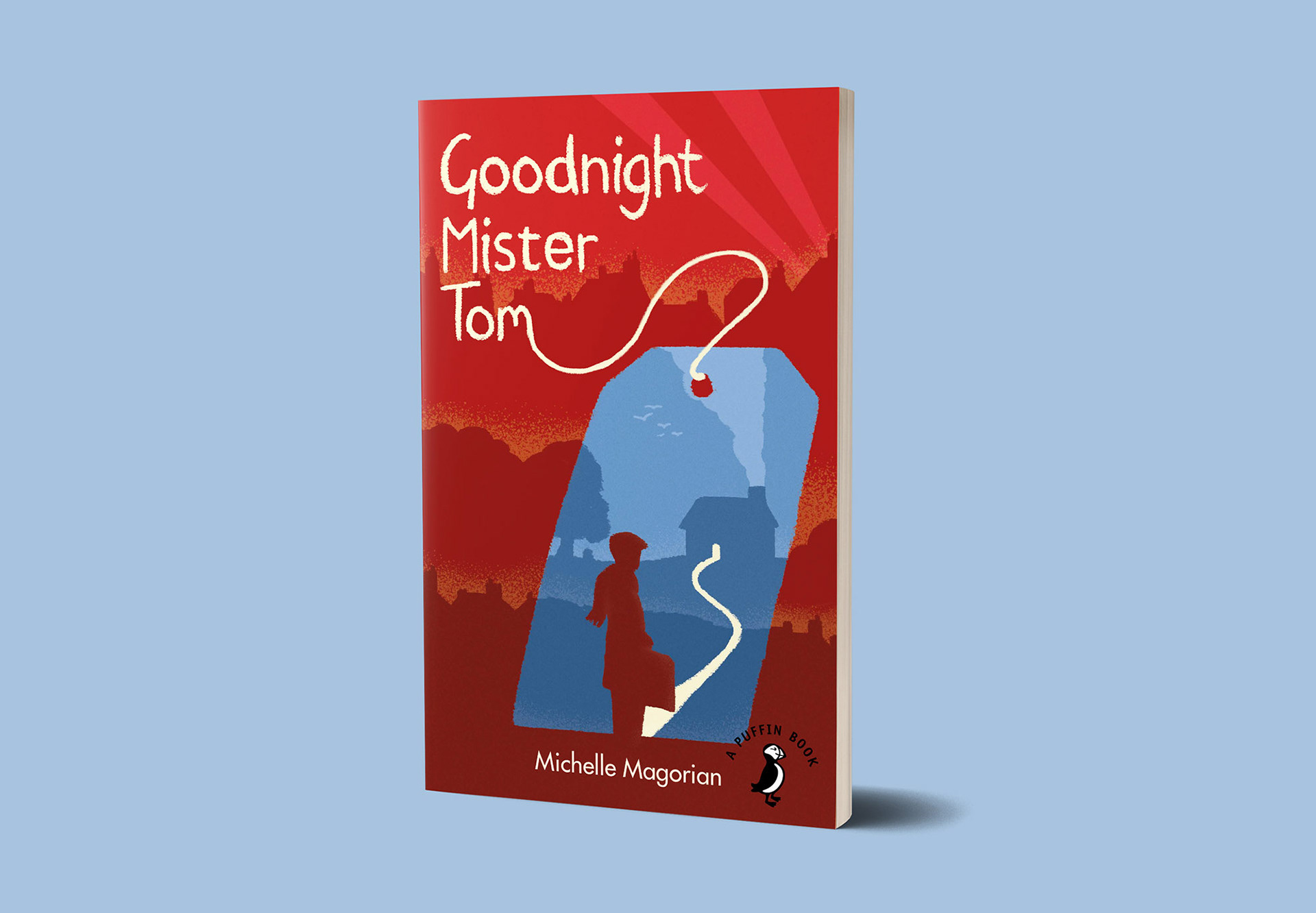
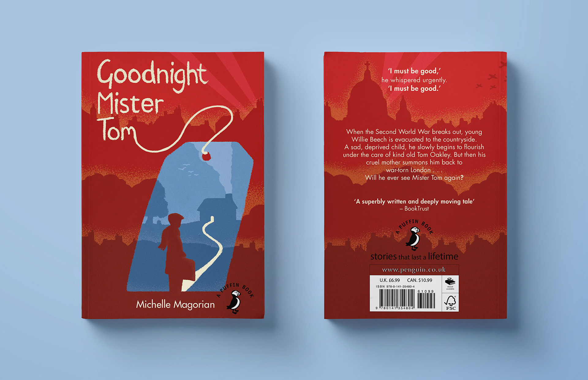
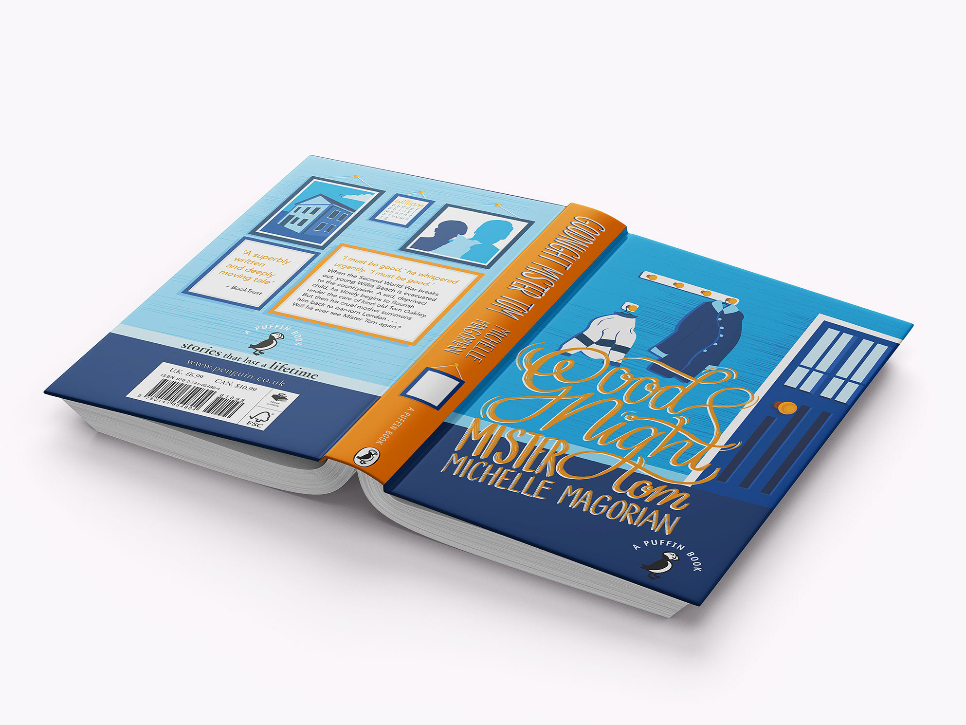
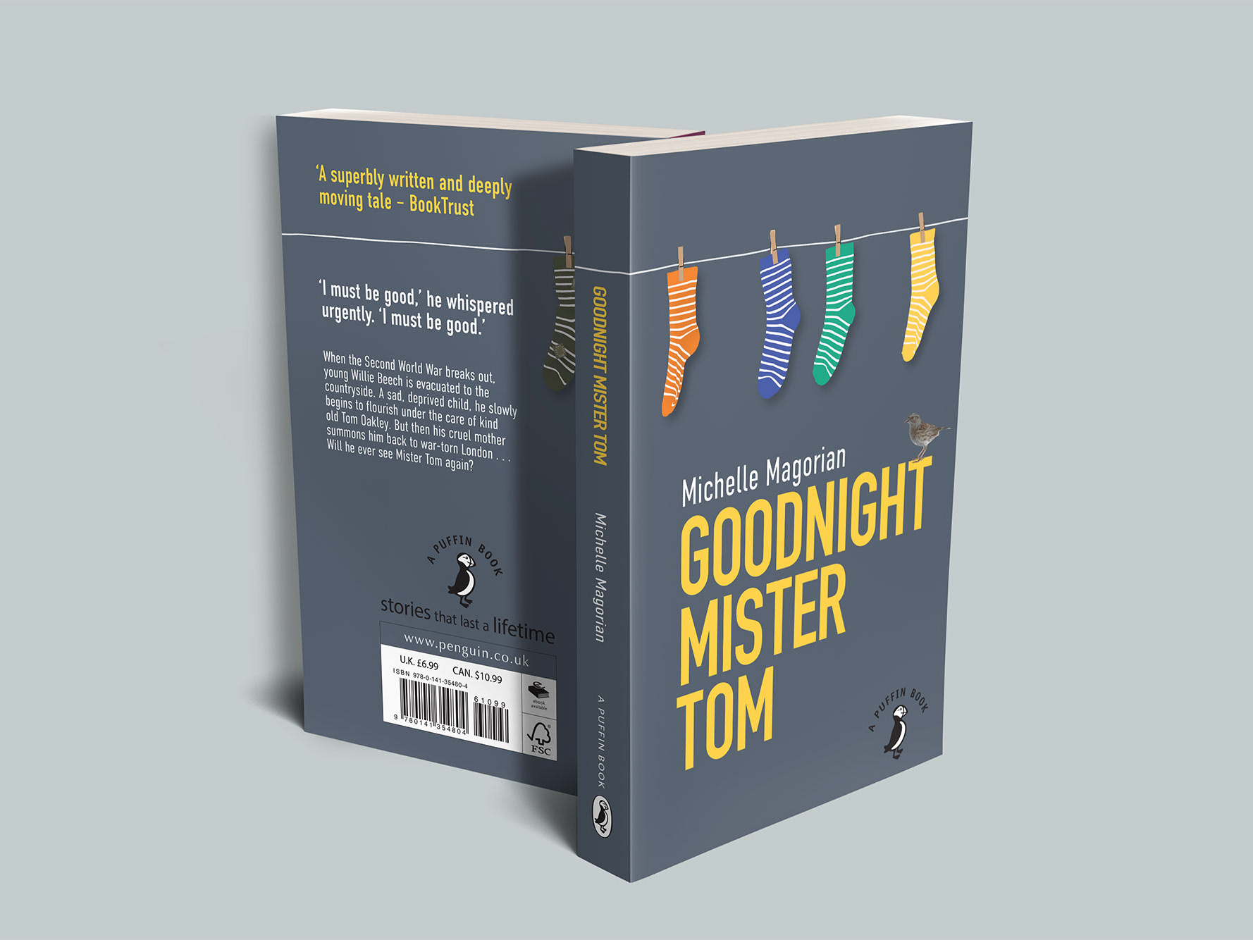
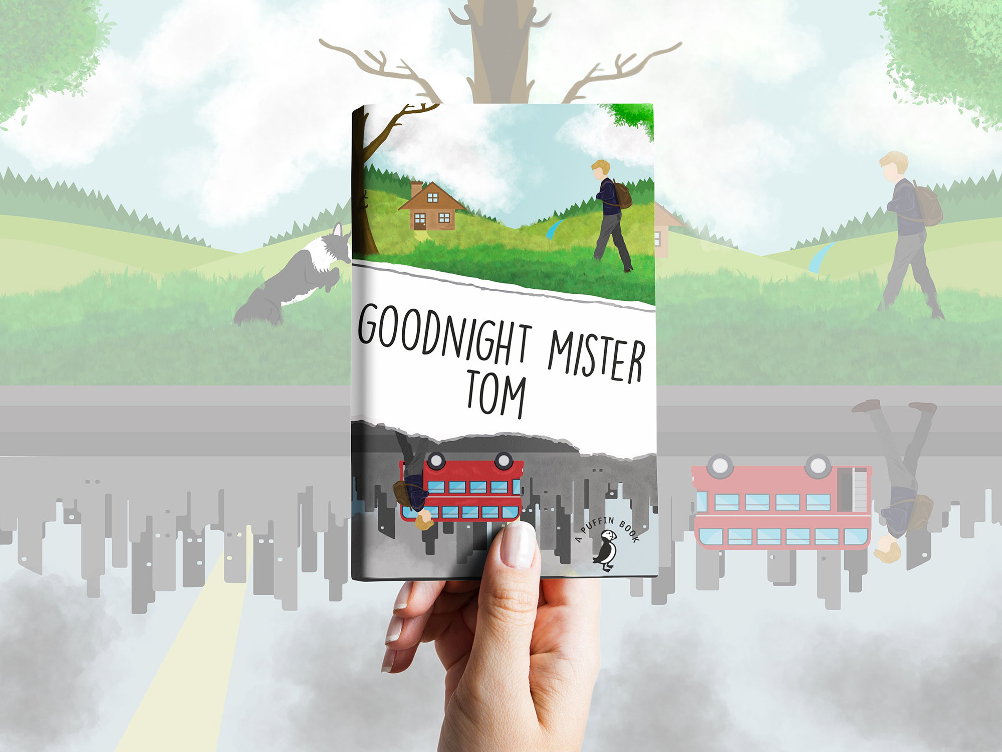
Project: Goodnight Mr Tom Book Cover
Client: Penguin Student Design Award
The cover design for this book effectively contrasts the protagonist’s poor and destructive life from London during World War Two. With the peaceful and colourful countryside, which evokes an impression of escape for a hopeful future. The representation of a typical Evacuee tag acts as a gateway to a new life to the book’s protagonist. Which combines itself with a characterful 1940s illustrated aesthetic, to make for an effective and fitting final concept.