Sam De Mello
My work isn’t beautiful, but it is different and raw. I am the person who researches things and comes up with starting points, finding new ways to present things is something I enjoy and can become quite fixed on finding a solution to a problem. Finding concepts that fit the brief can be challenging but equally rewarding when you come up with a good idea.
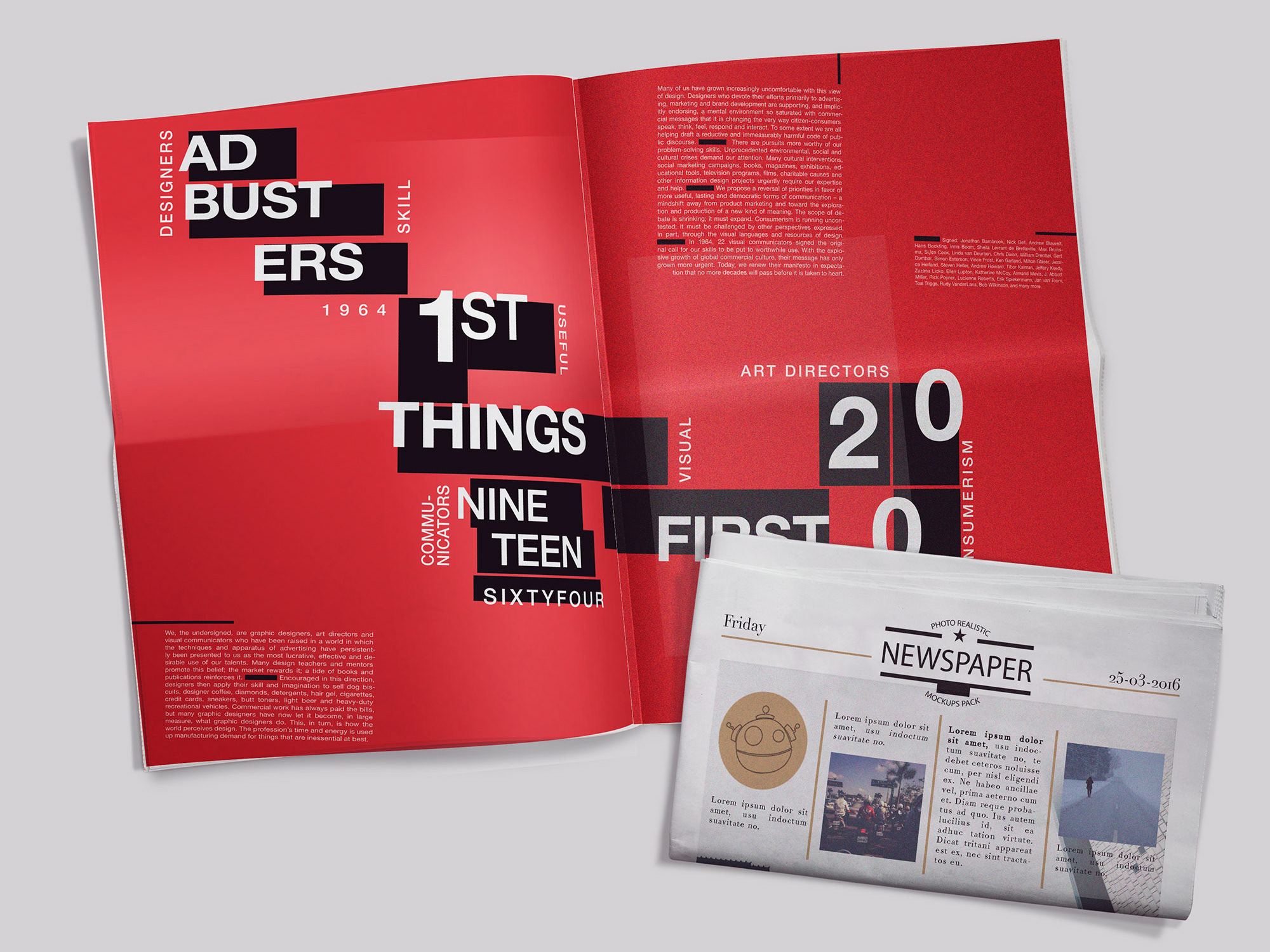
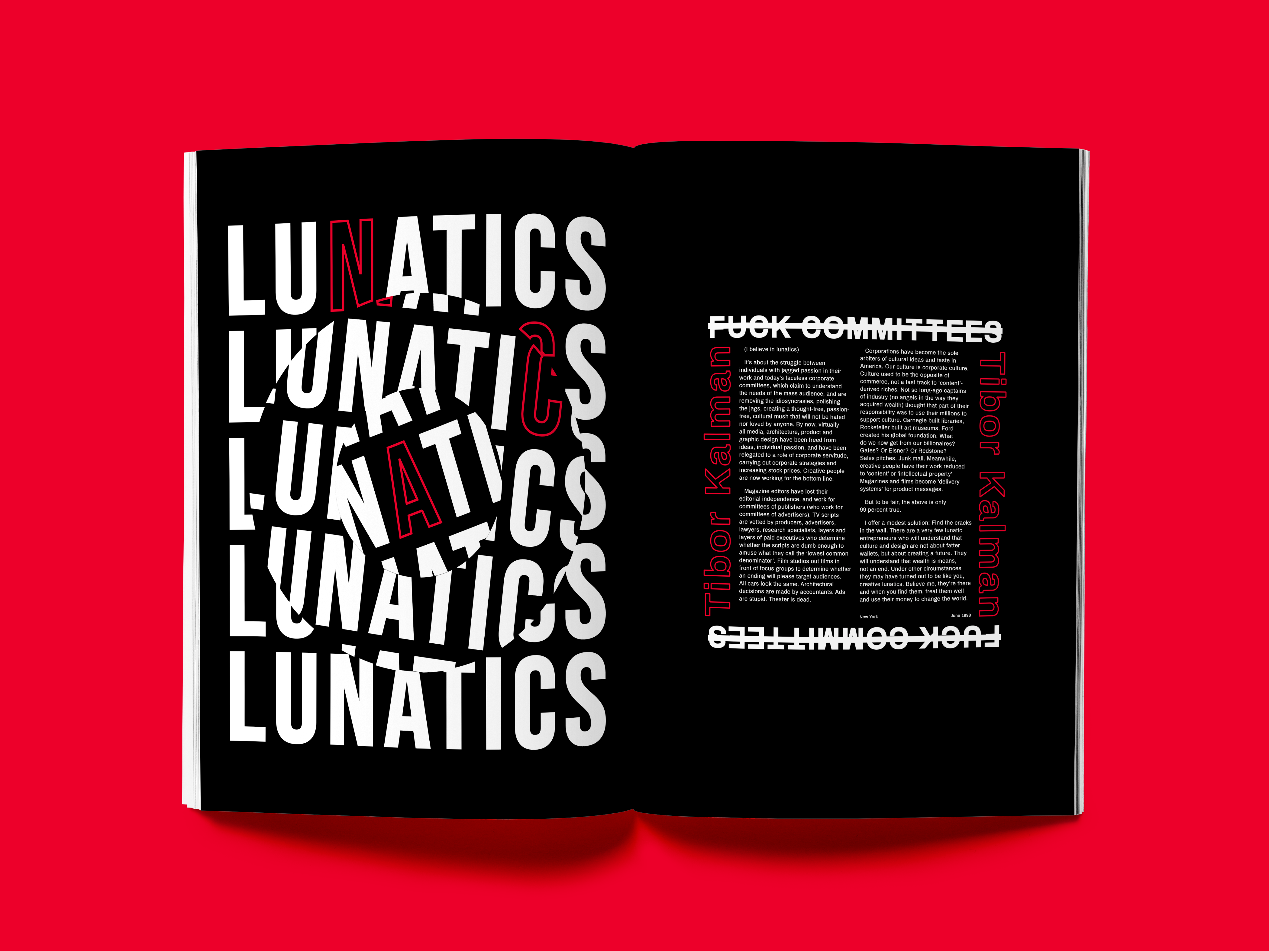
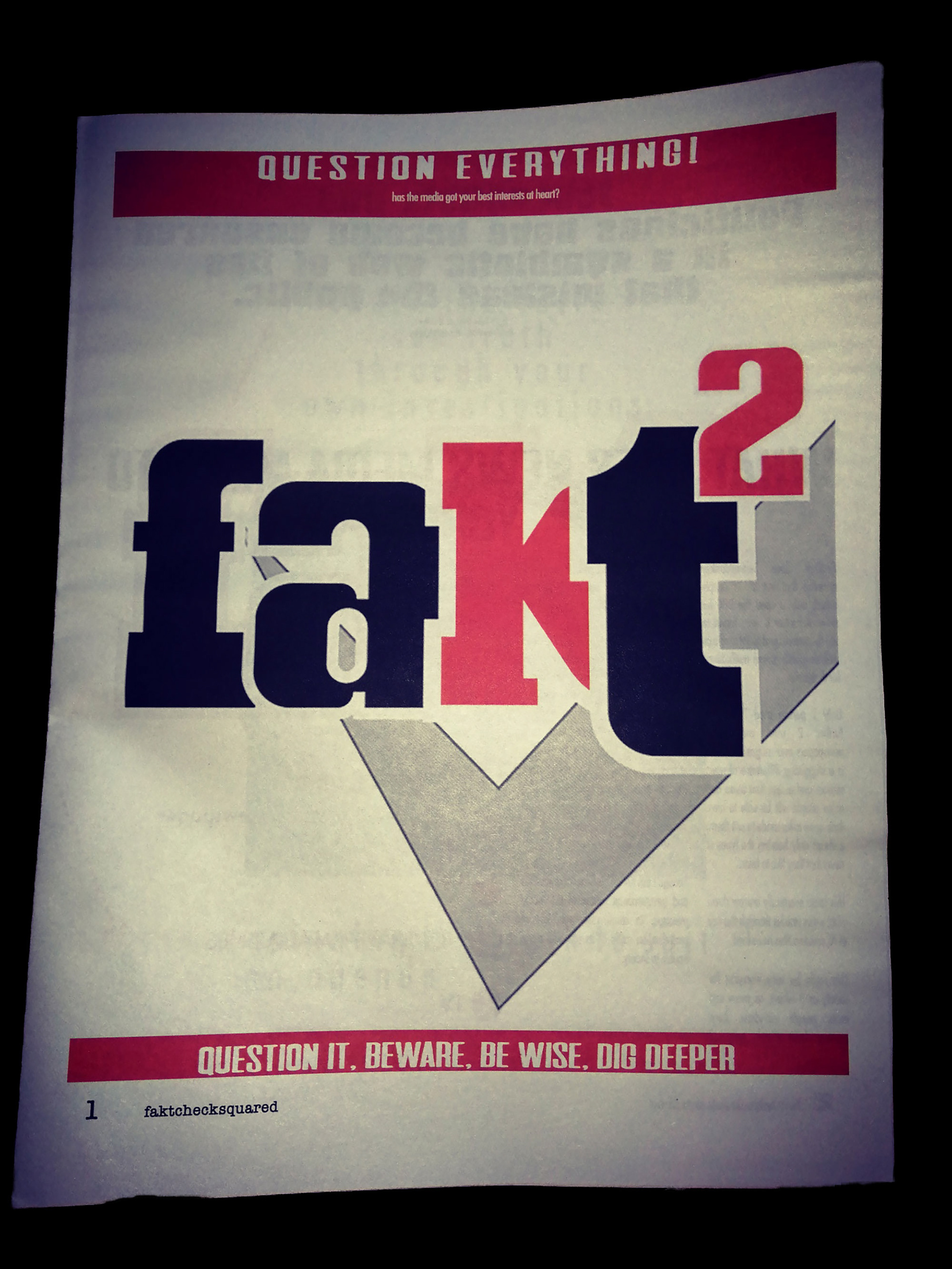
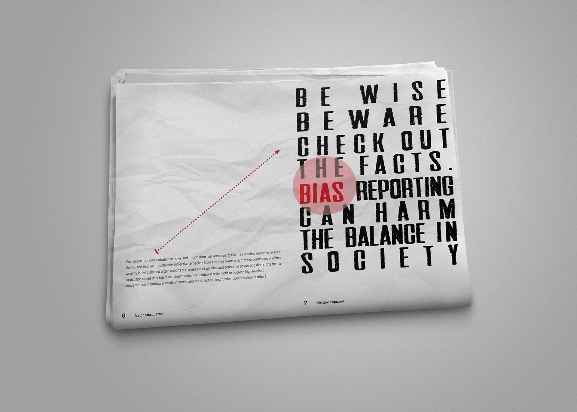
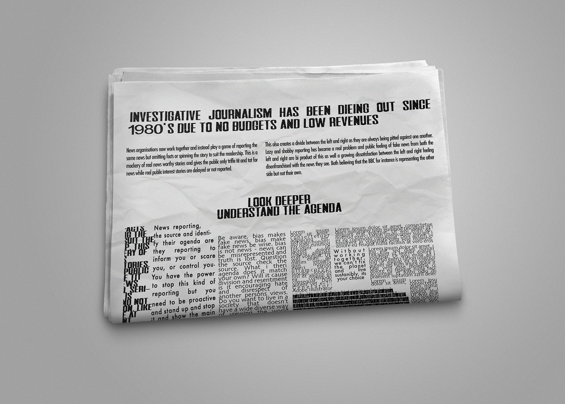
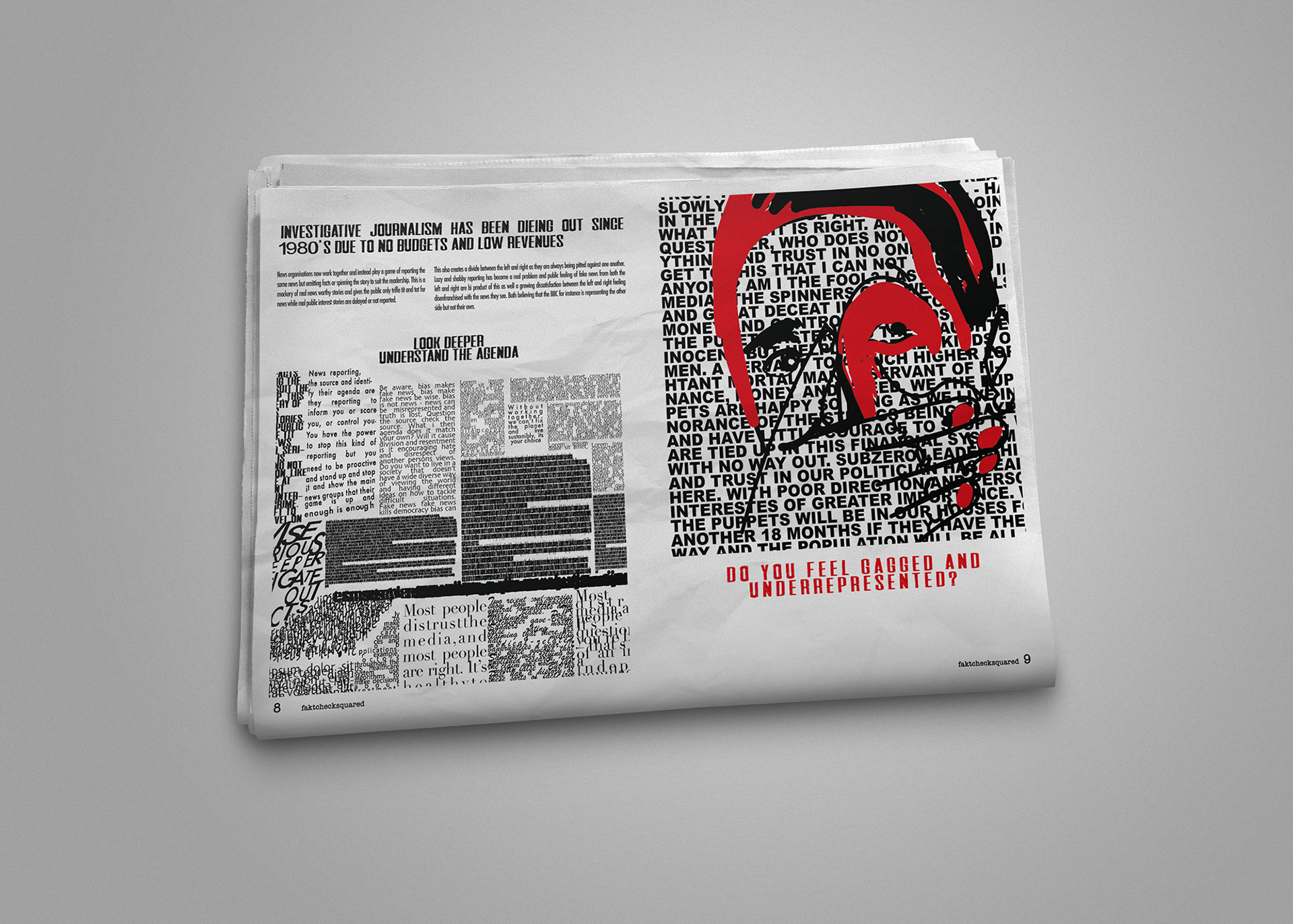
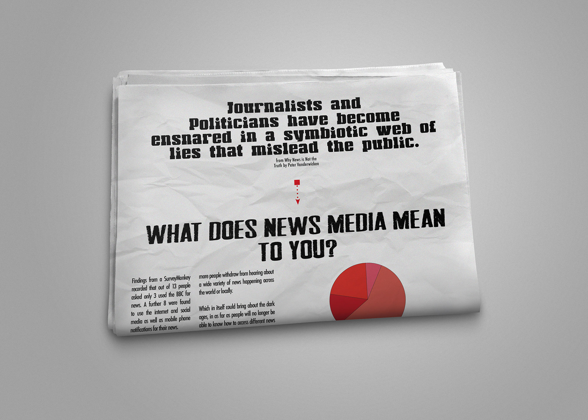
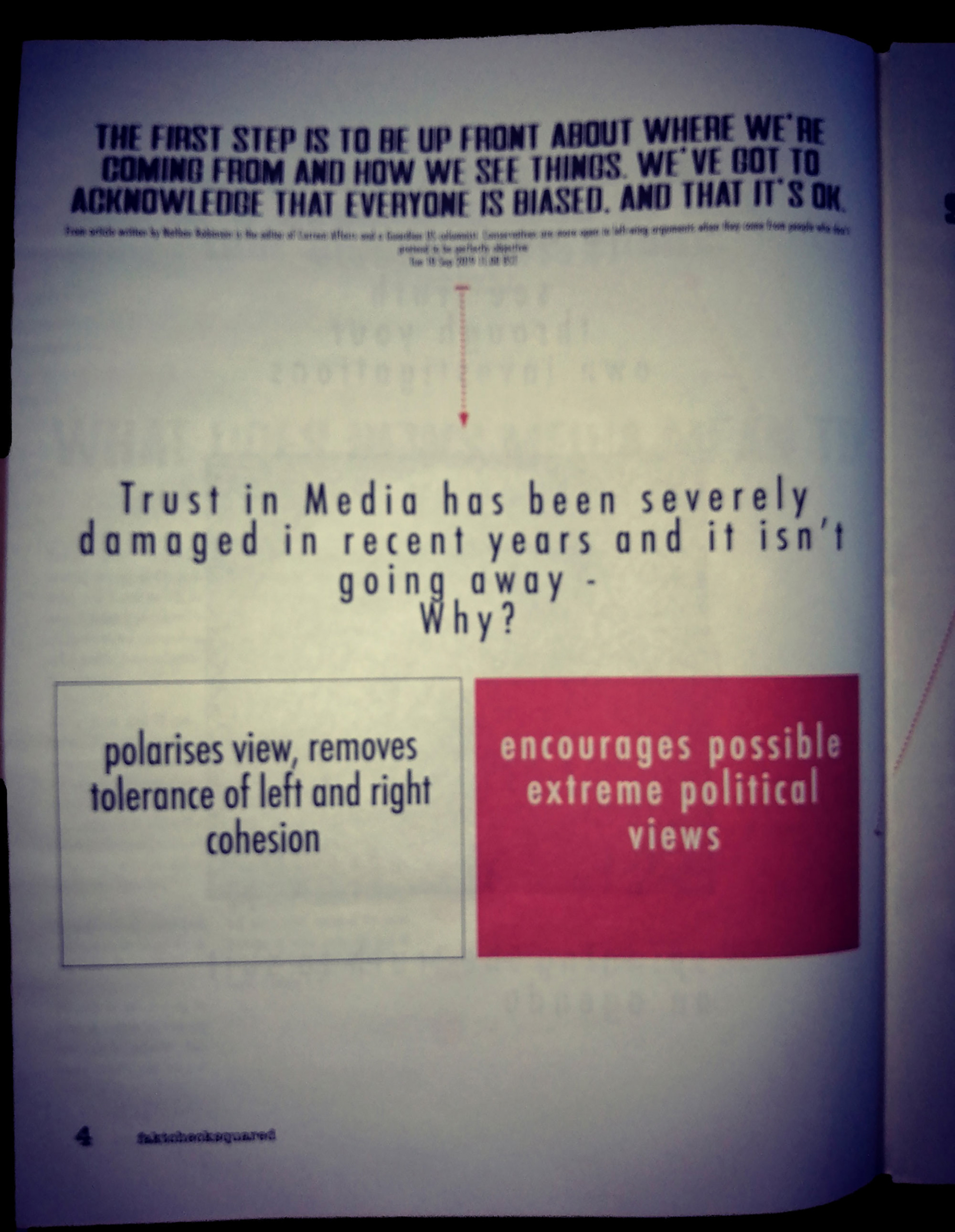
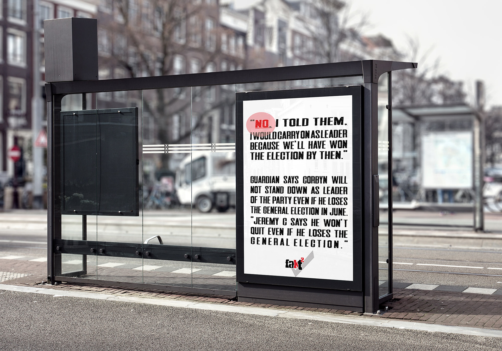
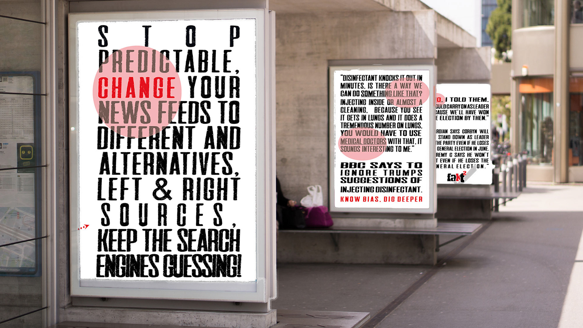
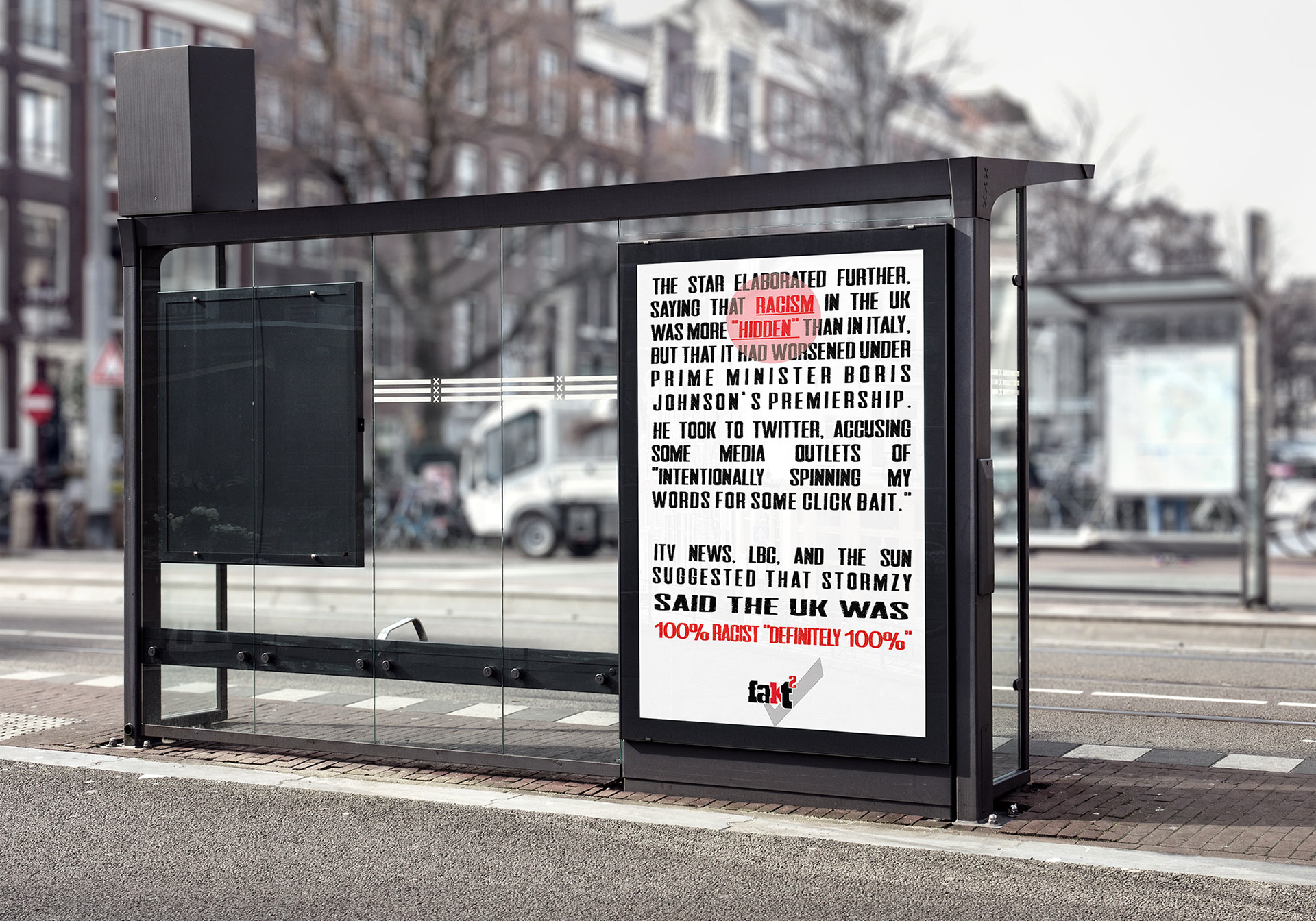
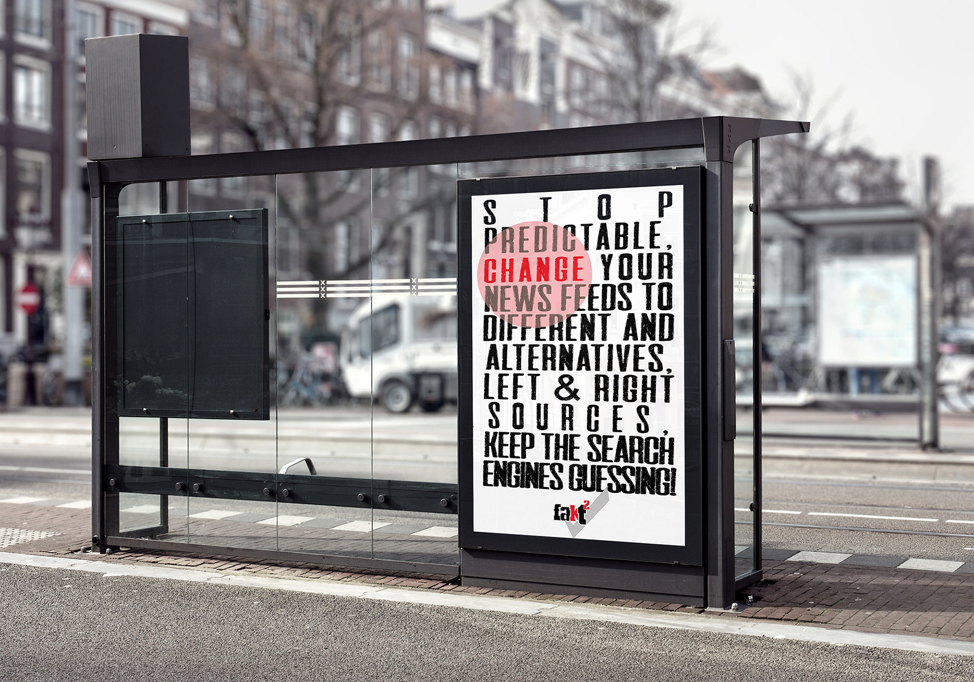
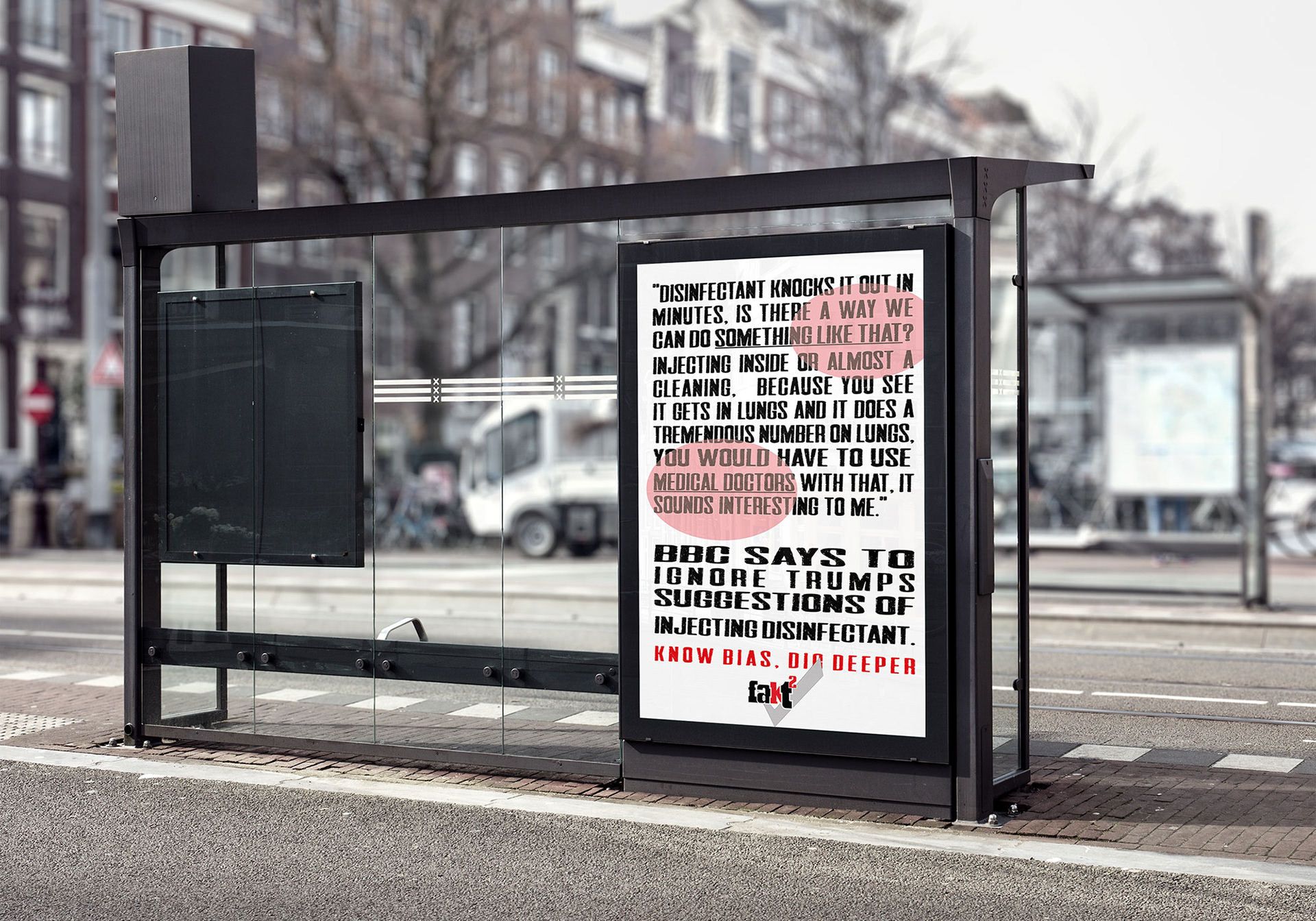
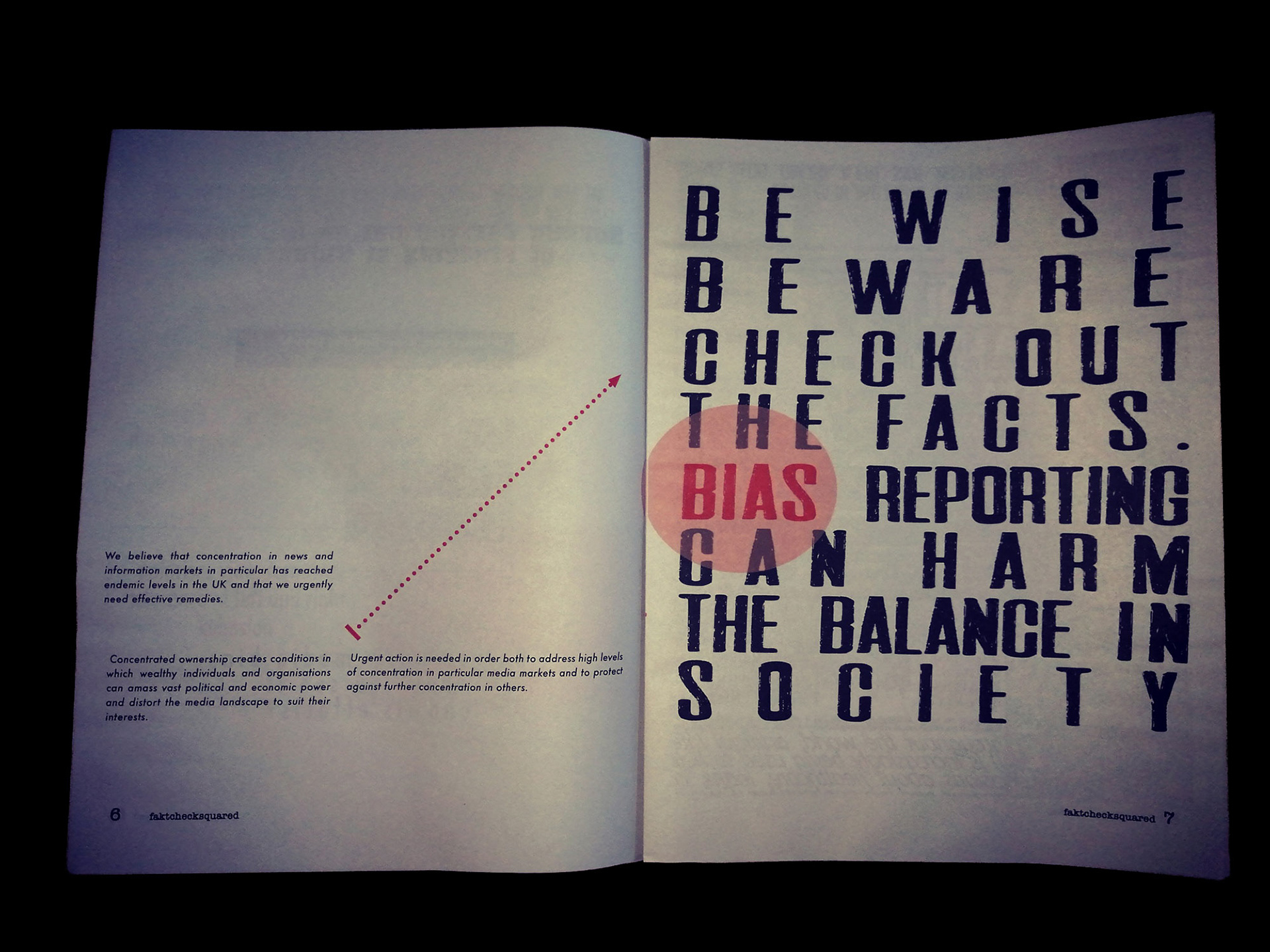
Final Major Project: Guerrilla Newspaper
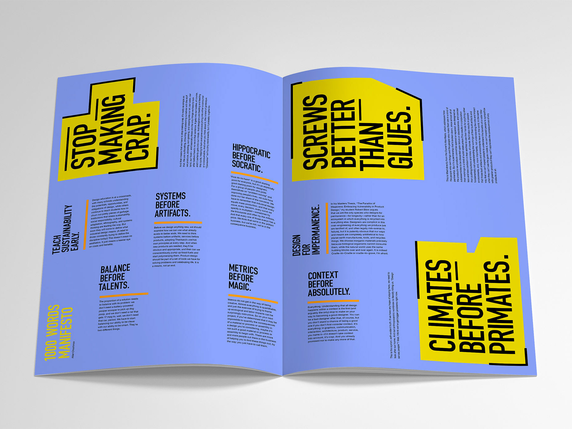
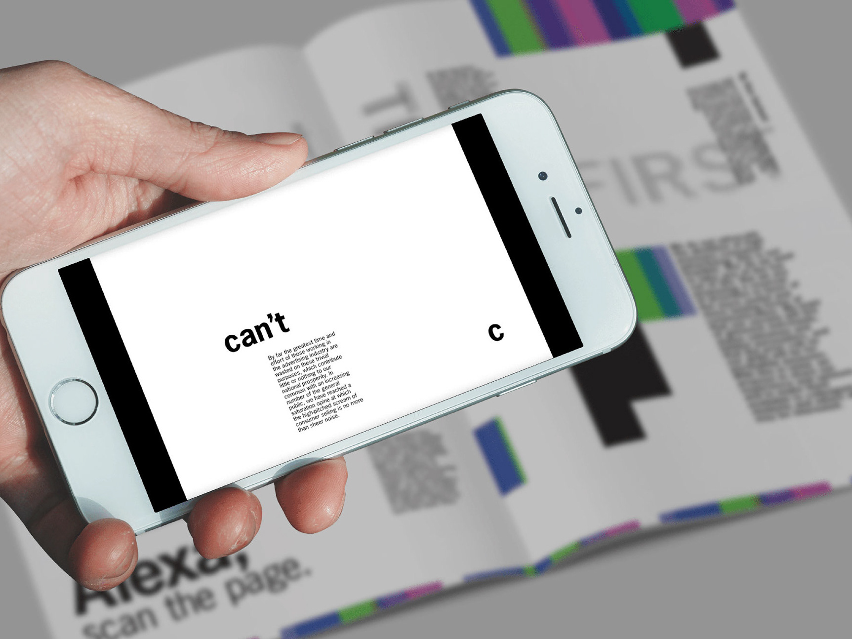
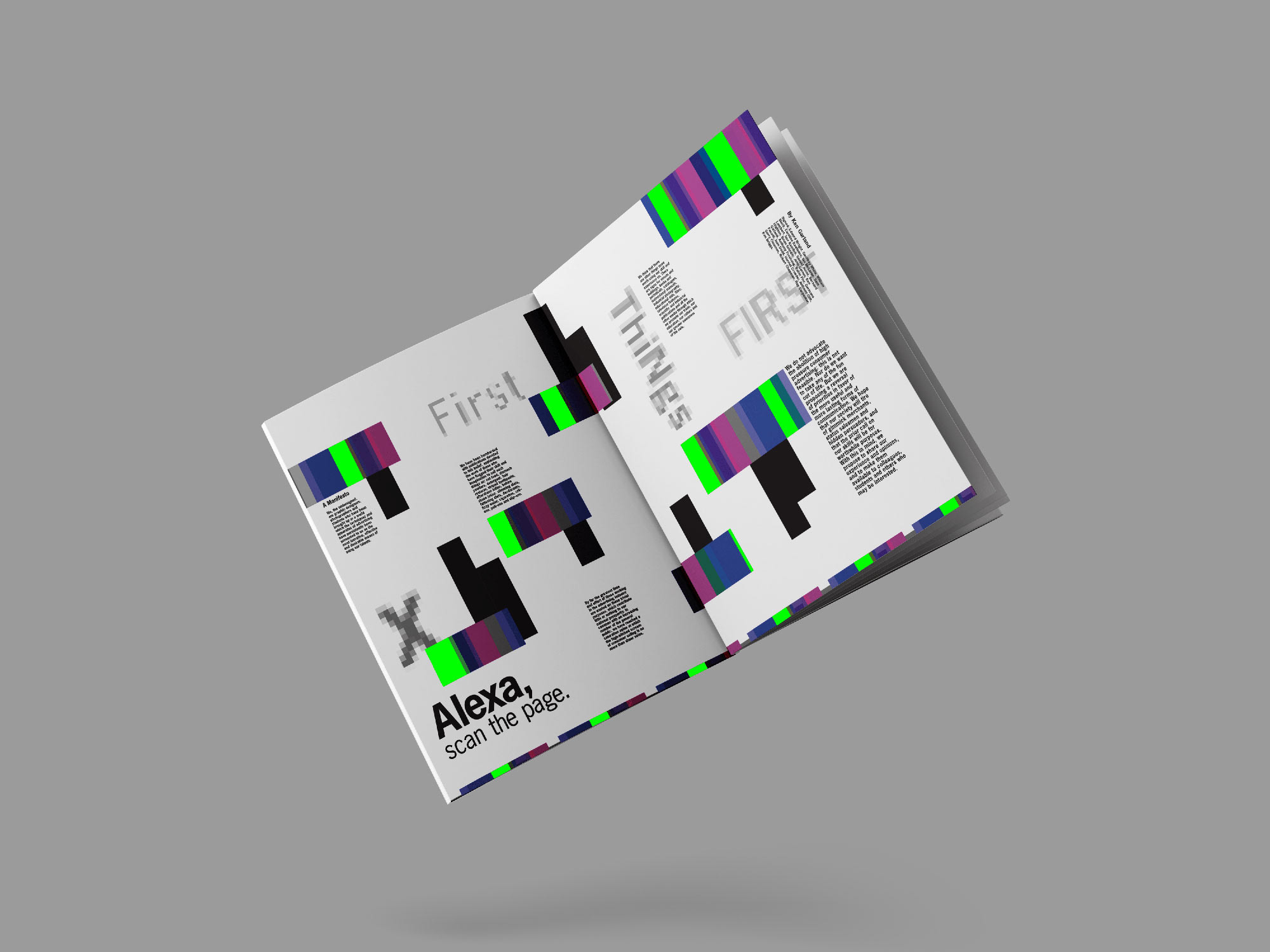
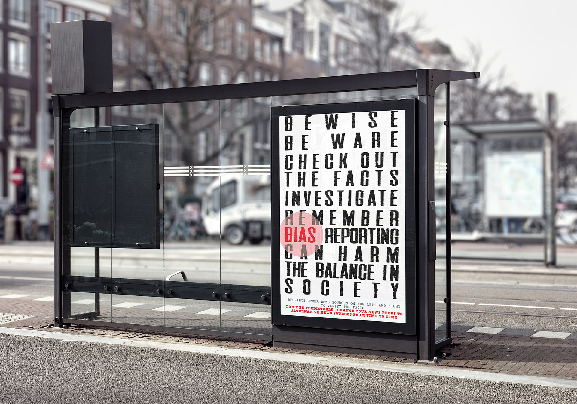
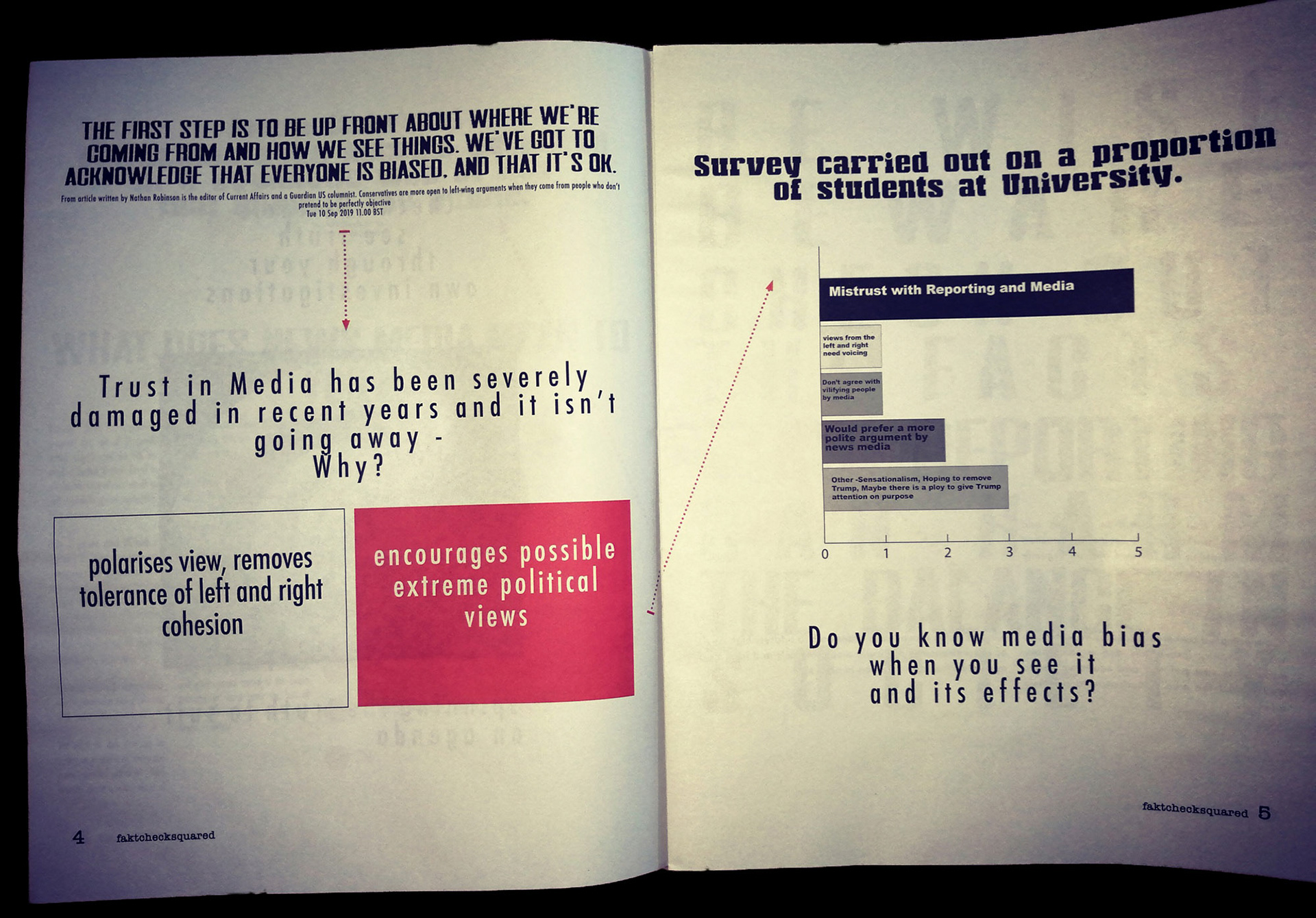
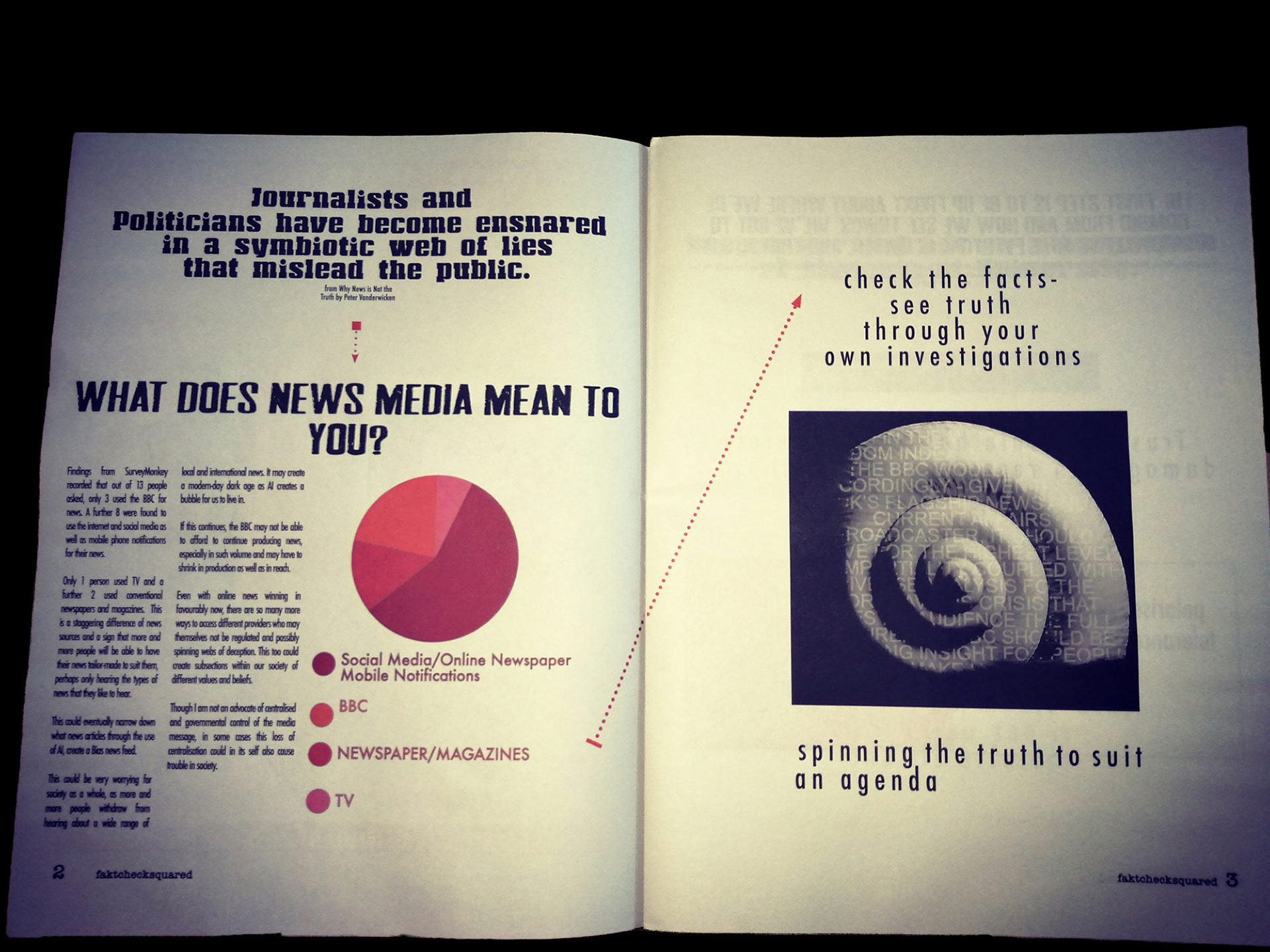
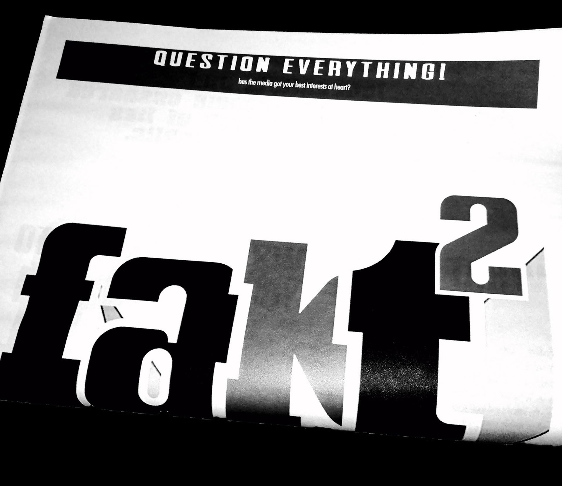
Education facilities will be targeted in an exciting and hard-hitting approach (without permission) to hand out the guerrilla newspaper to students. We don’t check facts, we rather just highlight the FACT that you should take an interest in checking your own facts out. You have your own bias, challenge your own bias. Facts can be spun to suit all and any agenda. But having an opinion is important without your own research it means nothing.

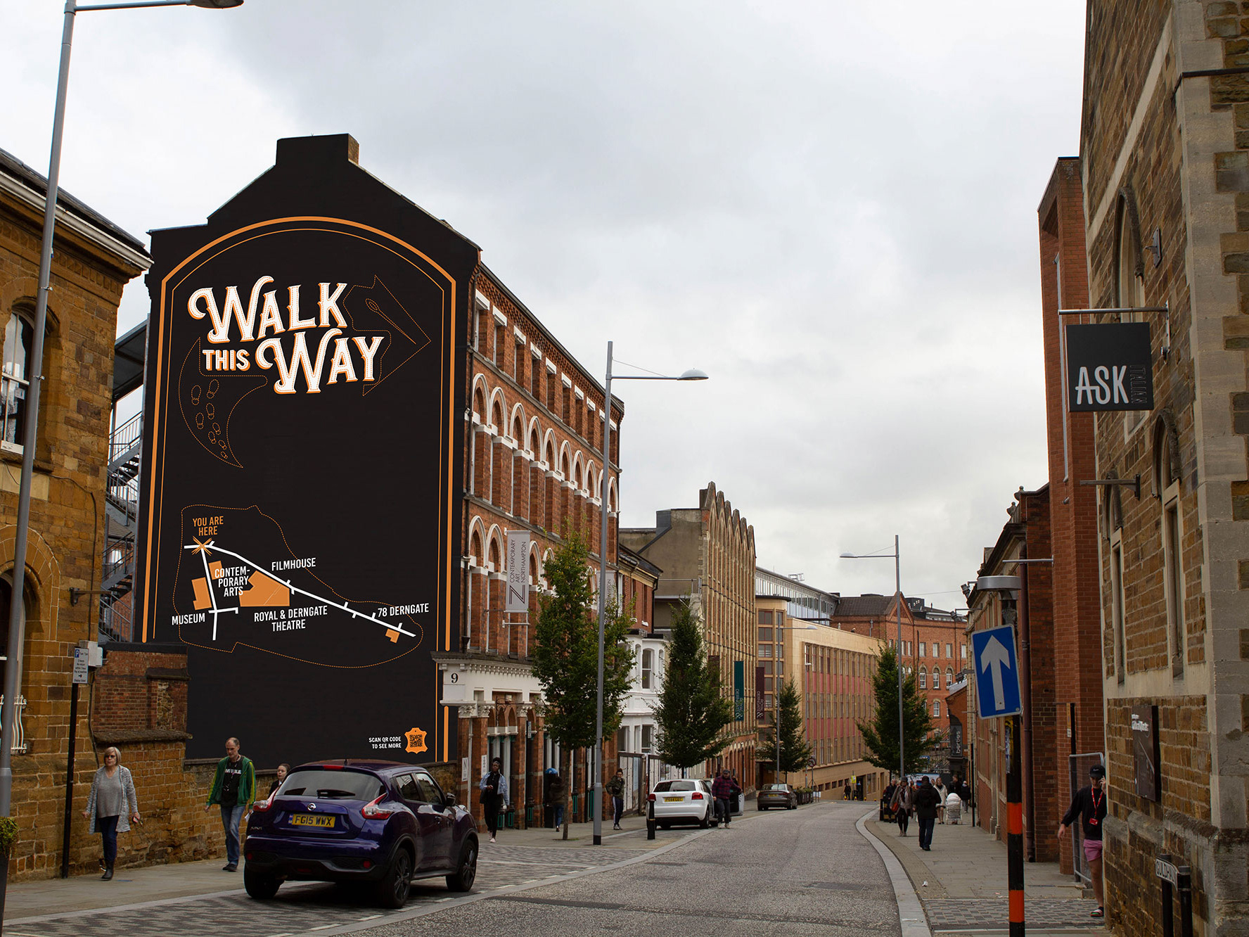
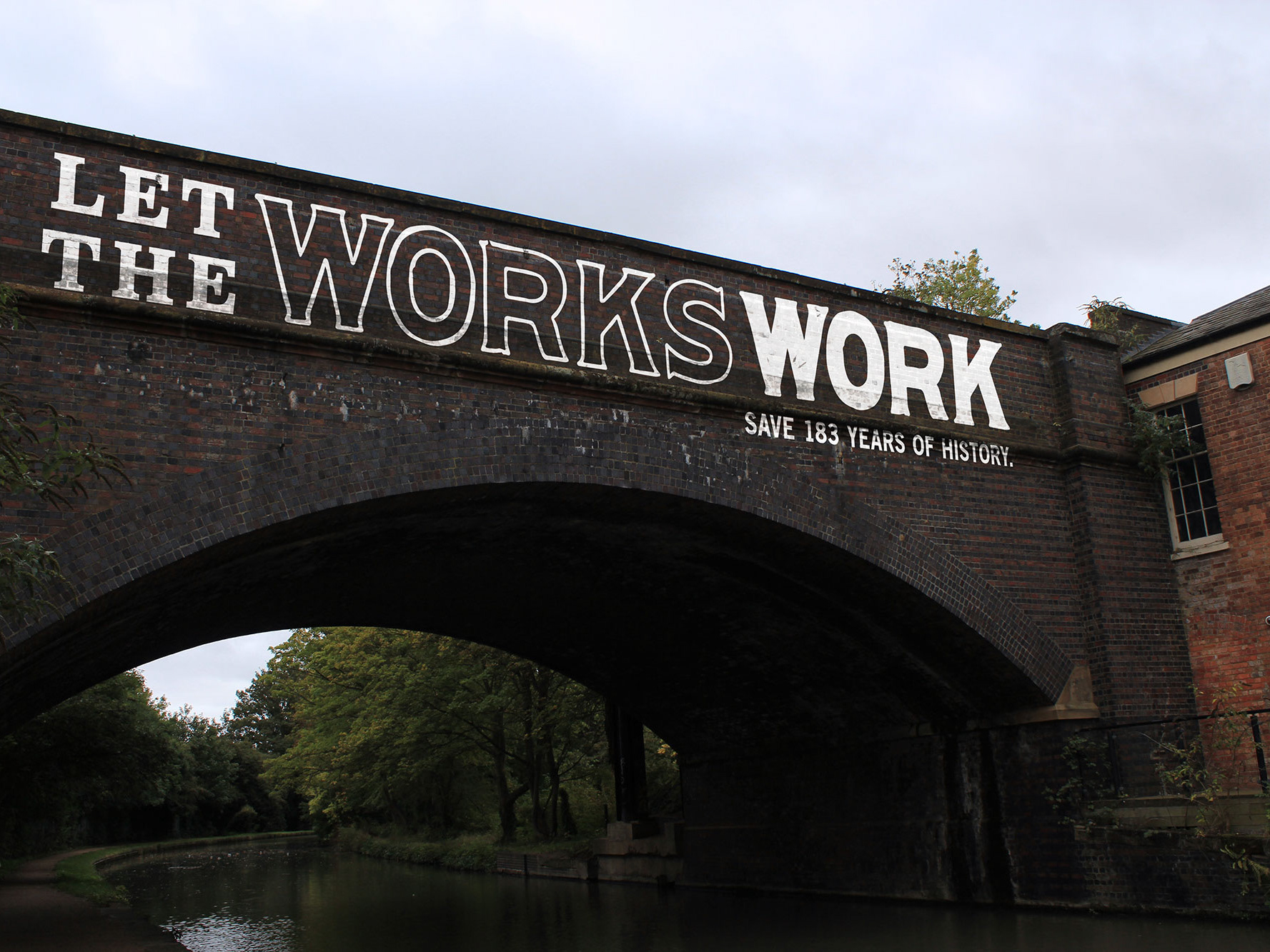
Project: My Type of Place
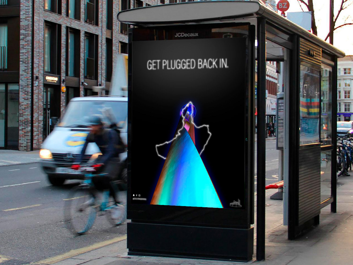
Identify a location and produce a site- specific typographic intervention that positively communicates the virtues of that place.
This project expanded from its original location which was the high street in Northampton and onto the Sixfields Lift Tower, as I felt the bleakness of the tower could do with some messaging perhaps in a washable paint that would erode over time so as not to spoil its neutral cement look forever.
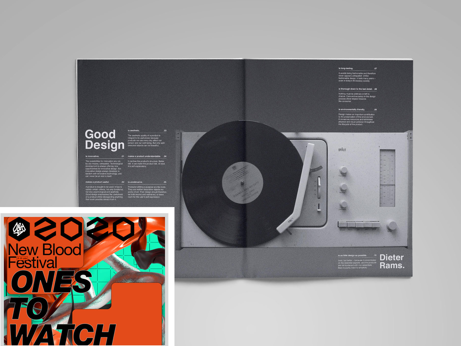
Project: D&AD New Blood Awards:
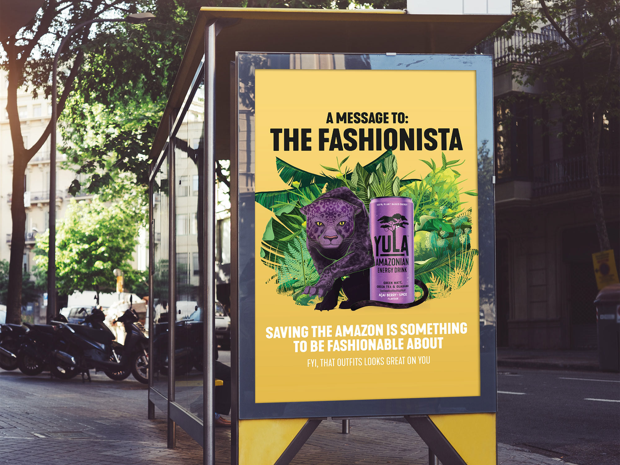
Yula Energy Drink
Create a copy-led campaign that develops an external brand promise and convinces traditional energy drink consumers to switch to Yula.
To draft copy compositions that exemplified all the good aspects of the brand and drink. These compositions would then be grouped into similar messaging and deployed as a yearly campaign demonstrating to the public the strengths and offerings of the drink. Quirky play of words, the natural and health aspects of the drink and the partnerships that the company feels is important to have in order to give the brand an ethical flavour.
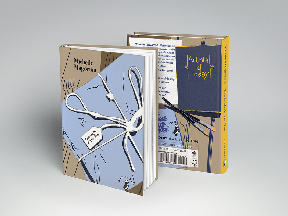
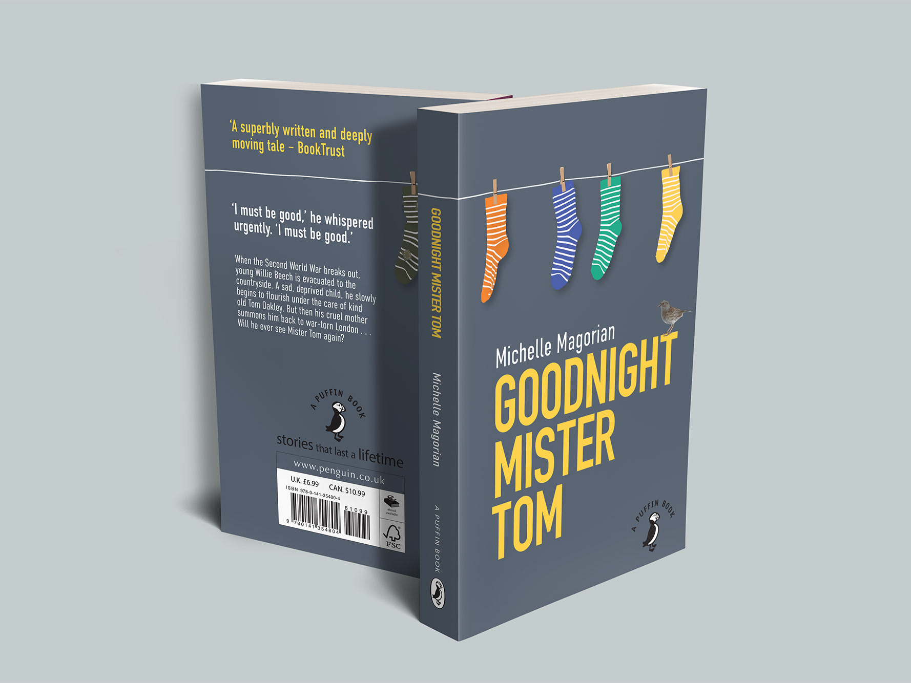
Project: Goodnight Mr Tom Book Cover
Client: Penguin Student Design Award
By using lino-cutting to create something unique to the type as well as something unique and antiqued to the image of the bike. The use of handmade paper gives it a more traditional and unique quality too. Mostly raw handcrafted design in a more traditional style. The use of Adobe was minimally used for this project.
