Kirsty Furniss
Kirsty Furniss is a graphic designer based in Northampton, UK, specialising in packaging design, branding and print. Her practice aims to convey a balance between aesthetic visuals and positive impacts to leave a long-lasting impression. Kirsty aims to use her skills to inform others of global issues through her designs, whilst also having a strong interest in branding and marketing.
Follow me on socials
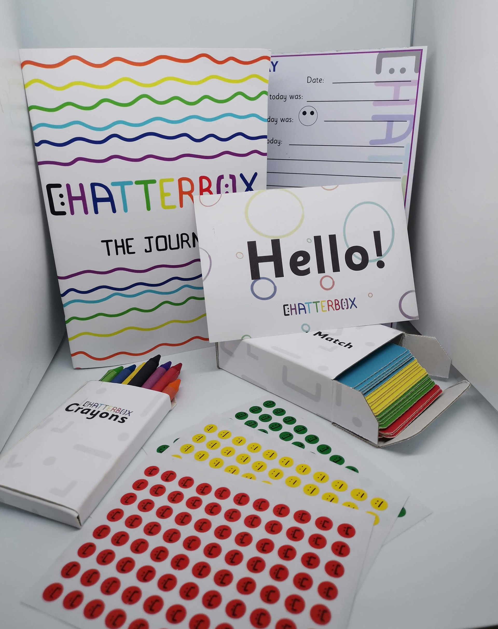
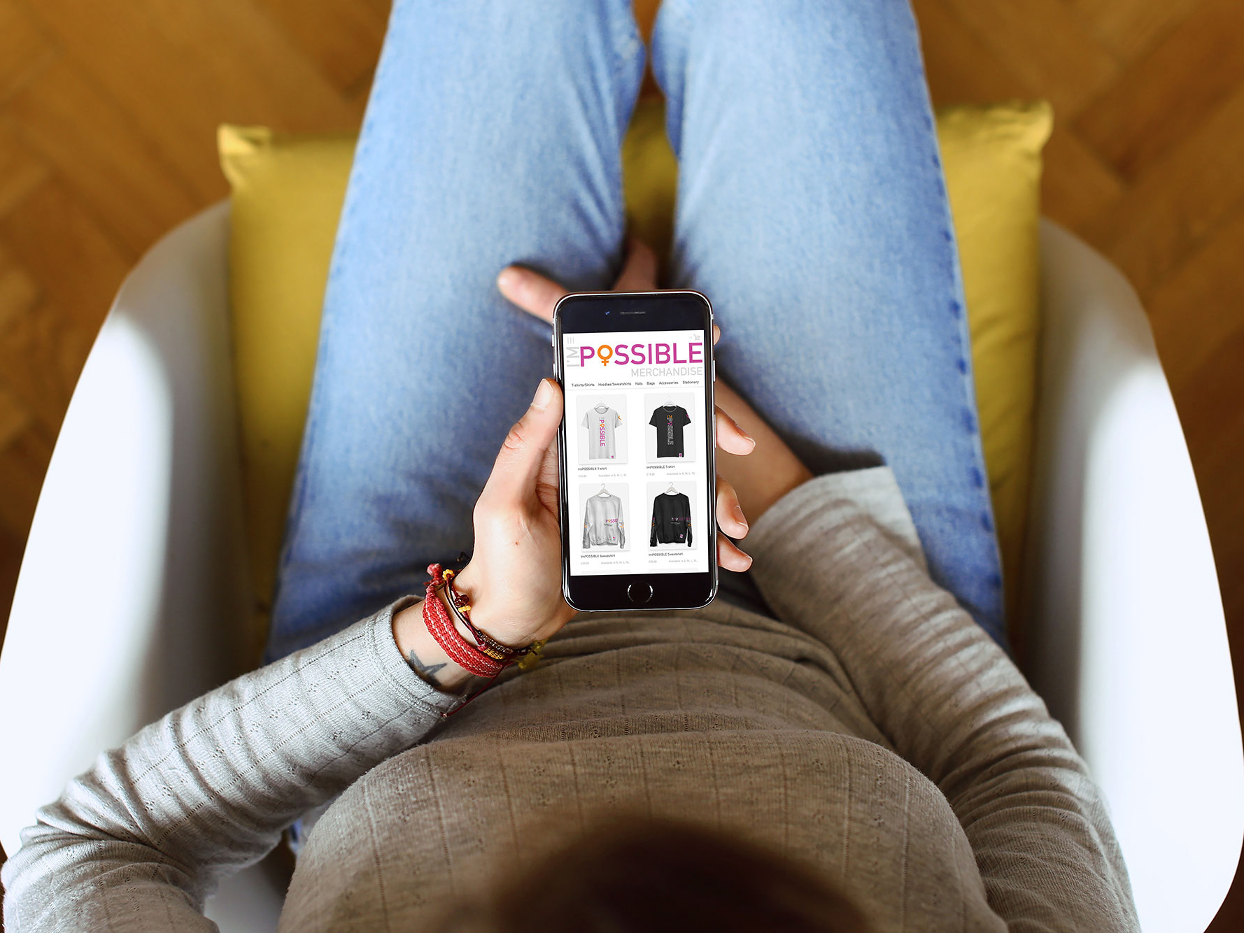
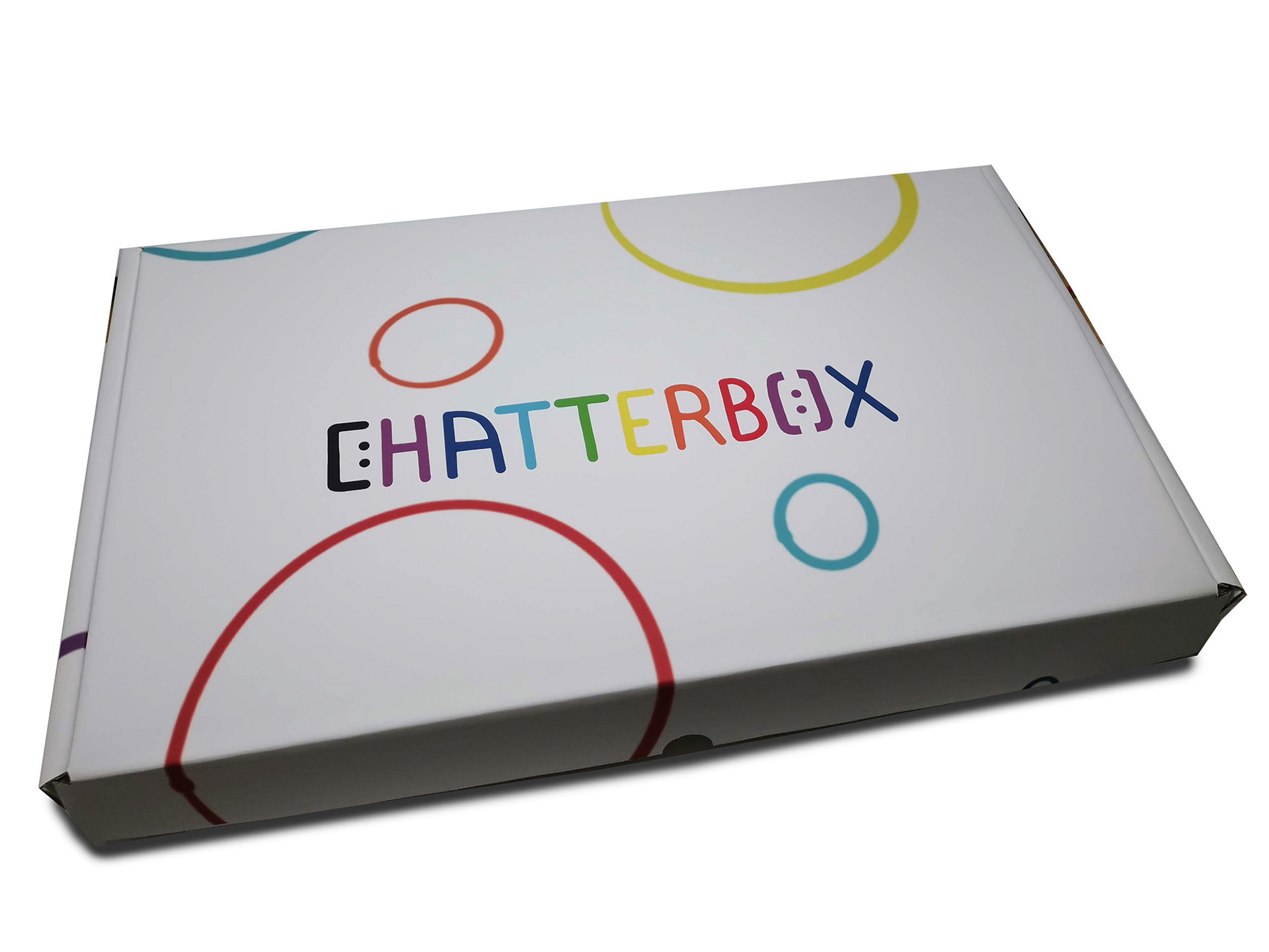
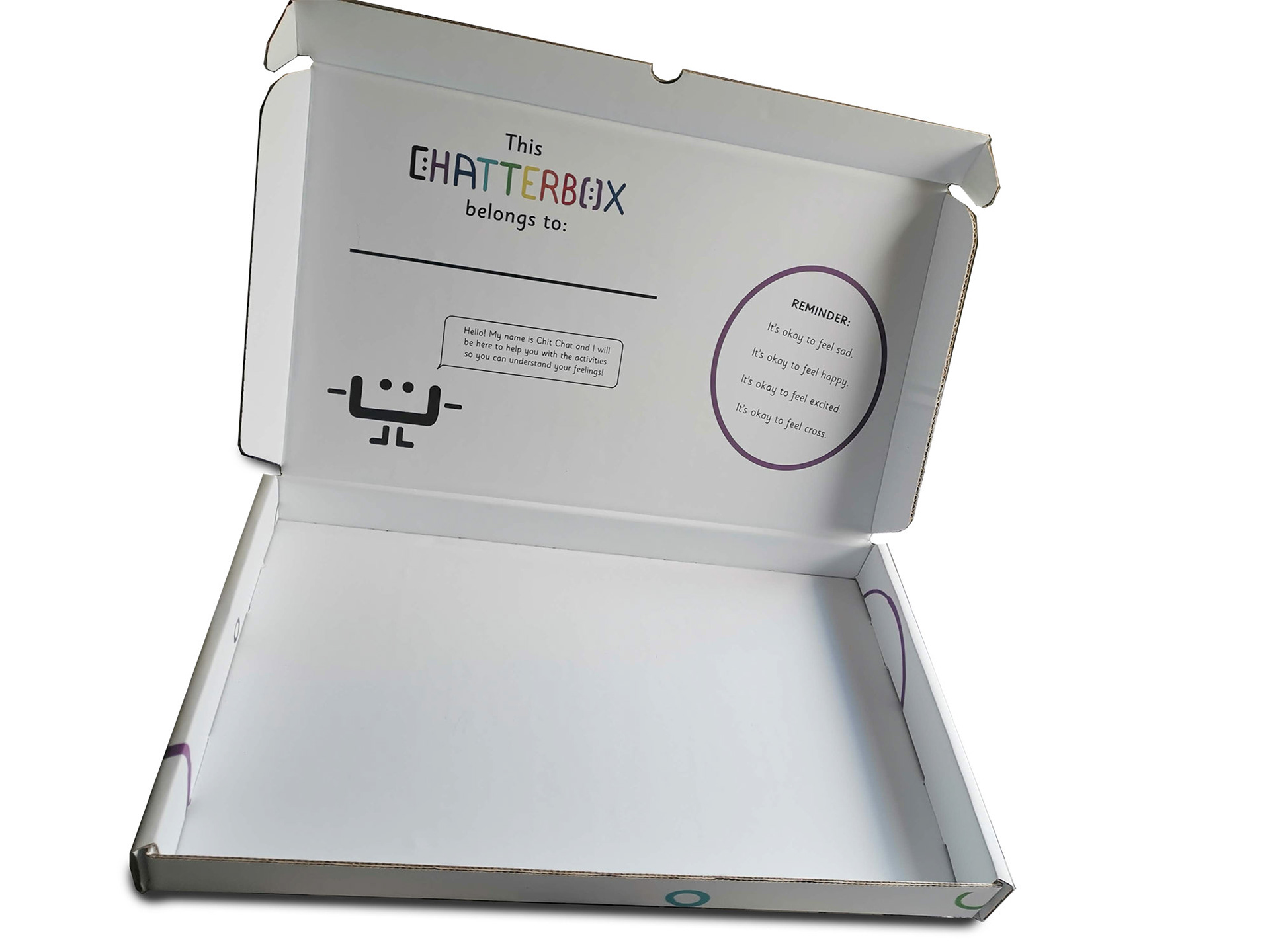
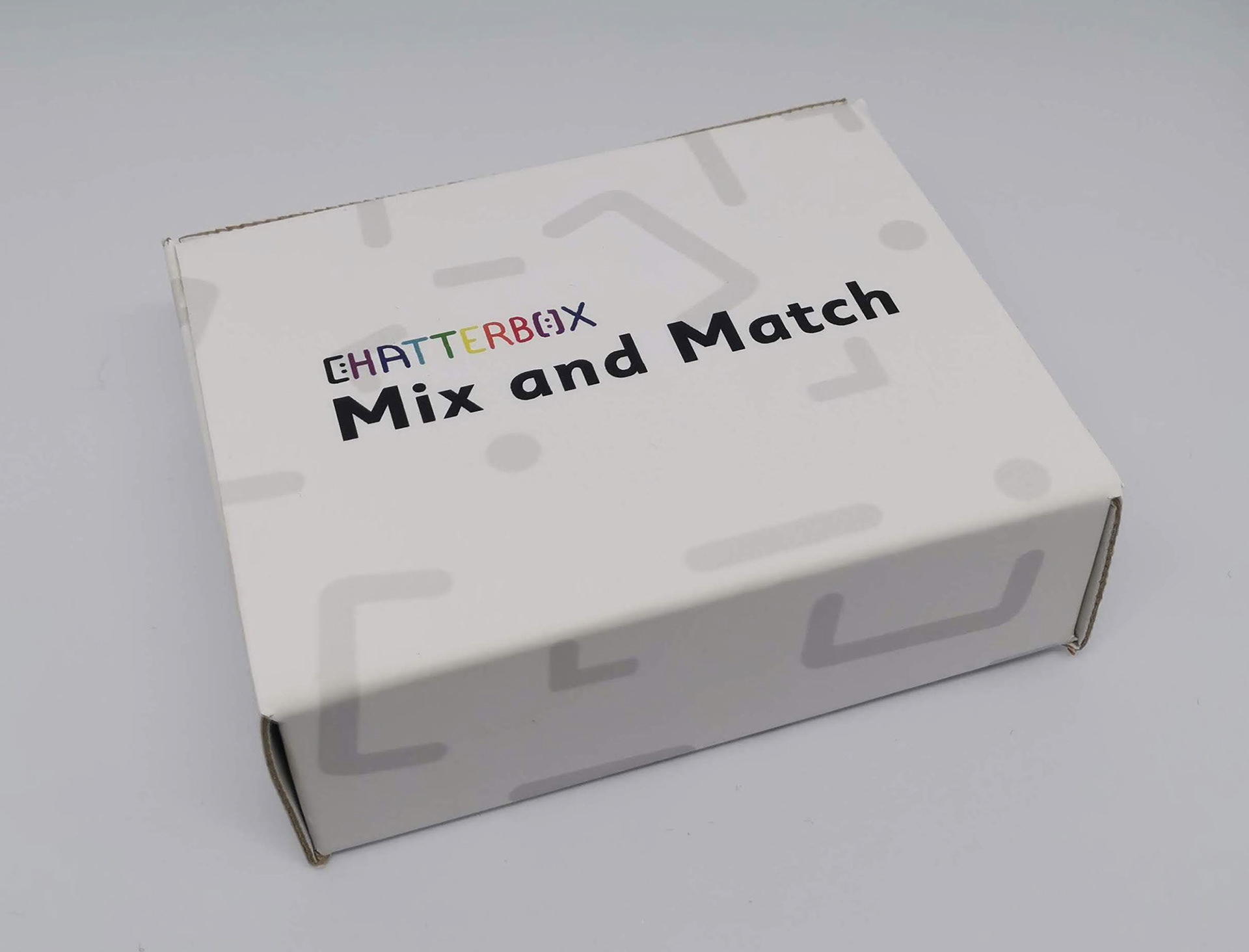
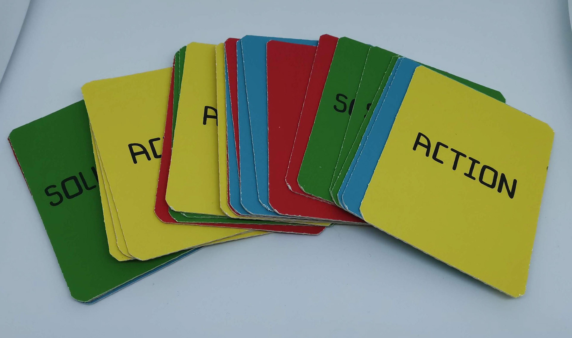
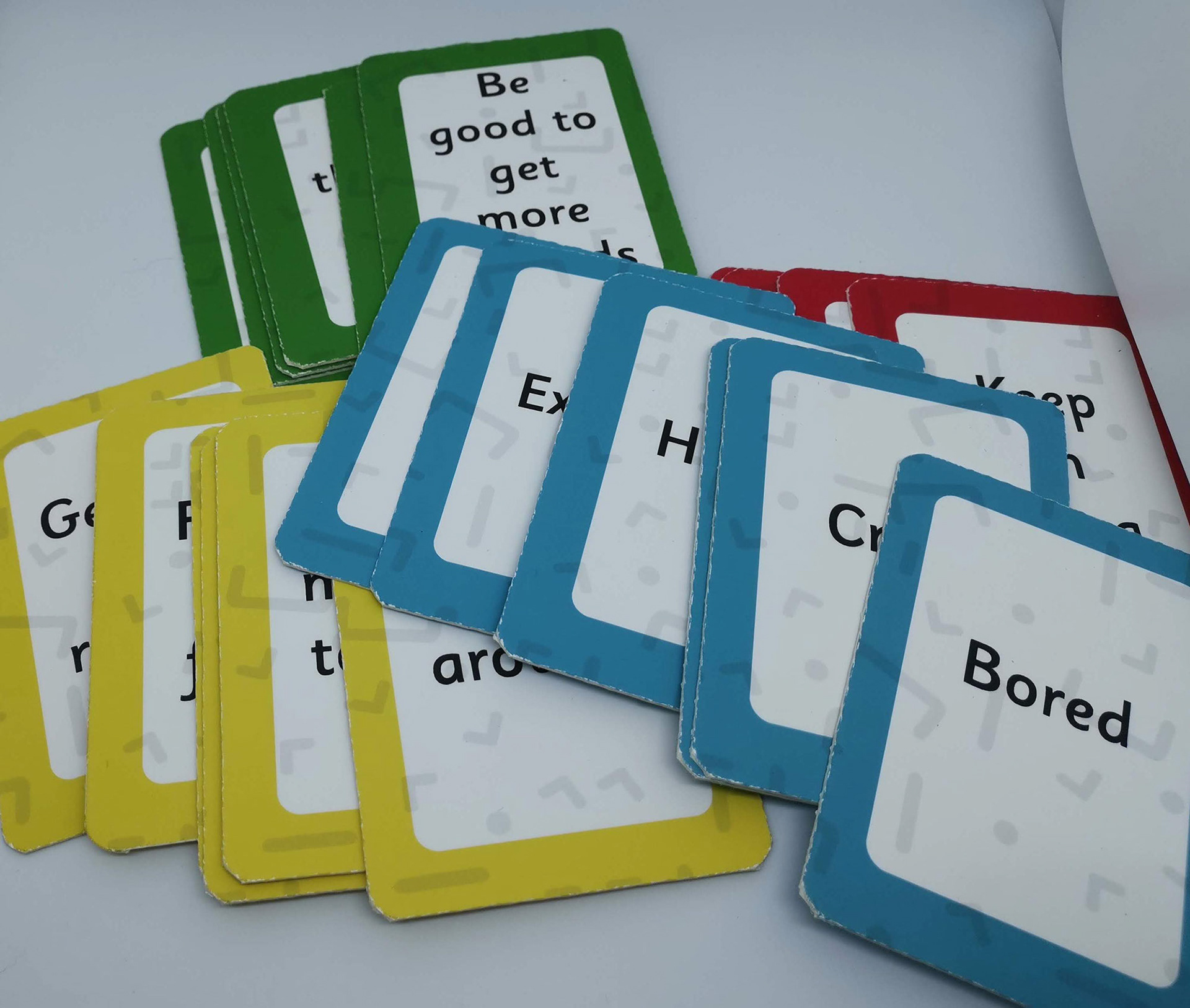
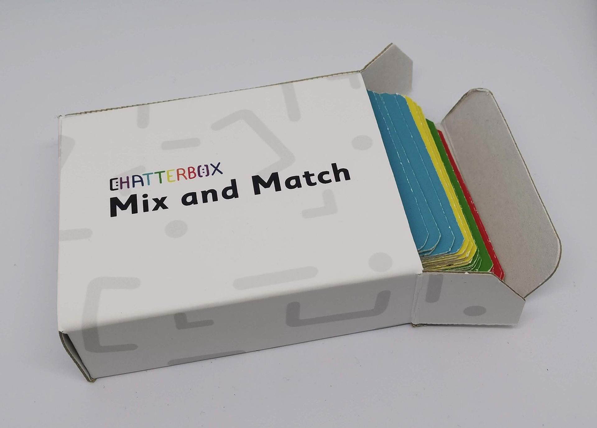
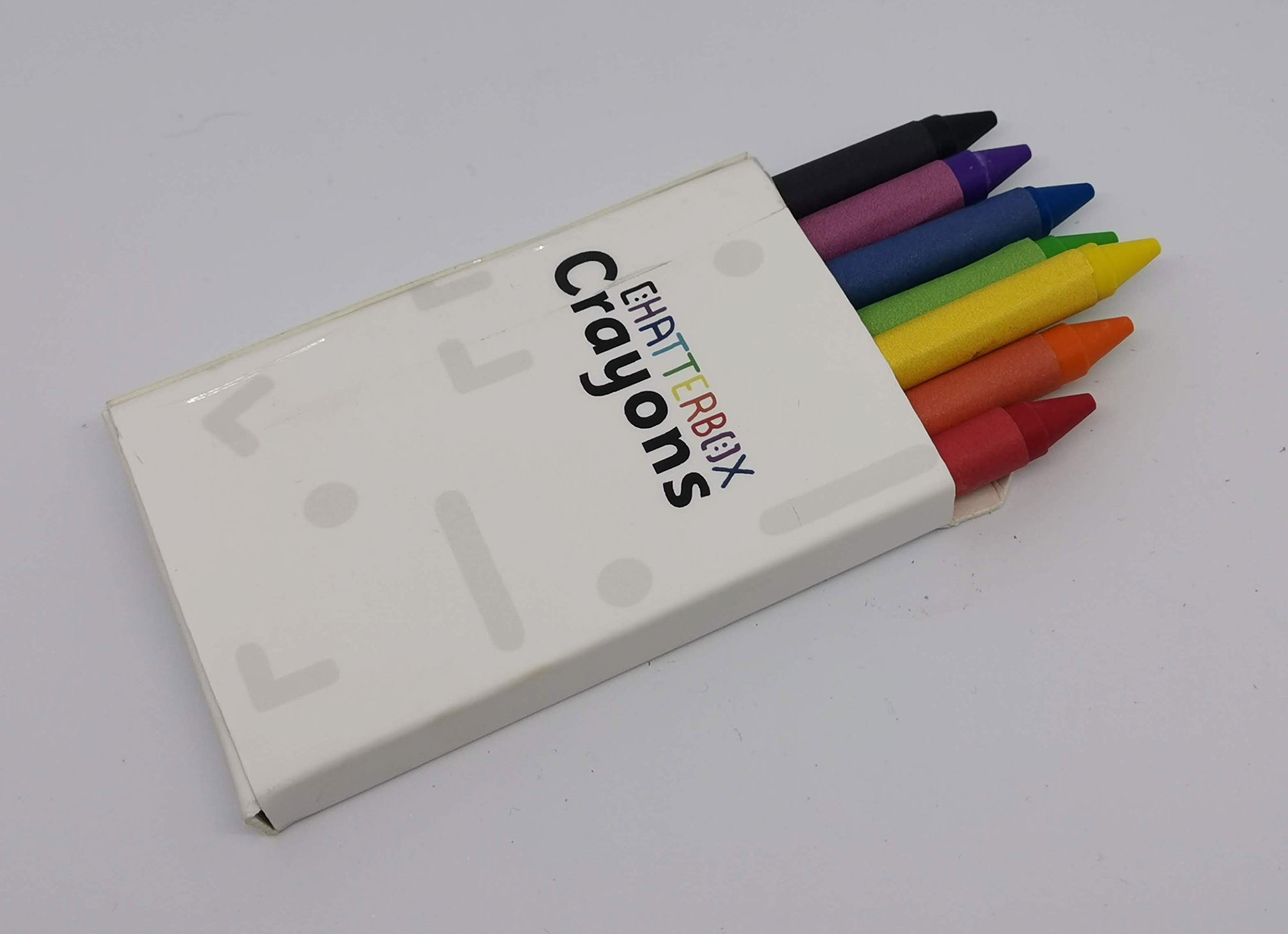
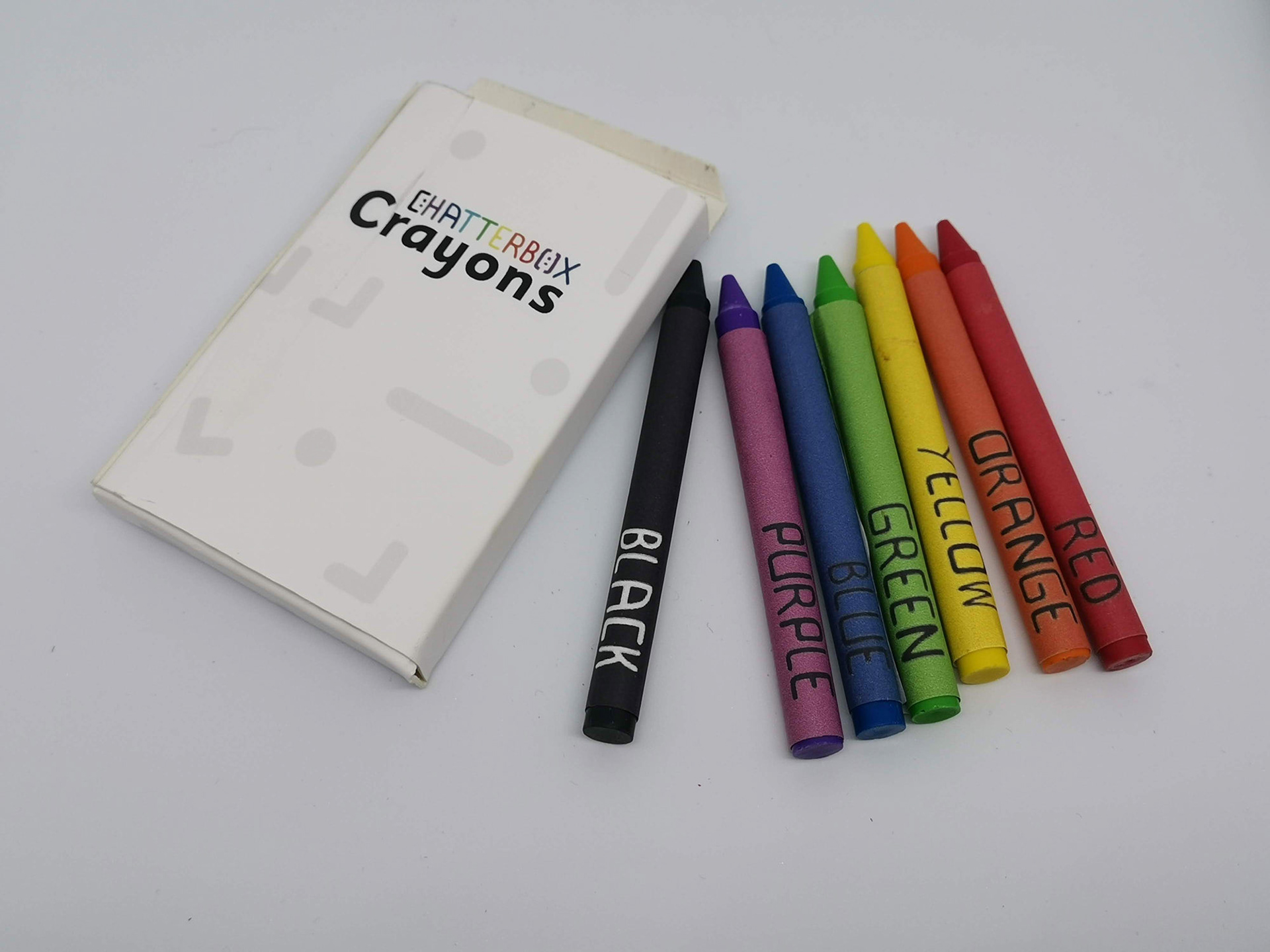
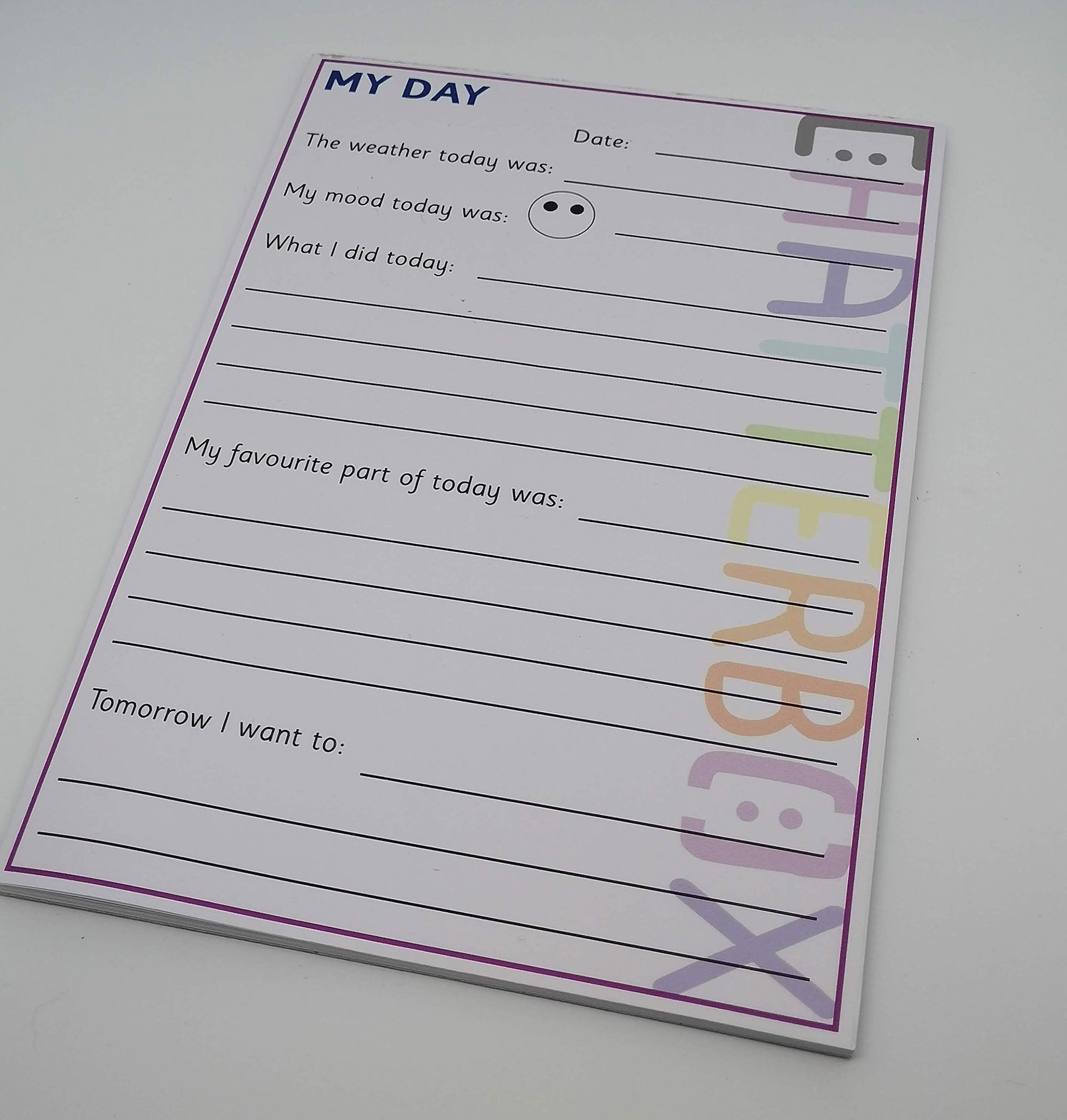
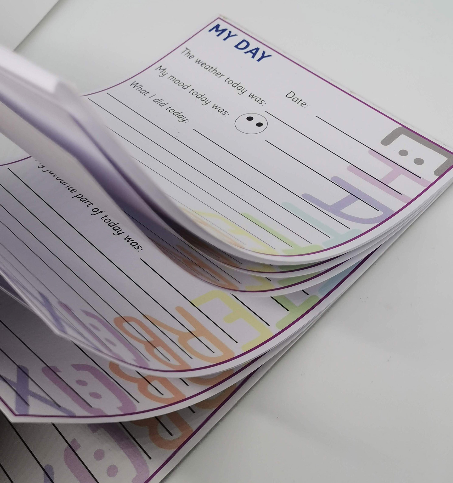
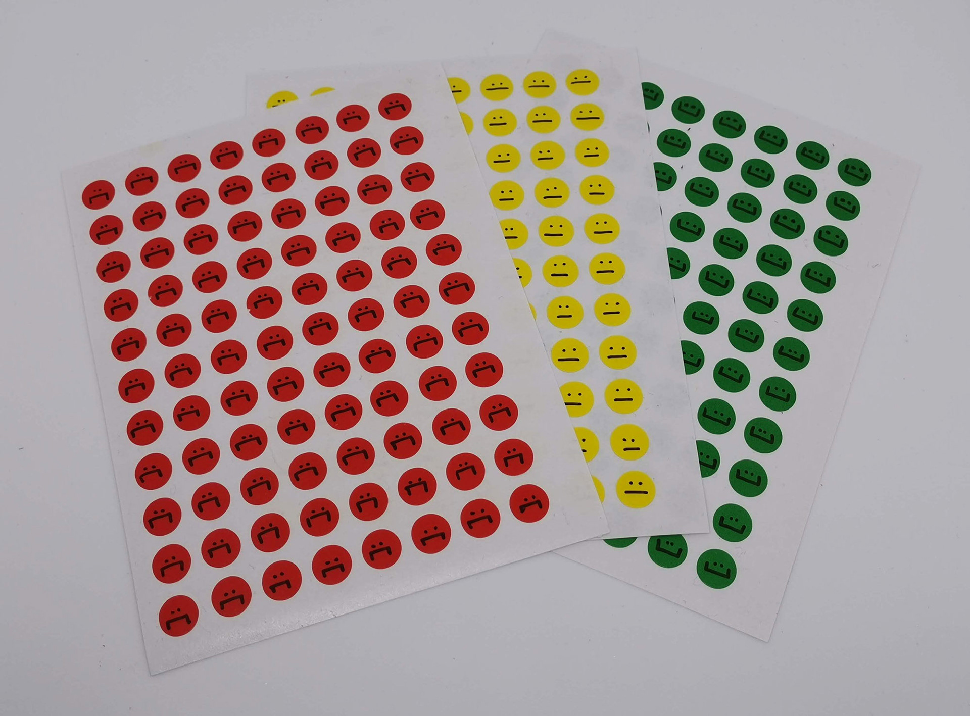
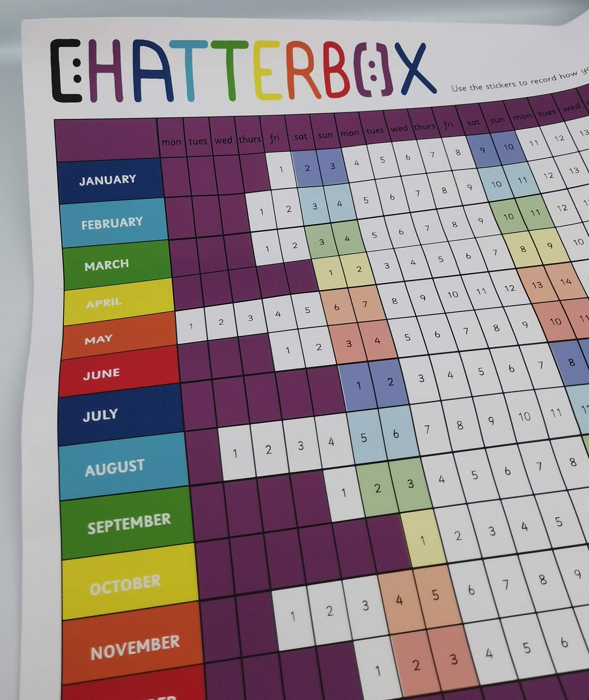
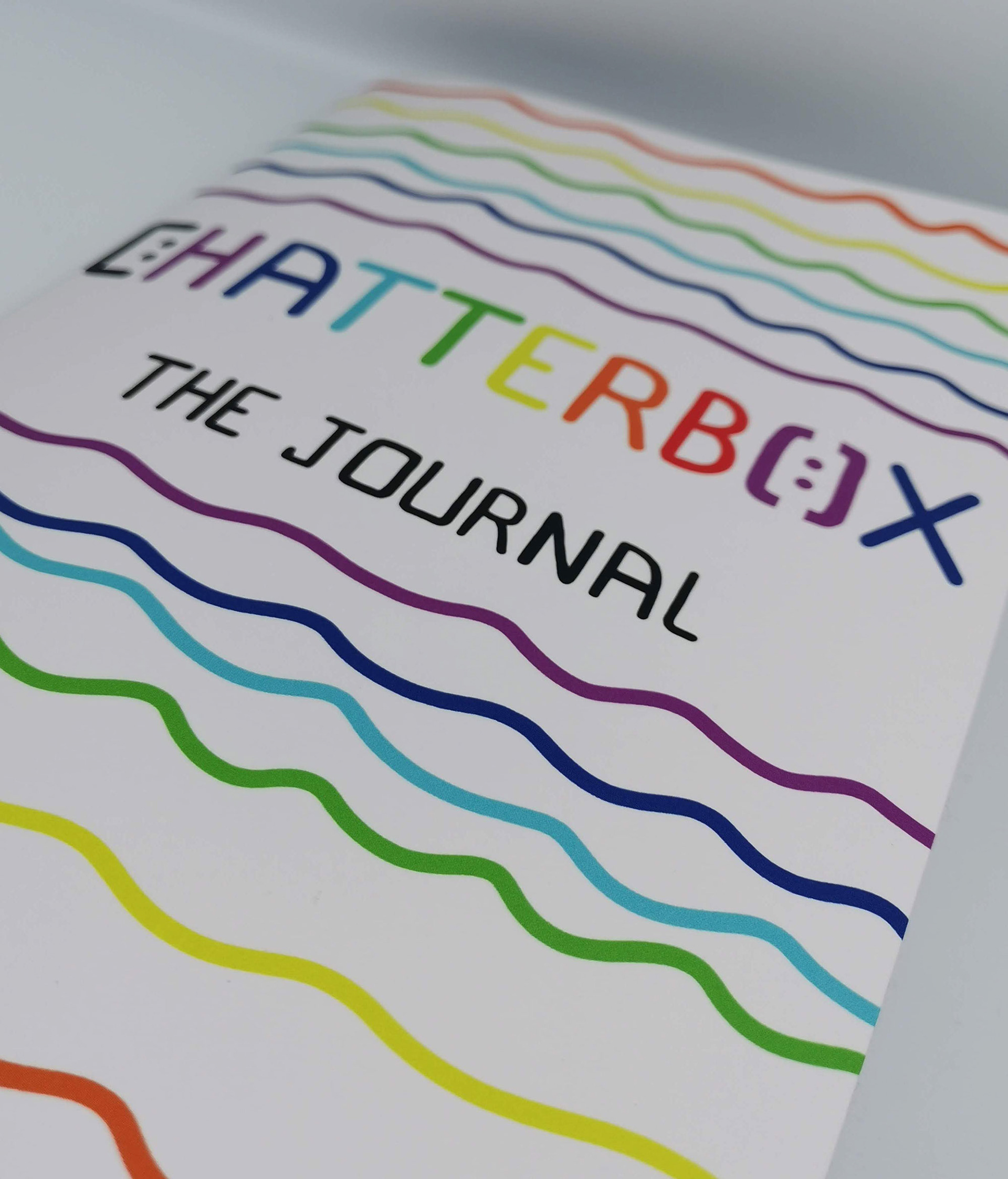
Final Major Project: Chatterbox
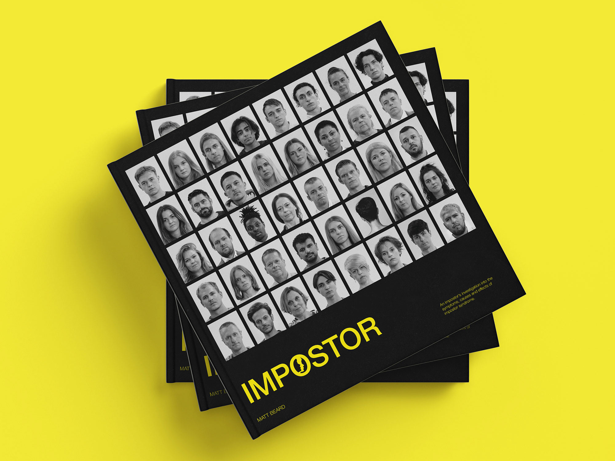
In 2019, I set out to write my brief for my Final Major Project. I had come across a statement from Children’s Society which stated that ‘approximately 1 in 10 school children have a diagnosable mental health condition. If young people between the ages 5 and 16 do not get the support that they need, their problems could worsen and develop into more crucial problems. and it’s vital that they get help with their issues now.’ This statement shocked me and urged me to want to help where I could. Obviously, I am not an expert in mental well-being and I knew that I couldn’t become one over the course of this project. Therefore I decided to simply create a space which develops conversations surrounding the issue within families, to ensure that young children are at least aware of this problem, but also to make sure that they knew that it is okay if they are struggling, that they can talk about it to somebody.

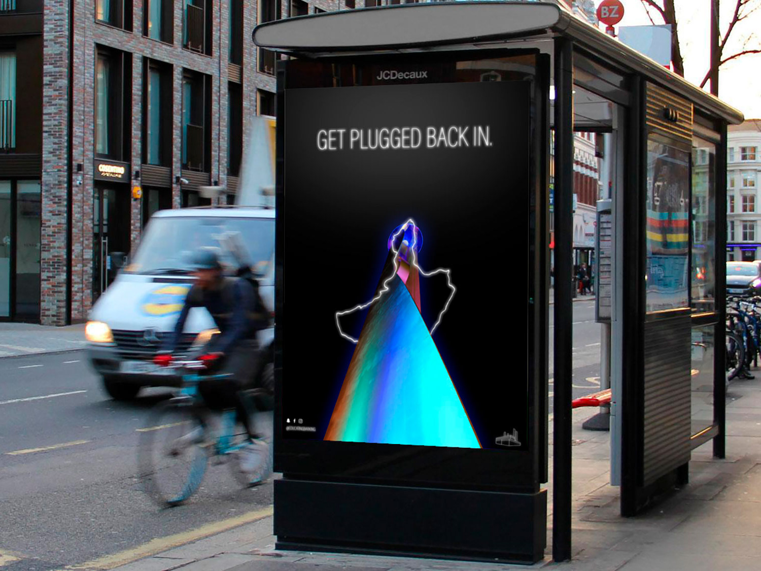
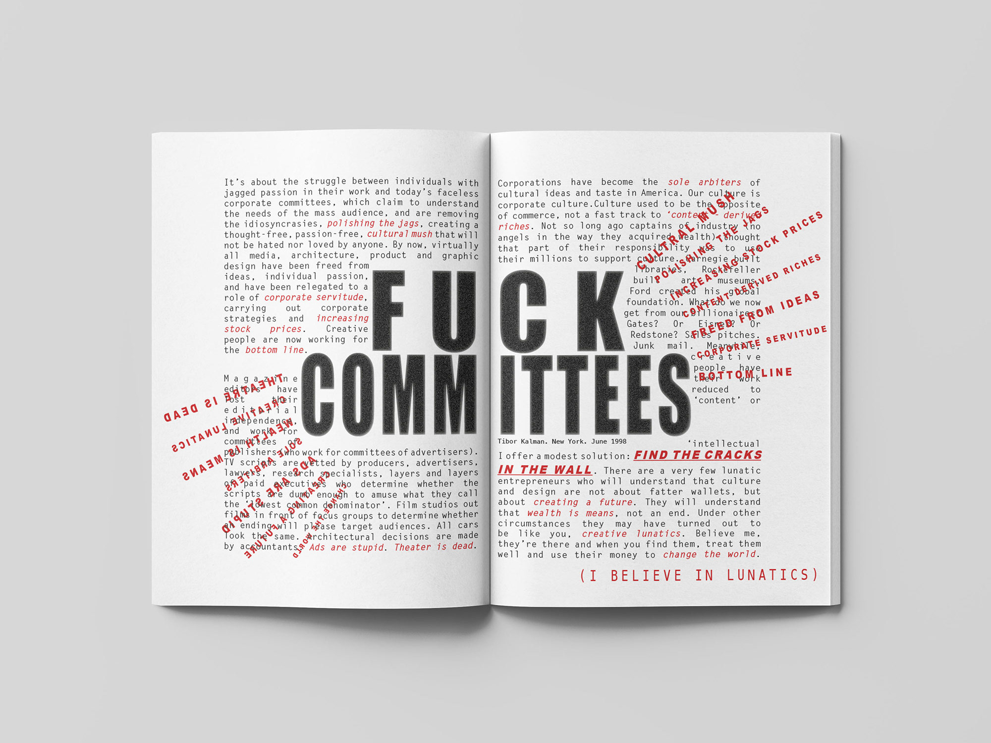
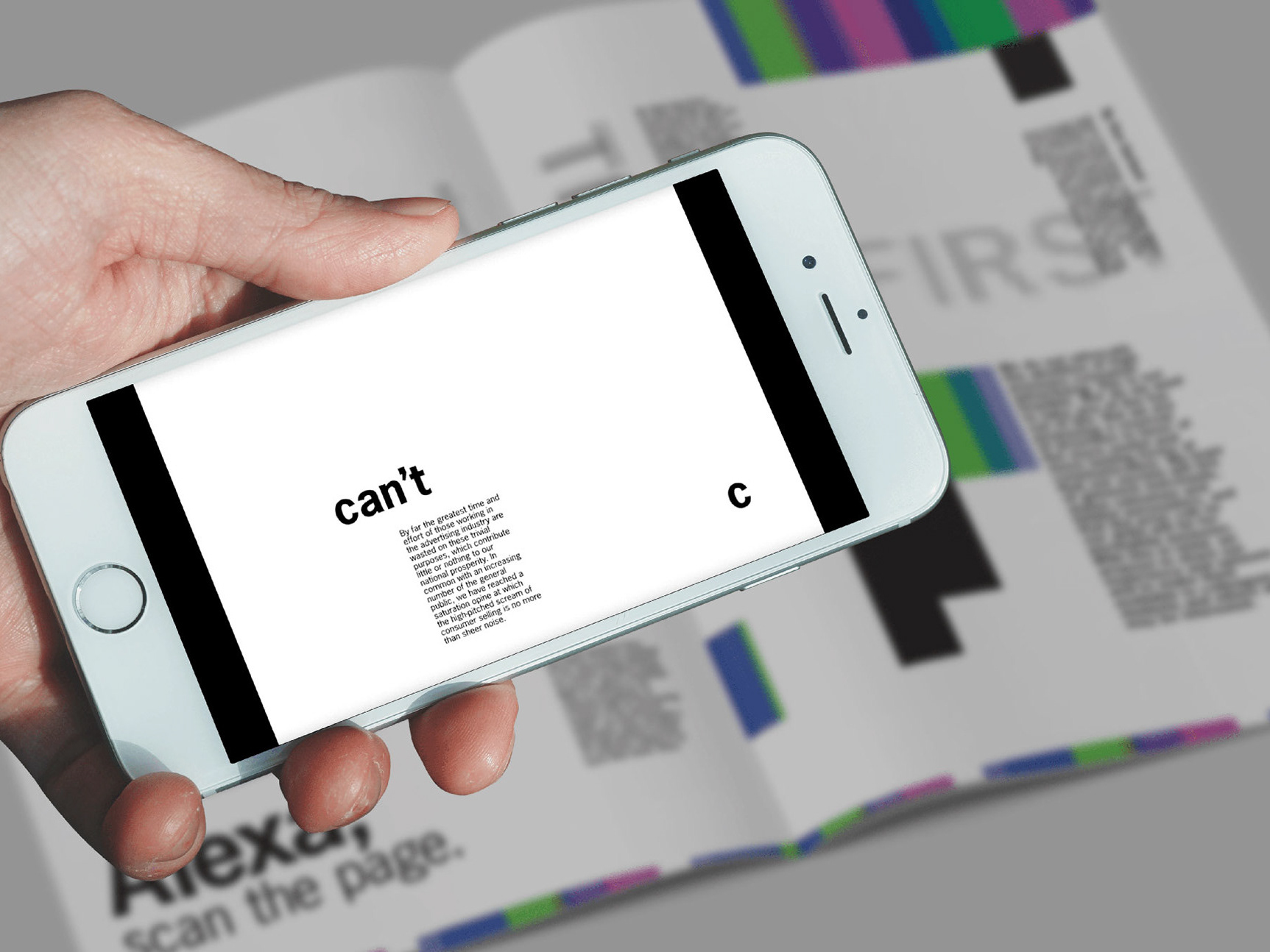
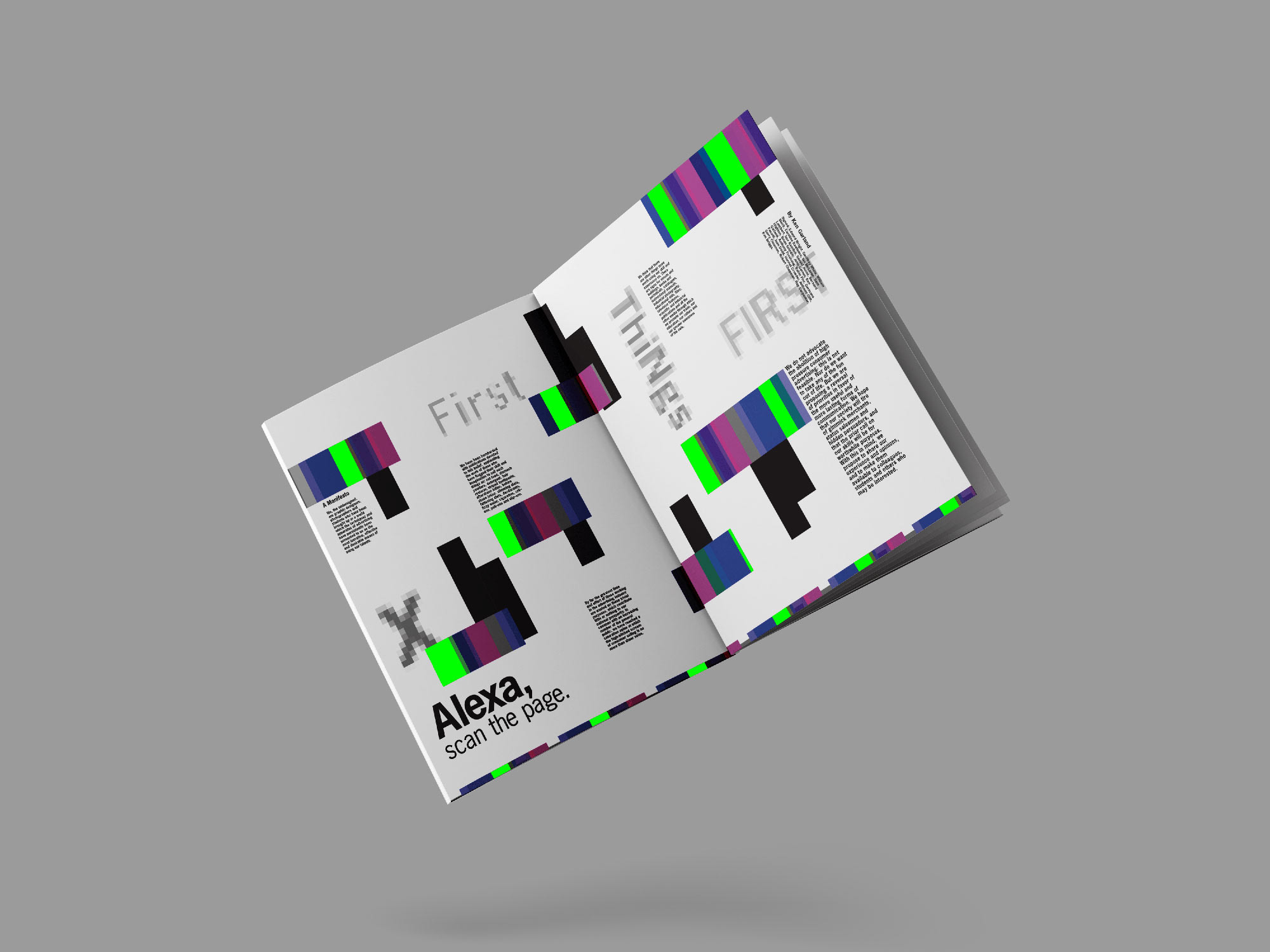
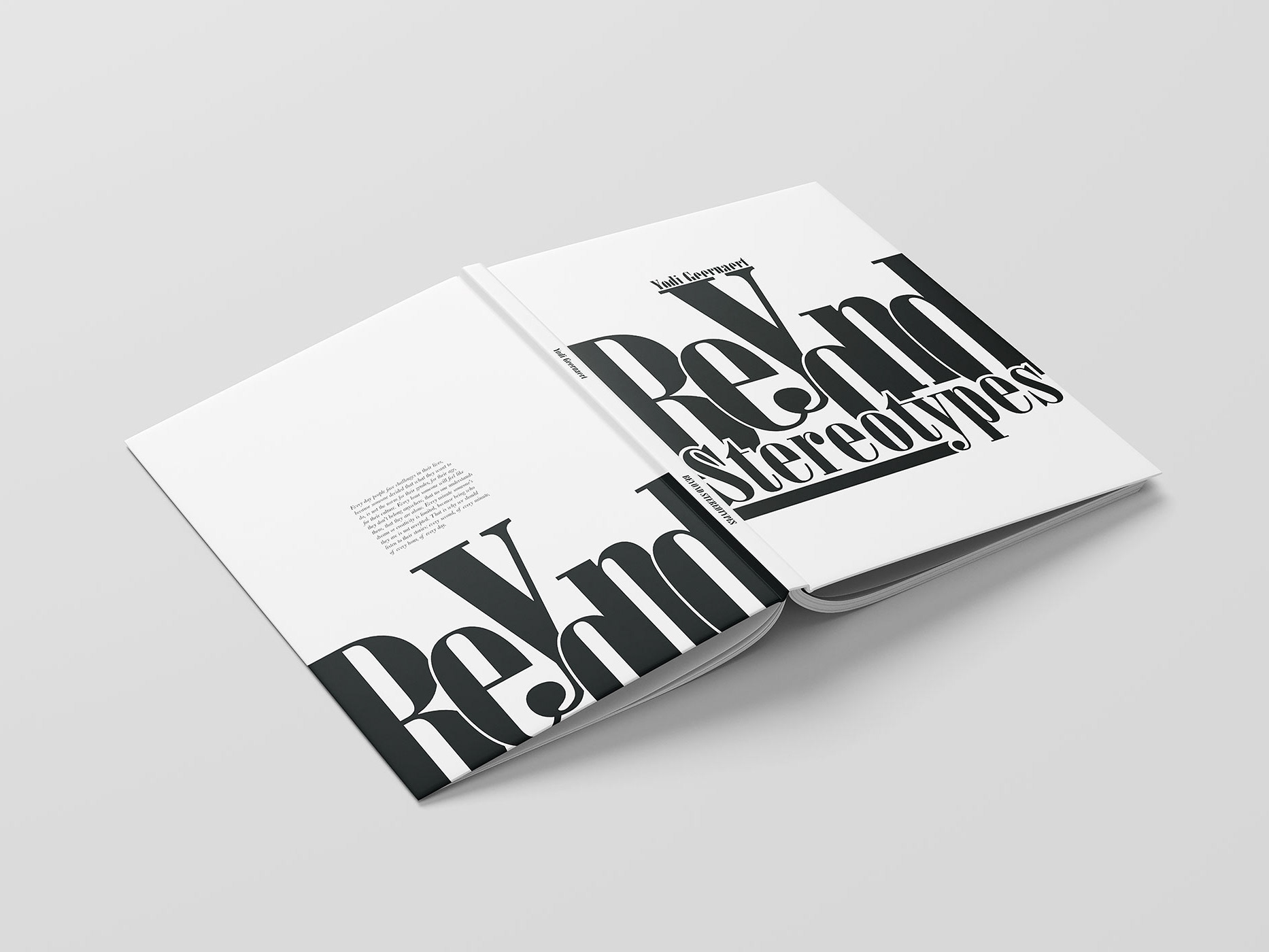
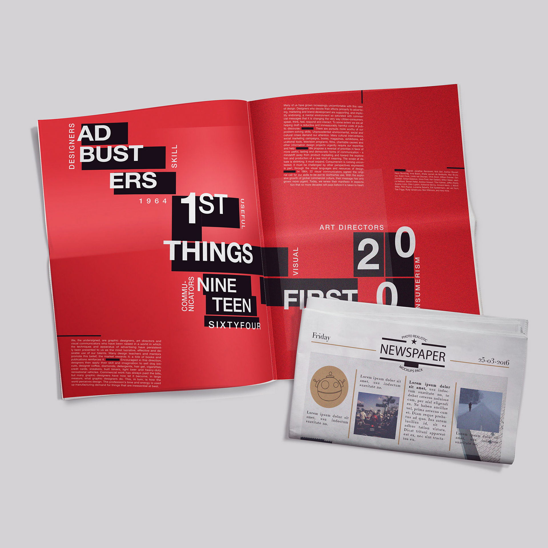
Project: Editorial Beyond the Page
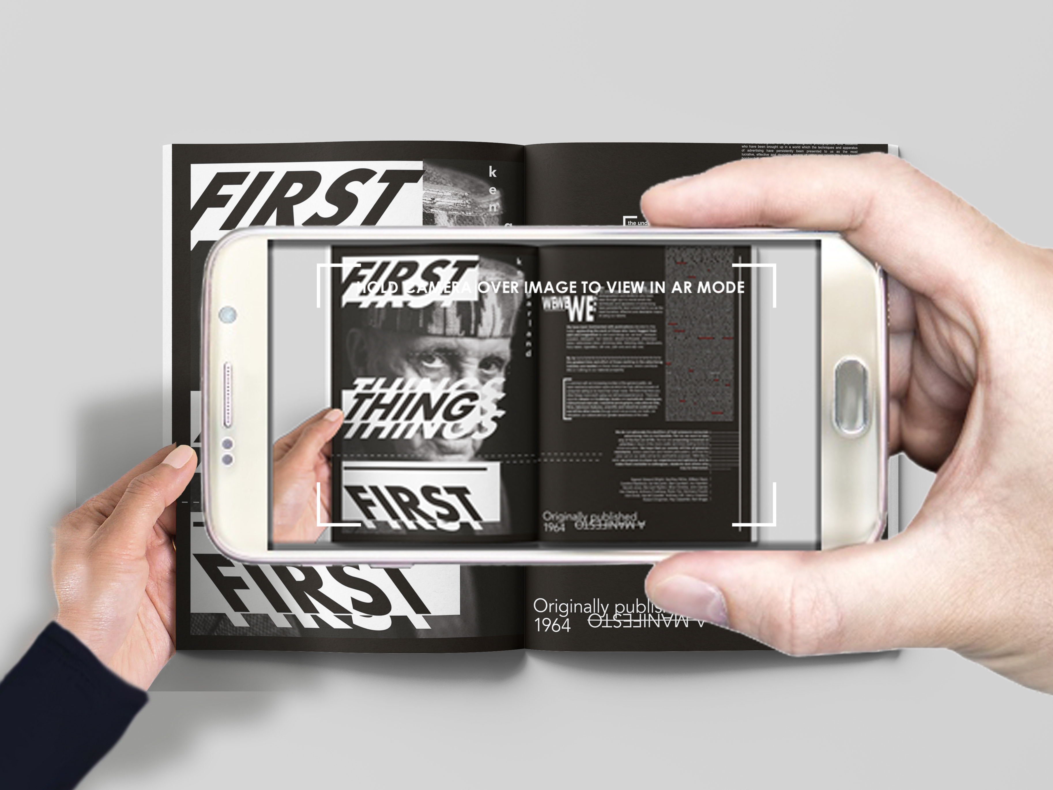
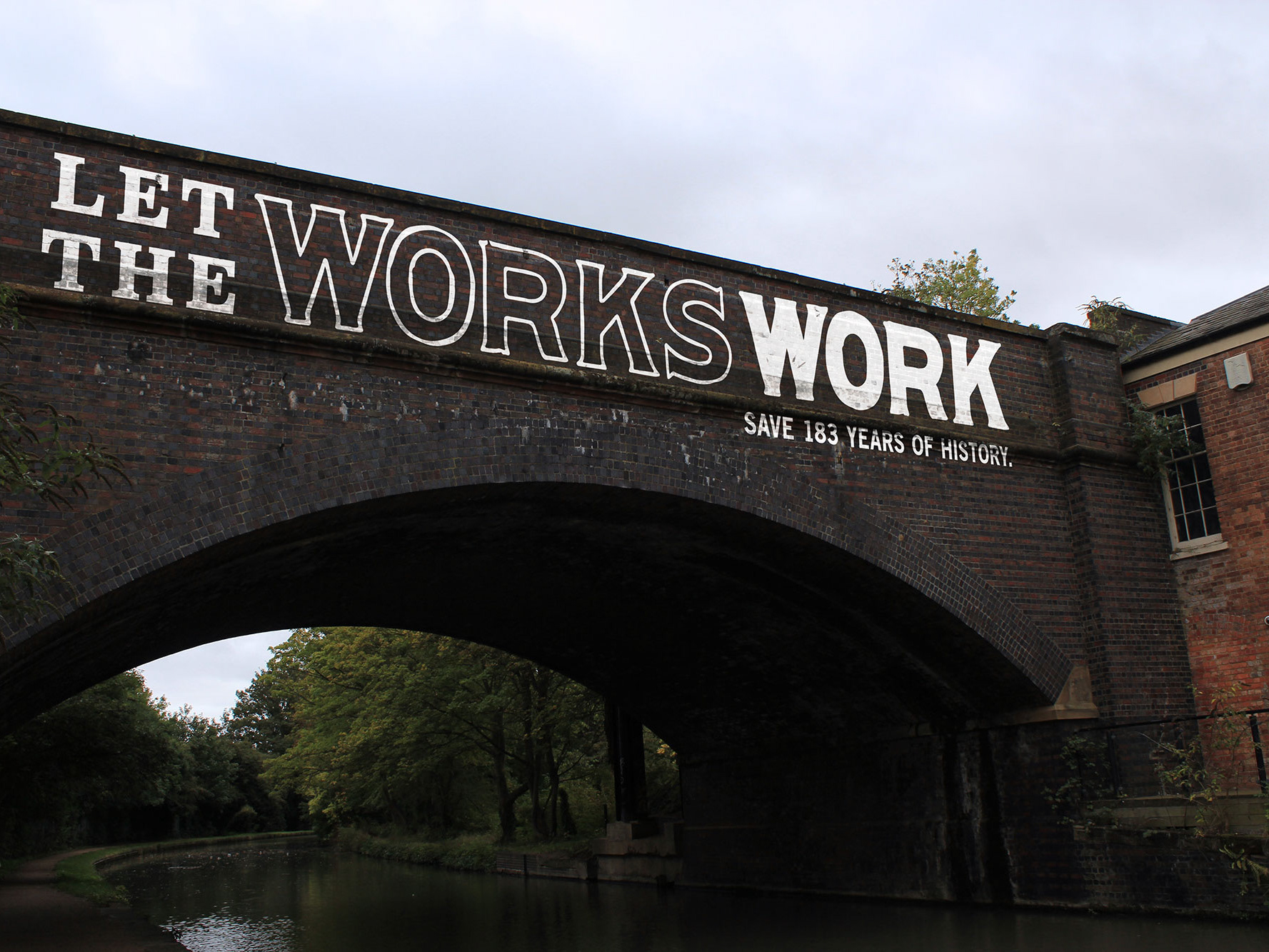
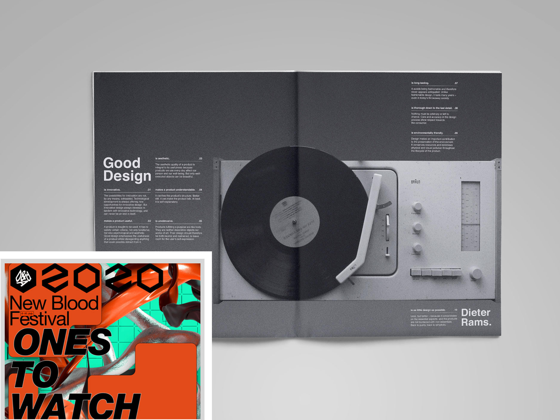
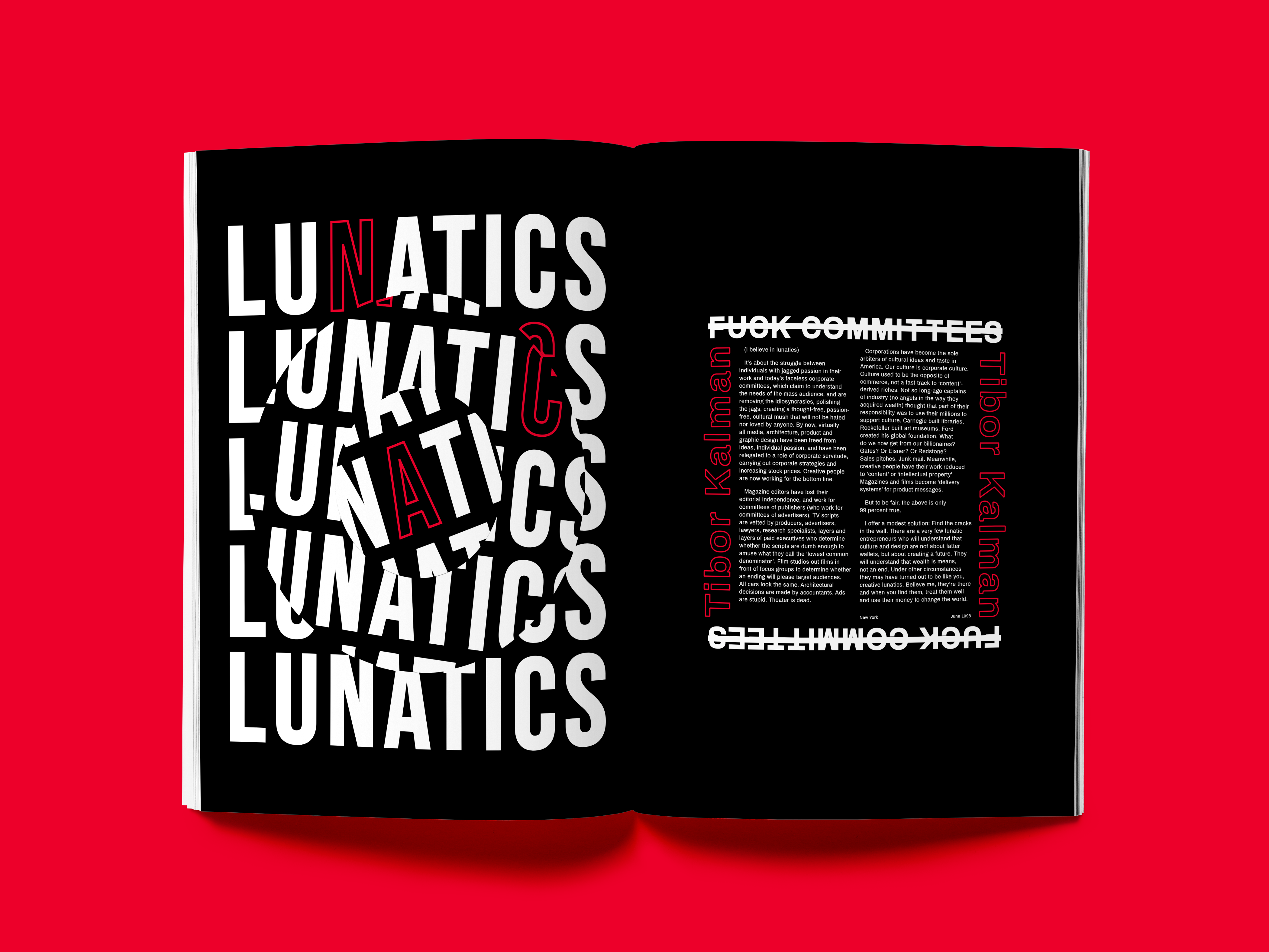
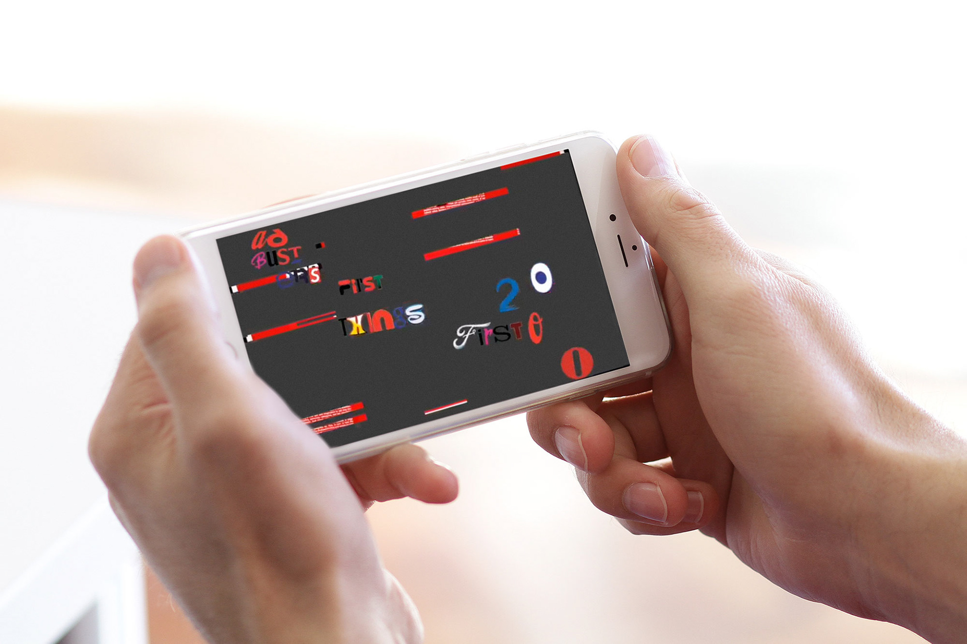
The manifesto chosen to communicate for this project was AdBusters’ First Things First 2000 manifesto. The concept for this project comes directly from the manifesto and portraying its message to the audience of designers. It shows that whilst designers should be using their skill to their maximum potential and to make a difference in the world, they are also needed for work such as branding of dog biscuits. The flickering Augmented Reality layer conveys that there are two sides of the message from the manifesto.

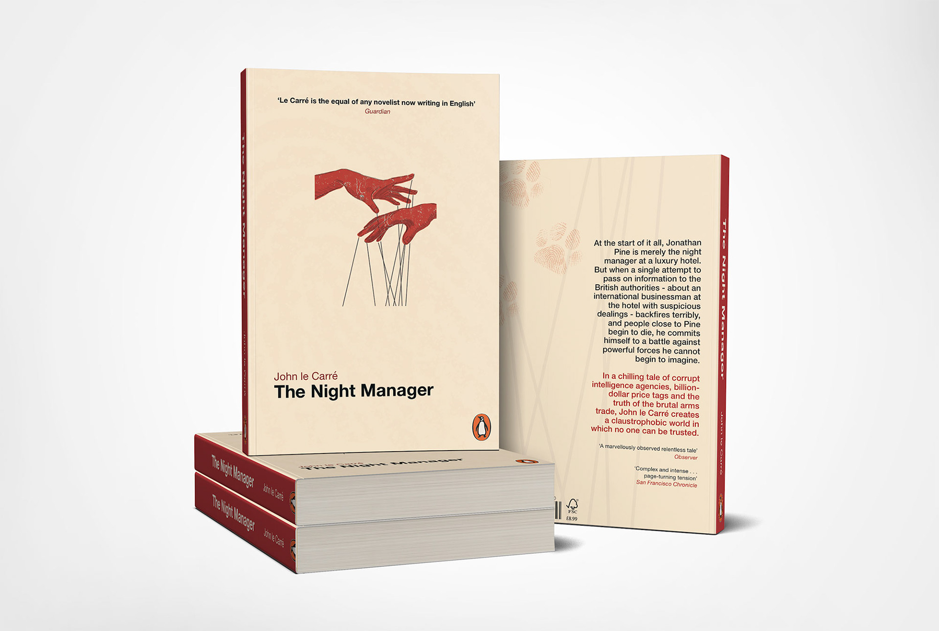
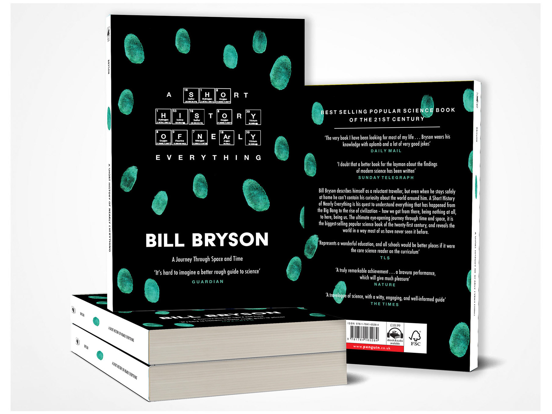
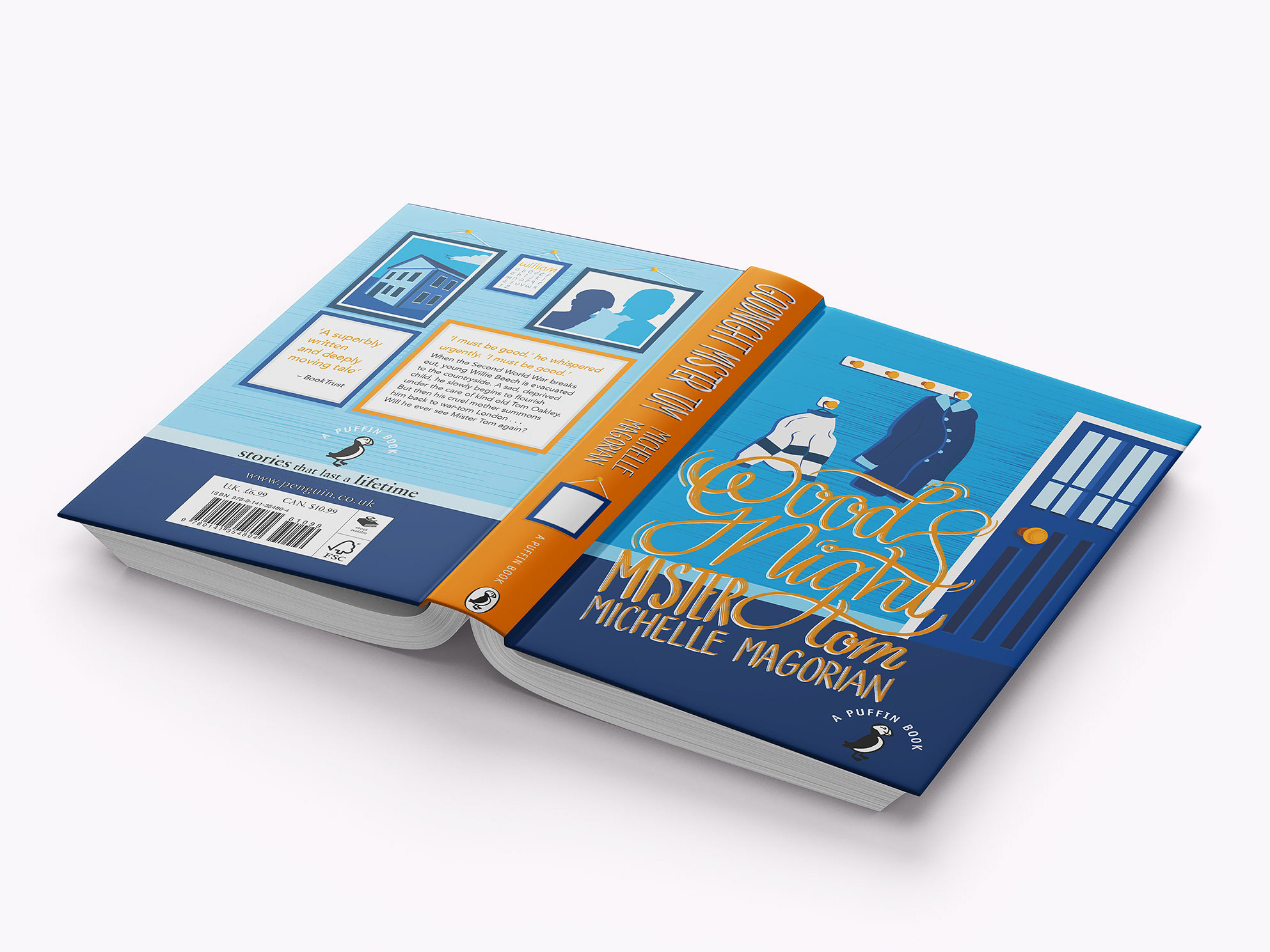
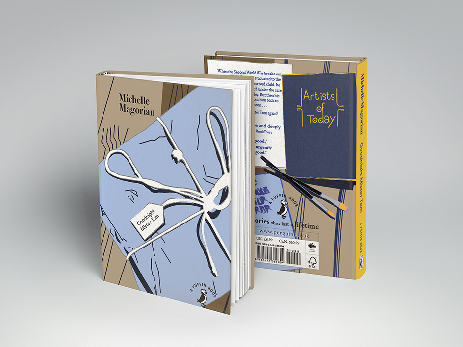
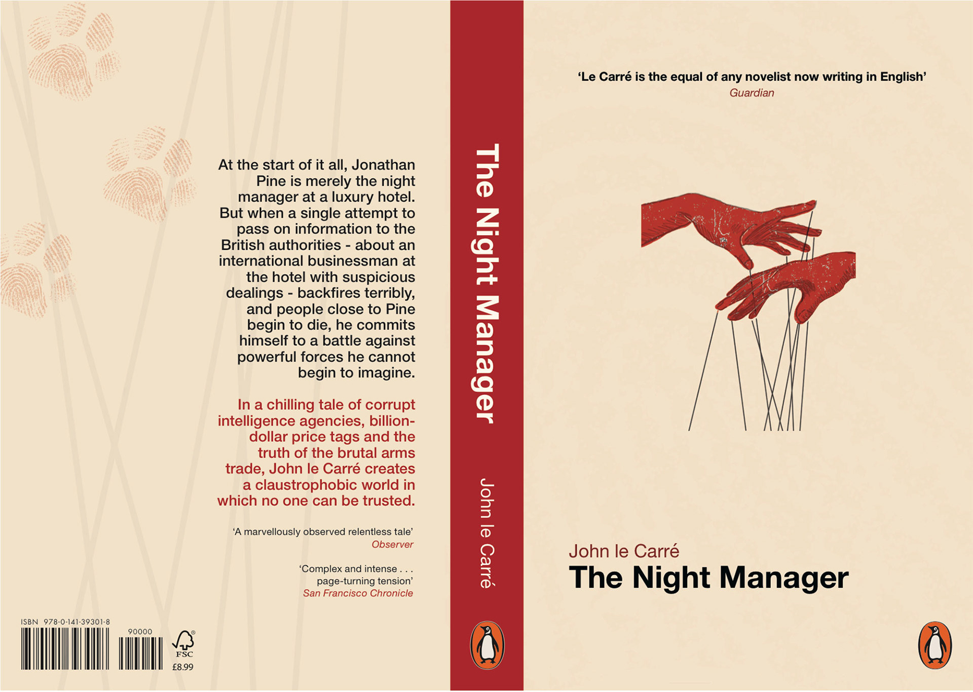
Project: The Night Manager Book Cover
Client: Penguin Student Design Award
This post-Cold War novel details an undercover operation to bring down a major international arms dealer. The design of this cover mostly steers away from the cliché crime visuals, whilst keeping simple elements such as the fingerprints on the reverse side to ensure that it portrays the genre of the novel. By conveying the message and genre of the novel in a modest way ensures that the audience will understand the basics, but the storyline will not be given away at first glance.
Project: D&AD New Blood Awards:
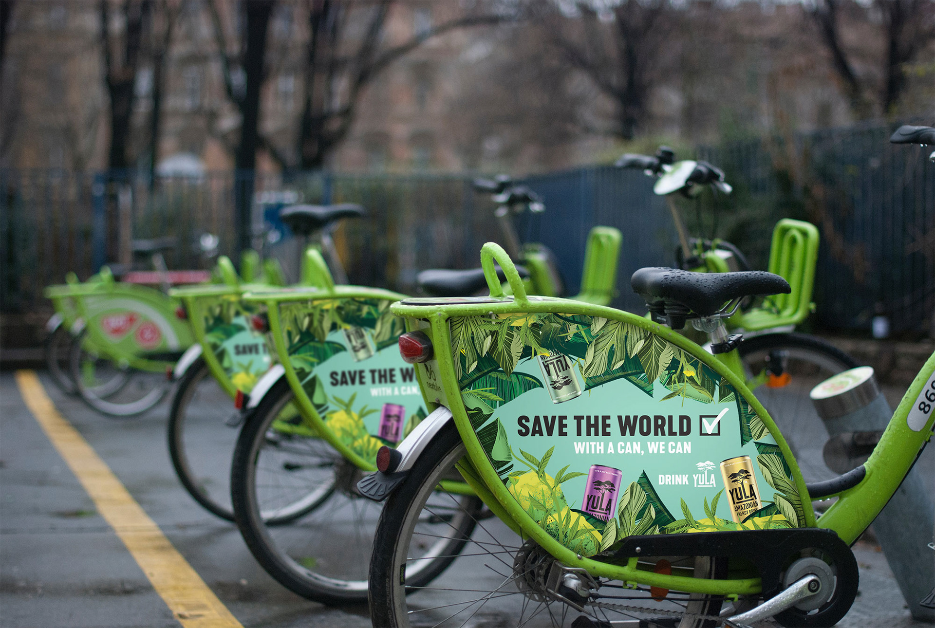
Yula Energy Drinks
Create a copy-led campaign that develops an external brand promise and convinces traditional energy drink consumers to switch to Yula.
YULA is an environmentally friendly brand which sells energy drinks. This copy-led campaign aims to portray the way in which the company is set on giving both the consumer and the world a healthier life. This is because it is both a main aspect of the brand identity but also something which a typical 18 – 25-year-old is interested in within the current day. This reasoning also influenced us to create a tagline for the brand of “Save the world. With a can, we can”.